Steemit Homepage Redesign: A Proposal For Maximizing Sign Ups


My Resume
As the founder and chief architect of GiverHub I spent a lot of time and effort on the design of the homepage in order to maximize click-throughs, sign ups and overall engagement with the platform and seeing as Steemit traffic seems to be down as of late I decided to take a somewhat critical look at the Steemit.com homepage to see if there was any room for improvement. There is. A lot.
Ned and Dan
First and foremost, the mockup below is not meant to imply that @ned and @dan are somehow slacking. This was more of an exercise and challenge for myself than any commentary on how well or poorly they are doing their jobs. I have every confidence that they are doing the best that they can and am still perfectly happy with how they are managing the beta release of their product. That being said, I do believe that there is significant room for improvement with the homepage and while I understand that issues like these might not necessarily be a priority, this is precisely why I am doing the mockup.
Our Responsibility As Equity Holders
If we in the Steemit community have ideas or proposals that we believe could make the platform better we don't have to wait around for management to take it on. Management, in this case Steemit HQ, have a lot on their plate and every decision requires a careful cost-benefit analysis. They simply do not have the resources to work on everything. But one of the great things about this platform is that if there is something we think is important, we can run with it ourselves and develop it to a sufficient level that enables Steemit HQ to see the value. In other words, we can change Steemit HQ's cost-benefit analysis by effectively reducing the cost of addressing an issue by doing some of the work ourselves and thereby reducing the cost of the project.
That being said, below you will find a quick mockup I made demonstrating some of the changes I would recommend for the Steemit homepage. The point of this mockup is not to show what I think is the "perfect" homepage, but merely to discuss concepts which could be incorporated into the homepage to maximize genuine sign ups. It is meant to be more of a conversation starter and so people are more than welcome to make their own suggestions and mockups whether based on my own or not.
The Header: An Ad For Steemit
I see the homepage, specifically the header, as ad-space for Steemit. 99% of the marketing that is done by a company is either captured or wasted by this spot. In other words, no matter how much time, effort or money you spend getting people to your website, 99% of people are either going to stay or leave based on this single point of contact with the application. That being the case, you want to draw people in as quickly and deeply as possible. You want to communicate to them as efficiently and pleasantly as possible that this is a place they want to stay and be a part of.
Communication
In order for communication to be effective it must first be clear and the Steemit homepage, in my opinion, is not clear. First, the majority of this real estate is consumed by the statement, "Welcome to the blockchain." What does that communicate to people? What do they know after reading that sentence that they did not know before and which motivates them to dive deeper into the site. To be completely honest: nothing. I love Steemit and I love blockchain technology and I have no idea what this sentence even means.
Rule #1: Be Compelling
When you're trying to convince people of anything the most important rule is that you need to be compelling. What is compelling about "Welcome to the Blockchain!"? The only reasonable argument is to say that if people really think about what this statement means, their interest will be piqued. But the people who are finding Steemit are already interested in blockchain-based startups. Telling them that they've arrived at some kind of blockchain related application doesn't tell them anything new, so why bother?
Precedents and Superlatives
Of course everyone knows that it's important to be compelling. But that's easier said than done. That's why I rely on the wisdom of others like Elon Musk. One of the most important lessons I've learned in marketing was a statement I heard him say on numerous occasions that I doubt many people took seriously but I believe to be genius in its simplicity: People respond to precedents and superlatives.
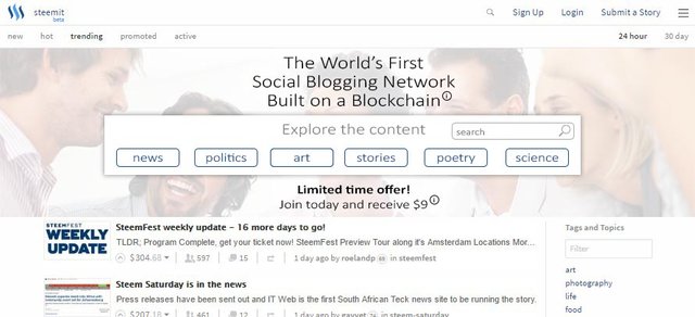
The World's First Social Blogging Platform
To highlight the importance of precedents and superlatives I have changed the tagline from "Welcome to the Blockchain" to "The World's First Social Blogging Platform." The point is not that this is exactly what the tagline should be, it's to illustrate a point. When discussing these types of issues, especially with those of the engineering-persuasion, far too much attention is usually given to the veracity of such a statement, whether it is perfectly accurate or not, as opposed to the important question of whether it accomplishes what it sets out to accomplish. The goal is to inform the potential customer of your product. Anything that does that is good, anything that doesn't is bad. "Welcome to the blockchain" is information poor. No normal human being knows anything more after reading that sentence than they did before. In that sense it is a waste of advertising space, internet real estate, and 99% of Steemit's marketing efforts.
The World's First Social Blogging Platform on the other hand at least tells the potential customer (a/k/a user) that Steemit is a social blogging platform. This capitalizes on the hundreds of millions of dollars countless companies have spent informing the public both about what a "social" website is and what a "blogging platform" is. This is not to say that people will understand Steemit completely after reading this sentence, but they might get 20% of it or 50% of it. Just how much information is conveyed to the customer is an interesting and worthwhile question to be asking, but it isn't hard to argue that my tagline delivers an order of magnitude more information to the user than the existing one.
Personally I have never heard the term "social blogging" before, though I would never argue that it is the most original concept in the world. Again, not really the point. How compelling the term is will depend on the user's ability to understand the phrase and how unique it sounds to them. I think a lot of people will go, "Well, I know what 'social' means, and I know what 'blogging' means, but I've never heard them together, so perhaps this site merges two valuable concepts in a way that I will not be able to experience anywhere else.
The Unique Value Proposition
By calling it "The World's First" Social Blogging Platform I am trying to highlight to the reader just how revolutionary Steemit is. Again, the most common refrain will be that this might not be a 100% accurate claim. One could argue that since Medium has social aspects, that it is the World's First Social Blogging Platform. Or maybe Facebook qualifies. The real goal here is to inform the reader of Steemit's unique value proposition (what it offers that no other site does). Yes, one of Steemit's UVPs is that is pays people to post and certainly tag lines that quickly, efficiently, and compellingly deliver this message should be A-B tested, but I am not able to come up with one that is especially good and so have therefore settled for the more communicable UVP: that it is the first REAL social blogging platform.
This is the real purpose of precedents and superlatives. They should not be interpreted, and rarely are, as literally true. They are a signal to the potential user of the unique nature of this site. If you do not believe that after being fully informed of your site's features, that the user will find the tagline to be reasonably accurate then it certainly should be changed. But at the same time, if your site truly has unique value propositions then it is necessarily true that one should be able to describe it as a precedent (if it is unique it is necessarily a "first"). If you don't believe your site has any UVPs you should stop working on it immediately.
Being Wordy is Greedy
What people who believe that every tagline should be 100% factually accurate and scientifically verifiable do not understand is that every word you make your user read costs them time. The trick is not to be totally accurate but to walk the line between accuracy and expediency, and to that end "puffery" can be extremely helpful. It should go without saying that a user should never leave the site with a bad taste in their mouths, but at the same time one should not neuter every effort out of fear that they will.
Your Voice Is Not Worth Anything
Many of my previous comments also apply to the second tagline on the homepage "Your voice is worth is something." While I think this is less confusing than the first tagline, it still doesn't communicate much to the user. At best it is something some potential users will agree with (Yes, my voice is worth something, but what does that have to do with you?) and some users will disagree with (No it isn't, so I guess you have nothing for me). Again, it does little to inform the potential user about Steemit, what's great about it, and why they will want to use it. That's why I get rid of it.
A-B Testing
It should go without saying that all of these components should be thoroughly A-B tested. But then ... barely any part of Steemit's landing page ever changes. As always I assume that the reason behind this is a cost-benefit analysis. As this is a beta release it may very well be the case that the company simply doesn't have the resources to dedicate to this aspect of the site, or this may not be something they want to improve at this point. That being said, if they want to maximize sign ups I can't think of a more important part of the site to test toward success.
Explore The Content
First I prime the potential user with my tagline, but then I wanted to show them a little bit more about what Steemit offers. One might think that my search/navigation box is intended to be used by the first time visitor, but that's not entirely the case. They're of course welcome to use it to explore the content, after all, that is what Steemit is offering isn't it? Content? And that's really what this box is about, communicating to the user more deeply that this is a site that offers content. In addition, the tags which are presented are another data set that can be A-B tested and maximized for effectiveness.
Talking To A Child
I think it is helpful to think of the potential user almost as a child. They're not stupid, they're just completely new to this world you have created. You need to walk them through it carefully. You need to present them information in multiple ways without being repetitive or boring. I think that the "Explore the content" box helps expand the information they are being given beyond the "social blogging" realm without being overwhelming. Also, what can be bad about giving the potential user a quick and easy way to use the platform for its intended purpose: the exchange of content.
The Monetary Incentive
I like that Steemit offers a monetary incentive, but I have to say that I think the "Steem Power" element completely defeats the purpose. I understand the belief that simply offering the dollar amount without mentioning that it is in "Steem Power" risks being deceptive, but growing a startup is all about risk. The question is not whether there is a risk it is deceptive, the question is whether anyone will actually view it that way. For example, while I have removed the "steem power" element to the promotional offer, I have added an information link. If people want to learn more they can click that link where we can more thoroughly inform people about the nature of the incentive. But people should again remember that their user's time is valuable, the more you make them read the more of their time you're wasting. The point of that line is that there is an economic incentive for joining, not to completely describe the nature of that incentive. I do, however, agree that the user should be more informed of that incentive before the sign up process is completed to minimize this risk, but that is simply not the purpose of the homepage or header.
Limited Time Offer
The point of all of this is to manufacture an interest for a product we all know to be interesting. Software almost never "sells itself" so we have to sell it. It is true that the financial incentive for joining will not last for ever. If that fact is not used then it is being wasted. By adding, "Limited Time Offer" I am trying to add a sense of urgency. Is it effective? Again that's something that should be A-B tested, but the point is at least to attempt to leverage every potential strength. If we're going to offer money, we should do it in the most compelling way possible. A-B testing can help you determine whether your attempts are compelling, but it can't tell you much about what to attempt.
Again, this is not meant as much as a criticism as an attempt to start a discussion with the community about how we might help Ned and Dan improve their site. After all, we're the ones who came and stayed. We're the ones who know best from personal experience what drew us in and what turned us off. It is obvious that we understand the mind of the potential user far better than they do because we were all once a potential user! That's a perspective that is unquestionably valuable to them and I am positive they understand that completely.

we should drop blockchain in the headline. It just confuses people in my opinion. Headlines should be clearly answer one answer: "What's In It For Me".
Blockchain, unless you are a techy, means nothing to 99% of people.
Agreed, and it also doesn't really make sense in this context. In other words, even for those people who do know what "blockchain" means, that doesn't mean they will understand what "Welcome to the Blockchain" means. I think what they were trying to do was advertise Steemit's ability to enable people to get involved with the Blockchain with a very limited investment, but that's not at all clear, which means it's not a very good tagline. I think that promoting this aspect of Steemit (as an easy way to get involved in Blockchain technology) is a good idea, but doing it there in that way is not.
I think the key feature about the blockchain is that it is "new technology". People do like being associated with new stuff and technology. That also primes them for not understanding it all right away. It's new, it's still developing, and they have a chance to participate in something special.
Excellent point, though instead of "new" I would use words like "revolutionary," "breakthrough," "state-of-the-art," etc. Same idea though. Maybe a better tagline would be, "The World's First Social Blogging Platform Built on State-of-the-Art Blockchain Technology"
Breakthrough sounds pretty good!
I think so too Blockchain is a meaningless word to most people. I think most people if not all don't care this is based on Blockchain technology. They want functionality and a chance to get paid for posting content.
Part of what I understand this project to be about is bringing understanding of blockchain tech to mainstream audiences. I don't think we should drop language from the intro, but I do think something like a hover-triggered window with a statement like "What's a blockchain??? Click here to find out" that links to a concise description of what a blockchain is as pertains to Steemit would be appropriate.
Great layout! I really like the suggestions and the design.
I do know that the front end dev team is planning a GUI redesign, but I think they are focusing more on features than looks for the time being. With that said, maybe your post might provide some inspiration to put Steemit's facelift higher on the priority list. It should at least provide lots of good ideas for when they eventually do.
There are several things in here too that could be done independently, instead of waiting until it can all be done at once.
Out of curiosity, do you have any interest in coding any of these out? The Steemit GitHub repository accepts pull requests.
Yeah, part of the reason I did this mockup was because the changes I see them working on were mainly functionalities. While improving the GUI and the design is good and important, the ROI on the changes I am suggesting are likely significantly higher. I mean, all the design and feature changes in the world don't matter if no one gets past the first part of the first page and signs up.
Unfortunately what coding skills I once had have long since atrophied and died :(
Hehe, I know what you mean. I made the switch from developer to project manager a few years ago, and already a lot of my development skills have started to rust :)
Haha, get some WD40 on those dev skillz! ;)
I definitely like your layout. I think of Tumblr when I hear a social blogging site. For the highlighted tags, I'd suggest tags where there is a lot of engagement - not just upvotes and earnings, but real comments and clear community. People do like joining communities and those tags give them a place to see people connecting in a positive way. Nice work - I hope to see it in place sometime!
interesting layout!
My suggestion: for the hero image, we have ton of user content images. we don't have to use iStock purchased unrealistic model image. We have real ones. Let's use them just like Tumblr or Twitter landing page.
Yes, the image I used was simply for illustration. It was really filler, nothing more. I like your suggestion
I think it is the difficulty of account creation. Think about the ease of setting up a craigslist, why can't Steemit be that easy?
It is not just one thing. The more people we can get to attempt to sign up, the more people will complete the process. Making that process easier (which they have) increases the percentage of people who complete the process. But if people never try to sign up in the first place because they are turned off by the landing page then it 100% does not matter how good or bad the sign up process is. We can fix multiple things. Proposing a fix for one thing doesn't mean there isn't more to fix.
Great job, congratulations
This post has been linked to from another place on Steem.
Advanced Steem Metrics Report for 31st October 2016 by @ontofractal
Resteemed: ( Steemit Homepage Redesign: A Proposal For Maximizing Sign Ups ) and receive 0.06 STEEM by @steemitfaucet
Learn more about and upvote to support linkback bot v0.5. Flag this comment if you don't want the bot to continue posting linkbacks for your posts.
Built by @ontofractal