You are viewing a single comment's thread from:
RE: New Logo proposal for FreeCAD
It's nice, you delivered all required files are correctly (logomark/logotype, icon, and ready to use .png) Well done. But, Please explain me! Why did you choose to that font? The Font seems incompatible with your main logo. [Utopian Moderator]
Well, first of all, thank you for seeing at my contribution and asking me a question. Before I choose a font, I always try it for 5-15 different fonts when creating a logo, and a perfectly fitting one is Oswald font. This is because the font has a strong and bold character, and is not widened (condensed), so it does not take space to the side. This font is perfect for this logo, because when I create a vertical style on this logo, the width of the font fits perfectly with the width of the logo and is very easy to read despite having a small width.
And of course this logo is logomark/combination mark, not a logotype. Both have significant differences. Not always the font must follow the existing fonts in logomark, because it will make the repetition, and it is not aesthetically pleasing for logomark.
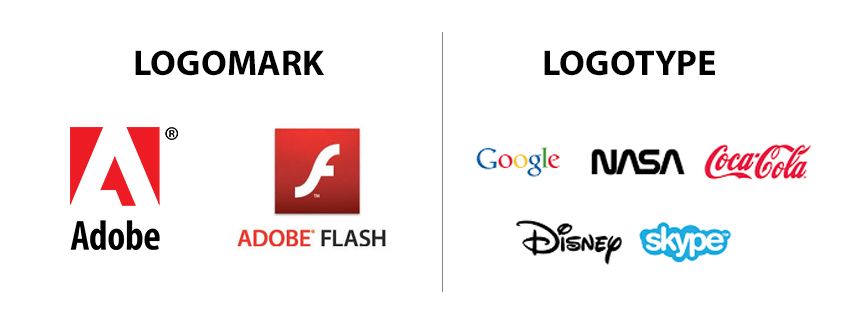
Here's an example of logomark & logotype. I am very inspired with Adobe logo.
Cheers :D
Bertambah ilmu baca penjelasan mastah ini