New Logo proposal for FreeCAD
Details
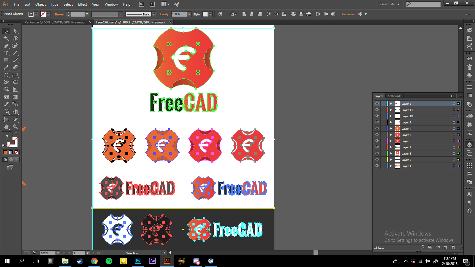
In this great opportunity, I would like to present my contribution in utopian for a new logo of FreeCAD. https://github.com/FreeCAD/FreeCAD
Benefits / Improvements
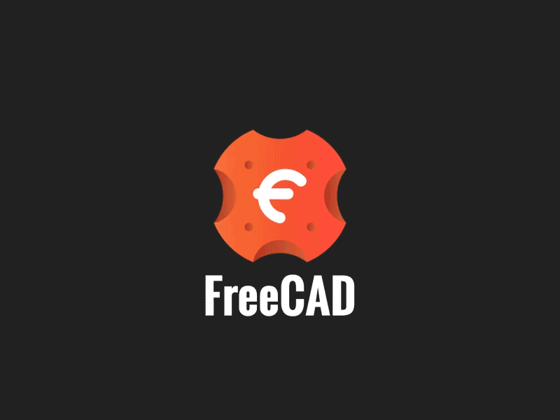
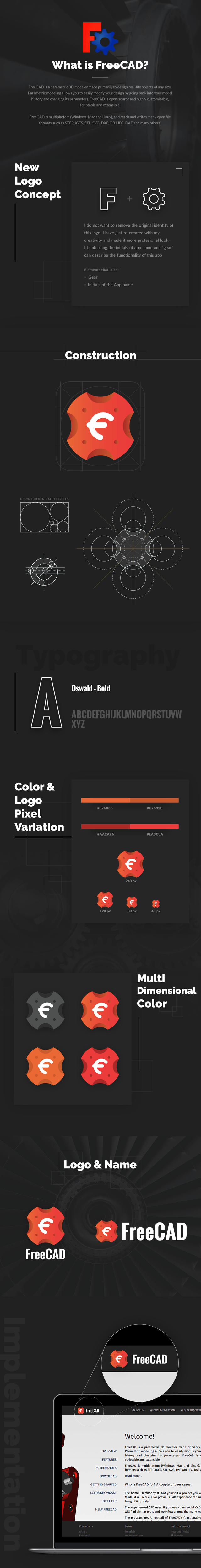
In the previous logo already represents the function of this application, only the execution is less satisfactory and too simple. I re-created it with a more professional look and have the characteristic to convince users to use this app.
Hopefully, this logo can add value to this application.
Tools
- Adobe Illustrator
- Adobe Photoshop
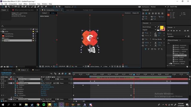
- Adobe After Effect
Proof of Work
Original files
- Editable Files
- Font
- Free Mockup
- 3rd Party Images: image1, image2, image3
Posted on Utopian.io - Rewarding Open Source Contributors
Thank you for the contribution. It has been approved.
You can contact us on Discord.
[utopian-moderator]
Hey @thillustrator, I just gave you a tip for your hard work on moderation. Upvote this comment to support the utopian moderators and increase your future rewards!
Good post, request you to follow me and upvote please. I am also following and upvoting you.
Thank you
https://steemit.com/@yousufpatan
Thanks for the upvote and follow, I will follow you back.
It's nice, you delivered all required files are correctly (logomark/logotype, icon, and ready to use .png) Well done. But, Please explain me! Why did you choose to that font? The Font seems incompatible with your main logo. [Utopian Moderator]
Well, first of all, thank you for seeing at my contribution and asking me a question. Before I choose a font, I always try it for 5-15 different fonts when creating a logo, and a perfectly fitting one is Oswald font. This is because the font has a strong and bold character, and is not widened (condensed), so it does not take space to the side. This font is perfect for this logo, because when I create a vertical style on this logo, the width of the font fits perfectly with the width of the logo and is very easy to read despite having a small width.
And of course this logo is logomark/combination mark, not a logotype. Both have significant differences. Not always the font must follow the existing fonts in logomark, because it will make the repetition, and it is not aesthetically pleasing for logomark.
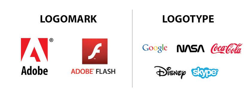
Here's an example of logomark & logotype. I am very inspired with Adobe logo.
Cheers :D
Bertambah ilmu baca penjelasan mastah ini
Hey @danuega I am @utopian-io. I have just upvoted you!
Achievements
Community-Driven Witness!
I am the first and only Steem Community-Driven Witness. Participate on Discord. Lets GROW TOGETHER!
Up-vote this comment to grow my power and help Open Source contributions like this one. Want to chat? Join me on Discord https://discord.gg/Pc8HG9x