RE: Task request: design an article preview for SteemMakers
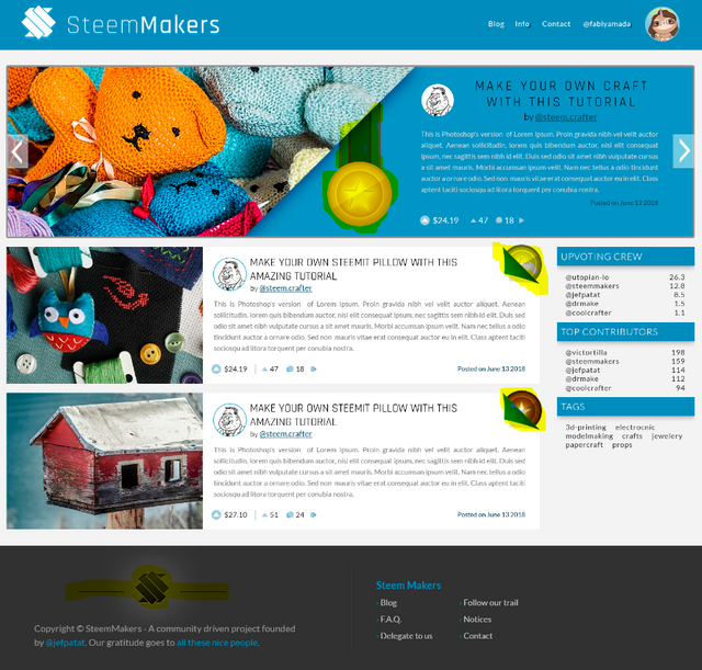
Your design triggered a lot of discussion in our community. The feedback was very positive and certainly set the direction. We have some minor remarks, mainly around the area's highlighted in yellow:

- We're not too fond of the badge hanging down because it makes us think of the army badges.
- The flipover is liked by some but we think it won't suit well to be responsive
- The logo in the footer doesn't completely match the text below it, maybe the line needs to go wider?
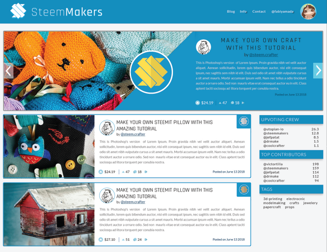
A lot of ideas surfaced thanks to @techtek and @podanrj. We ended with two proposals that we think are ok to move forward with:

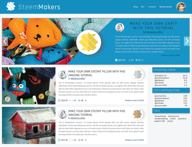
and

As you can see we used the steemmakers logo in the medal. Your medals were liked as well, but the consensus is that our logo would be better instead of a star.
My personal preference goes to the last design with the slight shadow drop.
One last note: we're currently investigating if we could incorporate this theme which has slightly rounded corners. Unfortunately it is not opensource. Could you try to match it?
And of course this means you're good to go on this ;-)
Thank you so much for your feedback :) I will work on it and show you the results!
Hi again, here is my new proposal with round corners and slight shadow in the post preview, and with 3 medal iterations. The footer was adjusted too.
If there is something else from the theme you would like that I consider please let more know more specific.
Everything can be achieved with CSS (I am a front-end dev too).
Also I wish you consider the version with the intro banner, it could have a very nice video of someone working in their workshop, or fade different images selected from pixabay/pexels which are CC0.
Thanks for your attention :)