Task request: design an article preview for SteemMakers

SteemMakers is a community which focuses on uniting, helping and rewarding makers and DIYers on the Steem blockchain. You can find more info about us and how to contact us on our website www.steemmakers.com.
Please read this post carefully so you grasp all details of the request.
We are currently redesigning our website and working on the implementation of new features. One of these features is that we will start scoring the reviewed articles. The way we envision this is that the reviewers will fill in a questionnaire. This will result in a score that will be translated into medals. We have the idea of three final medals: gold, silver and bronze. There is some discussion if this will be enough and a 'diamond' medal was also proposed.
Details of the request
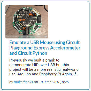
We are currently looking for a graphical update of the article previews. Obviously the design should work with the look and feel of our site. A live version of the test site is available here. Currently an article preview looks like this:

We would like to add several pieces of information to this:
- the medal (or a badge)
- a vote button with the number of votes
- the current reward
- a resteem button
- optionally a list of all earned medals
Although this request uses the word "medal" a "badge" can also be used, as long as we can indicate at least three levels clearly.
You are free to rearrange items in the preview but we require about the same amount of space to be reserved for the thumbnail, title and text. You are free to take additional height if required.
An important part is that the site is responsive, meaning that it shows differently on smaller devices such as mobile in which case it looks like this. (In the last development the thumbnail is centered horizontally)

In this case the text is shown underneath the thumbnail. Either the design should work on both or you could make a matching design for small devices.
This is just a quick mockup as example and by no means an indication of what the end result could look like.

A member of our team has already made some other mockups that can be found on our GitHub in this issue. Your design should at least have some difference. If you want to use our logo or other artwork you can find it here on GitHub.
Components
The design will be used wherever we need article previews such as the home page, the article submission page, the author profile pages, ... Currently we envision to expand the site with several features. If you're able to help us making the UI more attractive you are more than welcome to help us out.
Deadline
We are still in the design phase of this feature. The questionnaire is being set up and preparations are being made in the code. As such we have nothing to live test at this moment. We hope to finish a first iteration of this work in the coming weeks. We would like to have a design within two weeks. The deadline is Sunday 24th 23:59 UTC.
Communication
If you have additional questions don not hesitate to contact us. For general questions we prefer them to be asked in the comments of this task request so the questions remain visible for everybody. We will keep a close eye on this post until the deadline and respond as quick as possible. If you wish you can also contact us on our discord server. Please use the #general channel here.
Moderation
SteemMakers strives for quality just as much as Utopian. We will support the Utopian moderation team with our feedback and indicate which designs are really helpful to us as well as help fighting any abuse. No pull requests should be made as designs first need to be discussed within our core team. All designs should be publicly available and will be used under our license if chosen. Follow the Utopian guidelines for graphic submissions from Utopian.
Utopian info
Repository: https://github.com/JefPatat/SteemMakers/tree/master/website
My github account: https://github.com/JefPatat

This task request is now open.
Designers:
Only post to comments. Only works first approved by the project owner @jefpatat or moderator can be posted as full contribution and rewarded. Multiple works might be rewarded.
Deadline is 24th 23:59 UTC (for full contributions to be rewarded)
Provide multiple screens, not just one preview itself but whole homepage.
Your contribution has been evaluated according to Utopian policies and guidelines, as well as a predefined set of questions pertaining to the category.
Need help? Write a ticket on https://support.utopian.io/.
Chat with us on Discord.
[utopian-moderator]
Thanks for the help and feedback!
Hello!
Here is my proposal:
I was about to make the responsive version but I think it is better to get some feedback first, so I can improve this version and then move forward.
I took your current website and github proposals as sample for the info, also I am using Rajdhani and Lato (OFL); image placeholders are from pixabay.
I hope to hear your feedback, thanks for this task!
hello again!
Here is an iteration with banner....
That looks really nice. I'll get feedback and update you asap.
Thank you :)
Your design triggered a lot of discussion in our community. The feedback was very positive and certainly set the direction. We have some minor remarks, mainly around the area's highlighted in yellow:
A lot of ideas surfaced thanks to @techtek and @podanrj. We ended with two proposals that we think are ok to move forward with:
and
As you can see we used the steemmakers logo in the medal. Your medals were liked as well, but the consensus is that our logo would be better instead of a star.
My personal preference goes to the last design with the slight shadow drop.
One last note: we're currently investigating if we could incorporate this theme which has slightly rounded corners. Unfortunately it is not opensource. Could you try to match it?
And of course this means you're good to go on this ;-)
Thank you so much for your feedback :) I will work on it and show you the results!
Hi again, here is my new proposal with round corners and slight shadow in the post preview, and with 3 medal iterations. The footer was adjusted too.
If there is something else from the theme you would like that I consider please let more know more specific.
Everything can be achieved with CSS (I am a front-end dev too).
Also I wish you consider the version with the intro banner, it could have a very nice video of someone working in their workshop, or fade different images selected from pixabay/pexels which are CC0.
Thanks for your attention :)
Wow, I love your designs @fabiyamada they look really nice. I'm planning to contribute. Your works inspires me more!
I am on it!:D
Looking forward to it. If you need anything you know where to find us ;-)
Hy @fabiyamada, One think. The logotype is all in BOLD. 😀
hello!! I did it intentionally, as a proposal, I think it looks better to make the word "MAKERS" bold to give contrast and enphasis on it ;)
it will make additional work for me to make brandings assets. 🤣
Hey @jefpatat, if you want to submit a graphics task request, the second tag should (must) be task-graphics. That will help with categorization and it will be put in the moderation review line so that the Community Manager is able to see it and verify it.
Thanks for the feedback. I misunderstood the description on the site. First task request ever. Updated the tag :-D
Brilliant!
I realize this is a work in progress, so not much detail can be provided at this time. I’m hoping you can include some way to explain to the average viewers how and/or why the post scored the way it did. That information will also help the author improve future posts, if they desire.
Thanks for your continued efforts to make Steemmakers top notch.
Proud member, electricswine.
As always we will be open about it. We will line out what we look for and to the author it should be quite clear why the earned a badge. We wont be able to track all answers to the questionnaire at first, this is a longer term goal. This would require quite some effort and we expect the questionnaire to change quite a bit at the beginning. You can follow along with this discussion and give feedback if you want here: https://github.com/JefPatat/SteemMakers/issues/11
Awesome. Thanks so much for the link. Really appreaciate everyone's efforts.
Nice job @jefpatat your post is very nice.
Excellent post
Hey @jefpatat
Thanks for contributing on Utopian.
We’re already looking forward to your next task request!
Contributing on Utopian
Learn how to contribute on our website or by watching this tutorial on Youtube.
Want to chat? Join us on Discord https://discord.gg/h52nFrV.
Vote for Utopian Witness!
Hi @jefpatat can provide a link (Google Drive) with the editable files of the steemMakers logo, those that are in Github give me error when opening them.
I can't comment on that. I think it's best for you to join our discord and contact @podanrj. He has made those files.
hey @ggcarlosr try this file for your designs :)
https://drive.google.com/drive/folders/1jWIMI5pxJ_WH4c8KkKYiPWq3vQ1yilal?usp=sharing
thank you @podanrj