Strimi 2K18 - New Interface Update#1
Hello Steemian!
Few days ago we adding first post witht our new interface for blockchain Steem. Today we want show you some picture and gif of our works after a few days :)
TL;DR
We olmost finish:
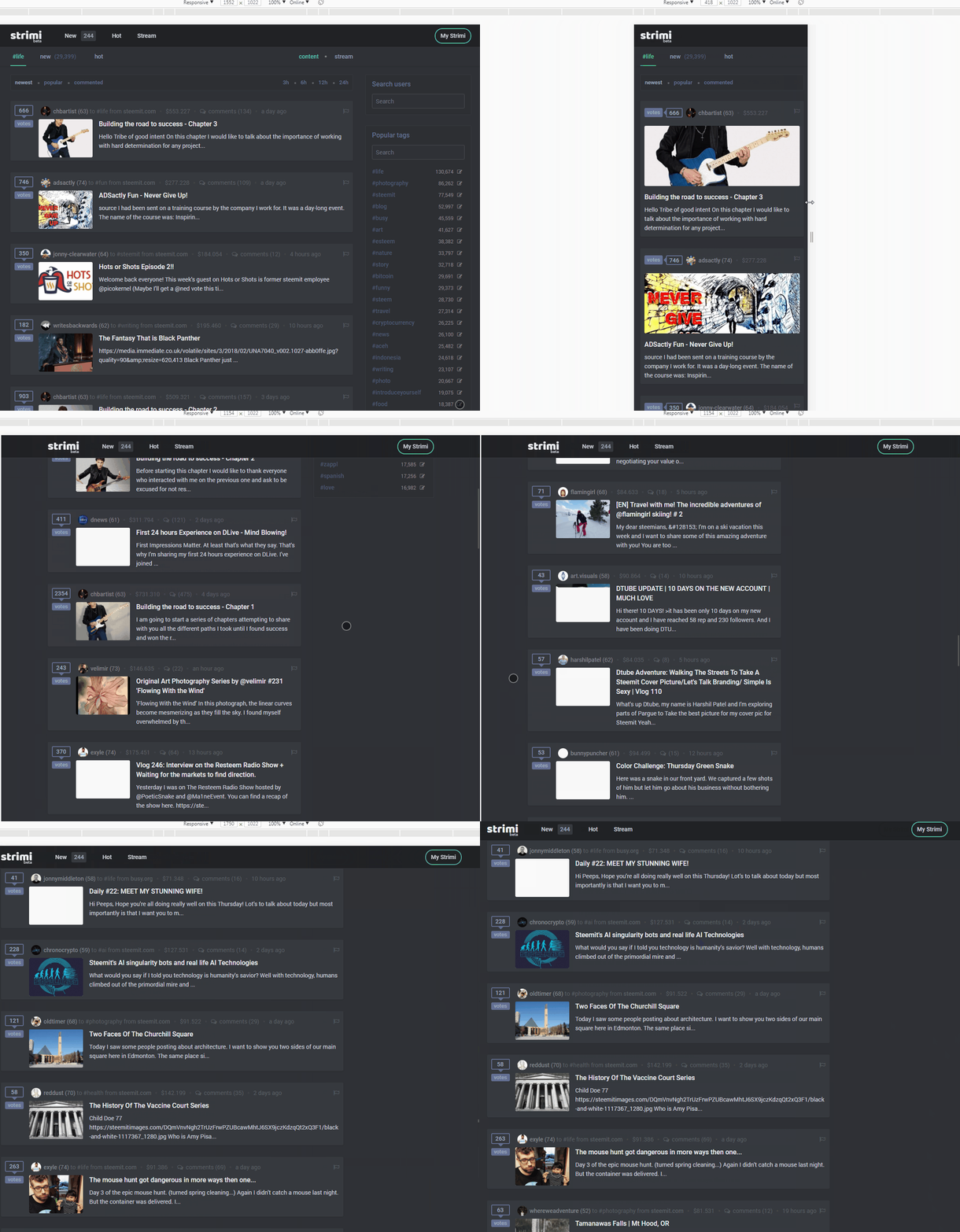
- Mobile version
- Night version
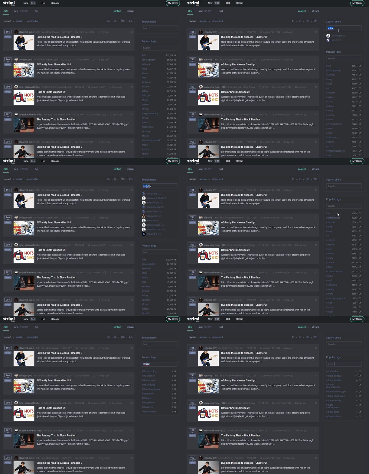
- Live searching users and tags
- Posts sorting on trending, created, hot via newest, votings count, comments count
- Posts filtring via 3 hours, 6h, 12h and 24h
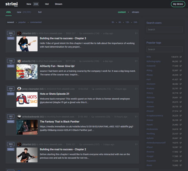
First we want finish mobile and night version, at this moment it looks like this.
Dark side of power ;)
The top of the page:
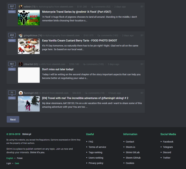
The bottom:
And now is time to mobile gif:
And searching gif:
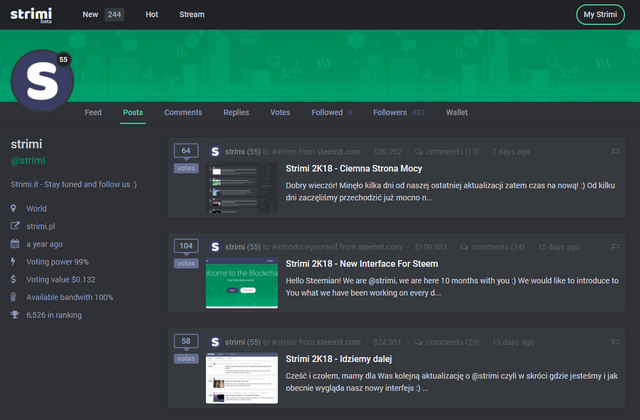
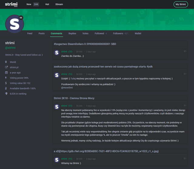
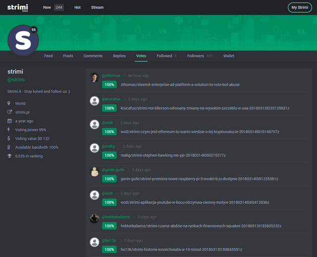
Dark user profile looks like this:
User posts page
User comments page
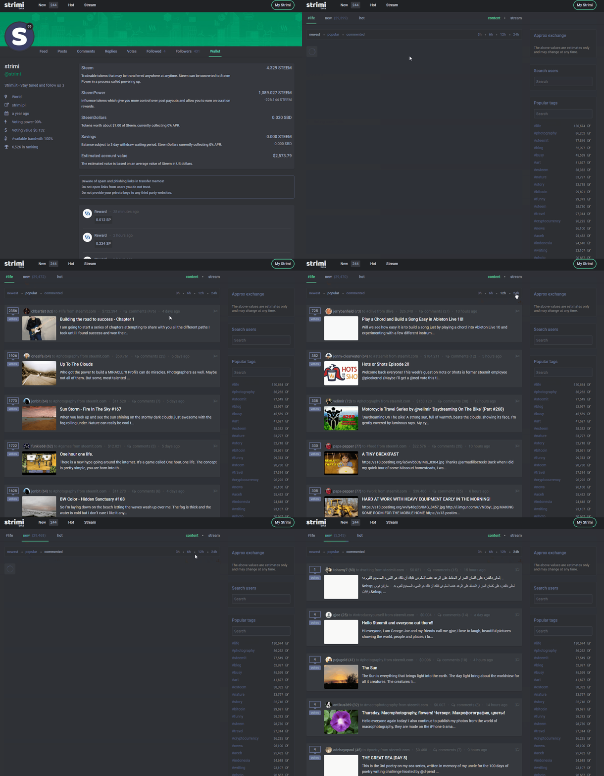
And now is time see speed and filtering action :)
User votes page
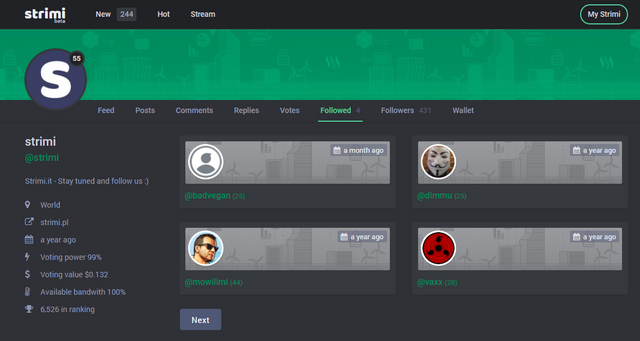
User following page
And wallet page
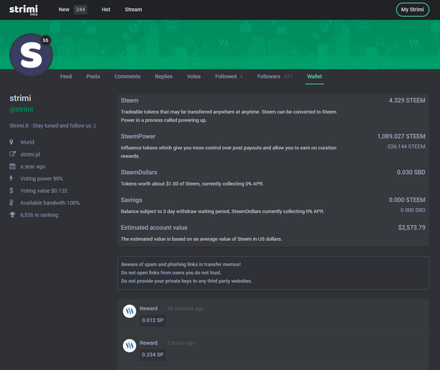
Strimi is online and you can find ous on https://strimi.pl but! On screen you see new interface, we want finish "read only" version on current month - we hope so.
Every day we votes to posts our users totally for free - this is our support for users. Perhaps @strimi steem power is not big, but we help as much as we can.
If you want to support @strimi follow us and votes this post :)
Best!
Strimi Team
hey thanks for sharing
Strimi is created with love to blockchain steem and we want share our work with people around the world :)
Thats great