20 NEW UPDATES TO STEEMPEAK.COM THIS WEEK
NEW TOYS!!
Anyone else feel like it's Christmas Morning every time the developers come out with a new list of updates? Lots of these updates were from your interaction on our discord ... this week we had two sets of presents (lists of updates)
- FEATURE HIGHLIGHTS = Beneficiaries | Down-votes | Support page
- UPGRADE HIGHLIGHTS = Slider | Formatting | Mobile | Mute
Feels good to be back pumping out features but me (@jarvie) and @asgarth loved creating https://peakmonsters.com the couple weeks prior to that for all the @steemmonsters fans.

FEATURES LIST
These were two sets of updates so all our discord people already know about them.
1 - BENEFICIARIES
This is optional you can make any account you want a partial benefactor of the rewards of your post! Think shared accounts, think contests, think charities, think content negotiations, think supporting.
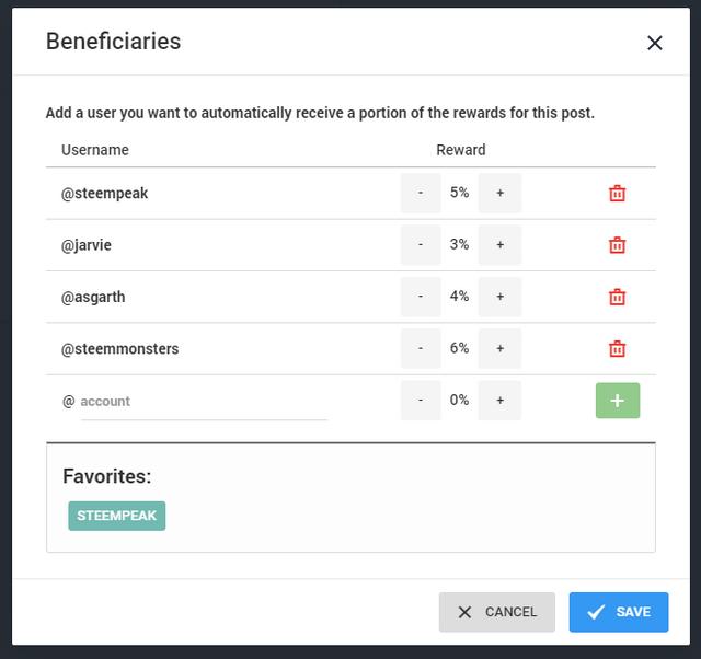
1B - Support via Beneficiaries
In settings we added an OPT-IN ability to support @steempeak with said feature. We are committed to not charging you to use our site. This optional support is up to you. And you can select this and STILL have the option for every post. #freechoice

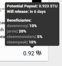
1C - VIEW BENEFICIARIES
This is not new but just wanted you all to know where to see what the beneficiaries of the posts are... I suspect we'll see a lot more of them as they are now seen more as a valuable optional tool instead of just an imposition.

2 - IMAGE SLIDER IS IMPROVED
- Filtered out non-picture
- Made arrows better
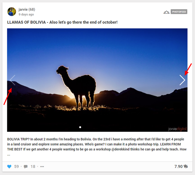
Opt into this amazing feature in your steempeak settings.

3 - FIRST IMAGE/VIDEO IS NOW THE DEFAULT... AGAIN
Pretty self-explanatory... we missed it when it went away during another update... and now it's back.

4 - SUPPORT STEEMPEAK PAGE
- Everything is totally optional.
- You can find a linke to the support us page located in the wallet.
- We suggest that if you like what we do and want to see more faster... here's a way to make that a reality.
- Like we mentioned above Beneficiary tool is a great way.
- Also we have a link to discord there.


5-7 - IMPROVED MOBILE
- Removed some annoying overflow
- Updated our logo on mobile
- Badge for Notifications
FYI: Mobile will have many more updates

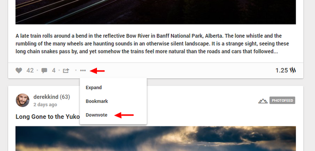
8 - DOWNVOTE OPTION
- You can now bring up a slider to "give down vote"
- This adds a negative total to the total STU of the post.
- Not a lot have requested this feature but those that wanted it are super excited.
- We also have remove downvote
- Also you can just do a regular vote and it will remove the downvote.

9 - WORD COUNTER
- Simple feature yet has been requested a few times.
- As long as it's loved and used we'll keep it there.


10 - SCHEDULE POST SORTED BY DATE
- Super straight forward as well. Quick fix.
- We love your feedback specially when they're easy stuff like this.
Who's been loving the schedule post feature?
We've heard of many really solid reasons and usages of it.

11 - MUTED ACCOUNTS WORKING AS EXPECTED NOW
- Keep in mind steemconnect (which we use) doesn't have "un-mute" so we don't either.
- You mute them on steempeak.com you will not see them again on steempeak.com
- Unless you go directly to their profile or a post
- Mute is interface specific


12-20 THE SMALLER FIXES
- Improved post html rendering to allow centered text
- Other html formatting options
- Improved comment layout when using html code
- Feed page now says "My Feed" instead of "Recommended for x"
- Fixed an issue with SteemPress uploaded images and images being proxied from sites without SSL
- Fixed GIF preview in Feed
- Bandwidth improvements
- Fixed some typos
- Fixed a bug that prevented saving a user and topic that were the same.

Good job to @asgarth and @anarcist for all their hard work... while keeping up their day jobs!
FUTURE TUTORIALS?
We LOVE seeing your tutorials and will keep looking for them on #steempeak topic and sharing the must educational and inspiring videos. In addition @jarvie wants ideas for features you think we should highlight.
Join us on our discord ->> https://discord.gg/yJcXebv
We hope you enjoy using the STEEM INTERFACE ->> https://steempeak.com
Awesome job and I'm hanging out to start using Steempeak full time
BUT
It still only has two interfaces, both of which I find hard to use - grid (wall of noise) or massive great pictures too big to easily scroll through.
All I want is Steemit sized list view in dark mode. Most of the other stuff I already had with "More Info" on Firefox. And I want to see small size clean lists of my comments and replies - like on Steemit.
When it gets a list view like Steemit, I'll switch over in the blink of an eye.
But at this point it just doesn't work well for me - especially as wall of noise keeps jumping around and rearranging when I scroll
Sorry to be a negative moaning prick, but this lack of a fast scrolling interface is killing it and is why I'm still mostly using Steemit... (except for when I'm posting because I like the Steempeak formatting)
I agree! I wouldn't have been able to word it as well, but a "Classic Steem View" would be great and YES to the night mode also.
Do you ever post from your other account anymore Mr. Frot?
I certainly do, but @sift666 is becoming more my archive, while @frot is what I've moved over to as my number one account from Sep 1.
I know it's a bit odd but I sort of needed to make the swap - here is an explanation:
https://steemit.com/steemit/@frot/why-on-earth-have-i-just-changed-over-to-a-new-account
Yep, it is not as yet the perfect medium, but hey, what is?
yes different people have different preferences of views. Some people only use grid mode and would mutiny without it. I myself don't personally like it.
I guess we may do a poll over on the steempeak discord to see if there are people who want a "list" mode maybe they also want it but just haven't spoken up.
I am also wanting a list mode, and am not keen on the current viewing options.
Apart from that I'm really impressed with Steempeak. Many thanks!
thanks for the input, we are indeed interested in knowing who likes this type of view option.
It's not a deal breaker for me but I would love to see it as an option. At times there are reasons why having a list is very useful. Happy to speak up about it in the discord group ;)
I've already had four people tell me they are waiting for a list view...
But some people - like me - don't use Discord (I hate it) - please do a poll on Steemit!
Haha we don't use steemit but i think you mean steem anyway. And why the huge flashy picture on your comment?
In any case We'll ask our users and see what they think and where we can put it into our roadmap if it's something people want. Thanks for your input.
Hi - I really appreciate all the work you guys are doing and I'm not trying to wind you up
For over two years on Steemit I've always chucked in images on all my comments - I don't check the size or anything - I just throw them in to make the comments more visual.
I'll fix that one - it was bloody huge - sorry
The reason I'm going on about this is because I really think this is the most important feature for Steempeak. And if it gets this sorted, Steempeak could rapidly take off.
Isn't https://steemit.com generally refereed to as "Steemit"? - I just meant to do a regular post that is also a poll.
@frot
www.frot.co.nz
Well if you think it's a huge one we'd love to know. For reals.
I'll be honest we just don't get much requests for it. And i'm not sure if any of our team would even use it if we created it so there isn't that internal group motivation. BUT... doesn't mean there isn't a desire for it. If there is a good desire I don't see that it would be to difficult to design. I think just a matter of not confusing people by having yet a third, so how to present them with that option. So we have to think about how that would be implemented.
The other issue is if we ask people if they want a 3rd view... of course they do ... doesn't cost them anything to just say yes, even if they never use it. So our poll would have to have some sort of cost to it to see how much they actually want it. "If you could only use one view?"
I'm perplexed by all this - but I sort of had a feeling that maybe you thought like that!
Until now I haven't said anything because I avoid Discord.
If I could only have one view - list , no hesitation - maybe that's why Busy is so unusable... And why almost everyone sticks to the Steemit interface.
How life works...
https://steemit.com/steempeak/@samstonehill/wcq46eo4
well keep directing people this way that feel the same. We'll listen. We just need to know more of them exist i suppose. Thanks for the heads up.
I am a newbie and love steempeak. I prefer it now. It has a much better design than steemit and quite some cool features, that I miss in steemit. Adding you new features is great. Thanks a lot for your work. I will try to support when I have more experience.
Exactly what I was going to say, although I only used SteemPeak for a short while, but I might get back to it and use it instead of busy.org. So many people complain about Steemit.com, but when it comes to a really good alternative I might say, we want things "like in Steemit"? That doesn't sound right...
I noticed the word count as I was making a draft this morning and was very happy, cool feature! Lots of great updates.
Fun to see people liking the word count. I didn't know it would be this popular.
I know i wouldn't have thought about putting it on the site, so i'm glad people are making suggestions in discord... specially the really easy ones that don't take @asgarth very long at all. haha
Yes, some contests require word counts so it is great.
Very nice! Great job guys, have you or are you going to seek a delegation? if not, why not?
We are still defining our strategy on this, but probably we will go for it in the future ;)
Well with HF20 giving tokens for free account creation to accounts that have lots of SP (delegated sp)
I personally think it's gonna be on the list IF we get into the new user sign up game.
And if that becomes the case we'll speed up a delegate undelegate tool on steempeak
And even add it to https://steempeak.com/support-us
NEW ACCOUNT SYSTEM
I have some very big ideas on this front so it's of high interest to me. #staytuned
It is my opinion you have built the best front end on the site. I tend to forget to use it, because I have become "used to" Steemit.
Knowing I was going to get even a small vote from the Interface, would help break my habit! :)
yes a vote bot would Also be another benefit of delegation.
And we don't fault the many many people that use @steempeak for every single thing including writing posts... and then copy paste that post into another service. haha
I find it funny personally. Doesn't bother me.
Well great job, I will remind myself to use the front end right after this comment. Really great job guys!
I did another contribution today though it's small, 1 STEEM, but hopefully can do a little bit encouragement.
13/09/2018
Thanks, we appreciate that ;)
My favorite are the beneficiaries and the scheduling :)
What a smashing job you are doing @steempeak! I've been transitioning over to you from steemit.
I have a suggestion for a future easy improvement. Please make sure you set the proper attributes so that sharing the post with a SteemPeak link (instead of the alternative DApps) via a different off-chain platforms like Twitter will show the proper image on the shared post, instead of no image. Thanks! And SteemPeak is awesome, keep it up!
Thanks for your suggestion, this is already on our roadmap ;)
I used steempeak today. It was my first post using this platform. I found many useful features on this site but I also faced some problem while writing my post. I noticed that the buttons related to formatting and photo upload were also floating when I was scrolling down to my post. So, I had to go up again to add a new photo or image in my post. scrolling was also not very smooth. I think these tools should be fixed so that editing or writing a post may not become difficult. Also, you need to work on scrolling.
I must say that steempeak is a really great UI - thanks for all the continued work on it!
Posted using Partiko Android