You are viewing a single comment's thread from:
RE: Why is SteemPeak better than Steemit as a user interface?
SteemPeak has so much potential and I'm trying it out right beside Steemit.
BUT
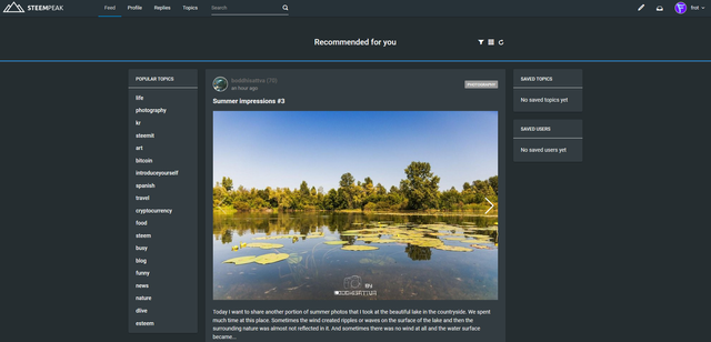
It still only has two interfaces which I find unusable - grid (wall of noise) or massive great pictures too big to scroll through.
All I want is Steemit list view in dark mode. Most of the other stuff I already had with more info on Firefox. And I want to see small size clean lists of my comments and replies - just like on Steemit.
When it gets a list view like Steemit, I'll switch over in the blink of an eye. But at this point it just doesn't work.

I hear you. And I understand this feature is coming... so keep watching.
Though personally I quite enjoy that wall of noise ;)
I'll try the wall of noise again - I can see the site is way more advanced, but the way the pictures rearrange themselves when I'm scrolling is a bit disorienting.
Have you tried using the formatting features?
IF YOU JUST CAN'T GET ENOUGH OF @SIFT666, I'VE RECENTLY SWITCHED MY MAIN ACCOUNT ACROSS FROM @SIFT666 TO @FROT SO FOLLOW ME THERE FOR A NEW WAVE OF STEEMING!
@frot
www.frot.co.nz
Thanks for the heads up ;)
Have followed you at your new address!