You are viewing a single comment's thread from:
RE: STEEM- Monetize your time with your words
i just made this ...a few minutes ago...tho am still compiling my entry for the contest
i just made this ...a few minutes ago...tho am still compiling my entry for the contest
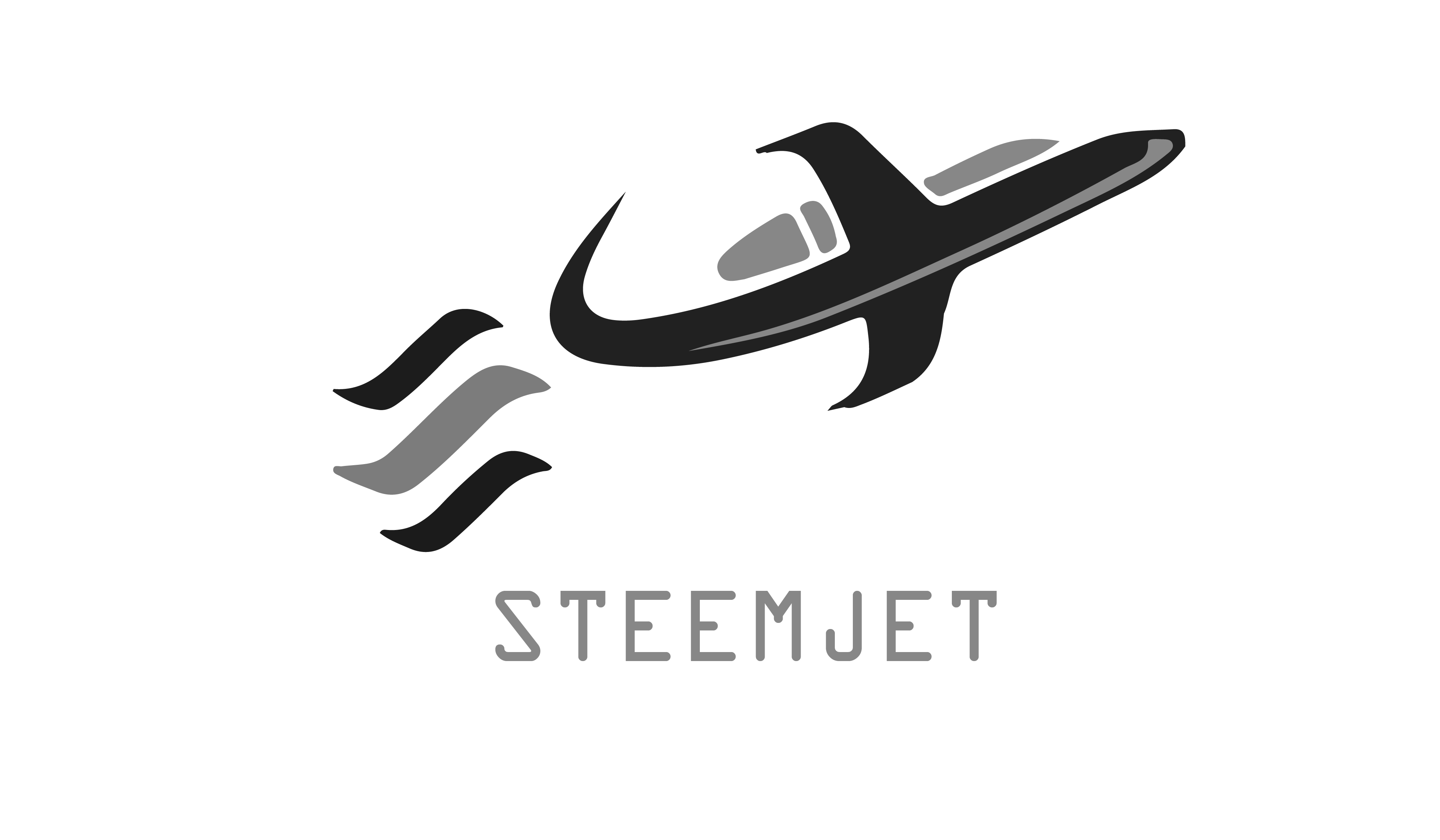
I love how the tail curves to meet the curved steem logo. Modify the font and you are really on to something. Seriously though. This is near perfection except for the lettering and the disconnected grey elements on top of the plane. I can't tell you how to make it better, but between the steem logo, and the black part of the plane with grey stripe down the underbelly, you have a near complete design and a prizeworthy contender. But I see your dilema, if you take away the grey elemets of the plane, then it looks like a bird (because you gave up the hard lines on the plane to merge it with the steem logo). This seems like an issue that if you could make the jet look more jetlike without those grey shapes above it, then, well, you get the picture. The grey plane stripe and the grey center steem line are subtle and extremely effective elements to this black and white image. Normally I don't like to mix grey, in the black and white image, but this grey is purposeful with style!
i ll make the necessary adjustment and post them in an articke after church
Beautiful work my friend
https://steemit.com/steemjet/@joshuaedoja/coming-late-my-steemjet-community-logo-proposal-c2111a72f2b66
the link above is a link to my proposed steemjet logo..am sorry for the delays i had so many assignment on to do and submit...that is why i had to quickly apply the necessary adjustment as you can see below
Perfection, you are a wizard! I paid you 9 and owe you 991 if you want to give us another image of your choice, or 491 otherwise.
thanks a lot @dimimp
glad you liked the new version of the fter the ammendments...i have some other logos in tge link i dropped..i dont know if any of them meet is okay byyou ...if NO i ll start working on another logo
16/1284
My thoughts exactly. I also had a problem with the font but talking about the grey element at the top, I think that gave it the jet like feel of the plane , removingbitnwould someworth make it look like an ordinary Bird. I wonder how else he would get to redesign it to make the logo contest worth but since he said he would cook up something after church then let's wait and see what he has to offer.
I love the shape of the jet
chuk, your 2 were 2 of my favorites. I would pay you $200 for a new design of anything you think would help us. I owe you about $295 already, but I'm good for it.
Your still compiling what??? This is just awesome. I thought everyone is entitled to just one entry.
STEEMJET will pay for effective marketing tools whenever anyone presents them.
Nice idea.... Let's keep up the creativity.
Time grinds on requiring continuous labor is the next competition theme in the style of shartzy in simplicity and the ability to use the image he most generously gave to the community out of the goodness of his heart.
I will give you $100 upvotes to give me anything that inspires you to help STEEMJET fly. I still owe you 290
Ok boss.. Would figure out something creative.. Thanks for the opportunity.
Paid 17 owe 583 or 283 depending on weather or not you choose to accept your next commission
Thanks boss. I accept the next commission
22/878
Thanks boss
This is quite different from everywhere I've seen here. Great job.
Paid 9 owe 591 or 291 depending on weather or not you accept your next commission.
Yes its nice...very nice
Paid 4 owe 96 or 46 depending on if you accept your next commission
I accept it @dimimp....thank you very much
So cool. I think this gonna boost my urge for designing
Good one....I like the concept.