Readme App - Minimalist Twitter Interface
Readme App
Minimalist Twitter Interface
Screenshots

 View Image |  View Image |
|---|---|
Hunter's comment
Readme App is a minimalist interface to the Twitter.
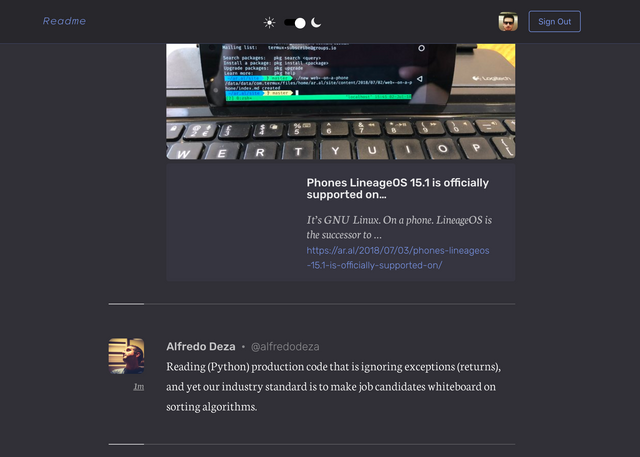
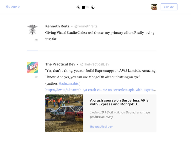
Twitter, normally shows ads, moments, trends, interactions, looong tweet threads in the timeline and as a result, it becomes a mess after you follow a good amount of people. This app removes all the noise and focuses on readability and the content you actually follow.
I am more a reader and don't tweet much. However, I check my timeline everyday to see the tweets and this app is a gem if you use Twitter in a read-only manner like me.
It works on web and mobile (iOS). The web interface is also open-source and actively developed by the maintainer.
Link
Contributors
Hunter: @emrebeyler

This is posted on Steemhunt - A place where you can dig products and earn STEEM.
View on Steemhunt.com
I can see you found yourself as a good hunter.
haha, thanks man. I have a little advantage as a hunter at Steemhunt since I follow ProductHunt since the beginning.
I am familiar with the concept.
I agree, beside that he is a really good python Dev.
thanks!
Pros :
Cons :
Interesting App, I bet it becomes very popular.
MANIAC HUNT @emrebeyler
This is my opinion about your hunt
Pros:
Cons:
Lastly
This is the value I give to your product
Pros:
Cons:
My Opinion:
Thanks for the hunt!
Here's my take on this application:
Pros:
I do like the way it is just simple and you will not be running to ads anymore by using this app ( may it be a desktop or mobile) ads take some of the data and slows down the twitter experience.
It has a night mode! The white background is too much for me it is too bright.
User-interface wise this is good especially if you are just reading some tweets from the folks that you are following.
Cons:
The design is pretty simple, I can say that it is a cons though but it doesn't show the number of retweets and like on a certain post. I think it is okay but sometimes I think it is better to know if their post is trending or not ( for stalking concerns hahaha)
An app for android users! They need that if they will be using it.
Congratulation! Your hunt was ranked in 4th place on 4 Jul 2018 on Steemhunt.
We have upvoted your post for your contribution within our community.
Thanks again and look forward to seeing your next hunt!
Want to chat? Join us on: