RE: Steemit.com - Coding In The Community
My dev / team and I have been thinking about this for a while as making something similar to SteemPeak as an alternative front
We want a better interface and that local communities have a freer place of their own to set up, for example, advertising, competition, so that the training pages are not dominated by competition in local communities
I have previously also mentioned this when there was a competition 10 months ago
"What can be done to improve this platform in Steem Bolckchain"
Our own local community page needs to be upgraded and should be more like a separate website with more features for us moderators
I show some suggestions in the form of the picture below here
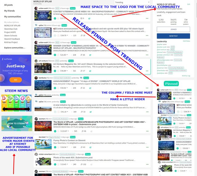
The entire post can be read here https://steemit.com/hive-139293/@xpilar/what-can-be-done-to-improve-this-platform-in-steem-bolckchain
we can have a chat with my dev in with @ the-gorilla
we have some plans that we can air with you
I like your graphics.
A wish, which I have already mentioned to the Steemit Dev Team (was noticed, but nothing happened): In a prominent place must also be seen in EVERY browser description and rules of the community (which is for me in the top right much more important than a logo). No, on mobile they are not displayed at all. On PC Google Chrome shows them, Brave and Safari don't (and I don't have more comparisons).
So if you are tinkering with the site with your developers, I would be very happy if you think of this request.... :-))
Within the code, there are rules which say some functionality does not get displayed on mobile devices or devices below a certain resolution. For example, everything which appears on the left hand side of xpilar's screenshot is removed.
It's not just mobile devices. Even on my coding monitor which I set in portrait mode, the items on the side don't show up.
That's right.
< start geek >
It's done through media queries within the CSS. By default, some components are set as "display: none" and then once a minimum width is reached, it becomes visible (via "display: block" I think) but I've deleted the code now so I'm not sure). You'll see the "snapping" point by messing about with the width of your browser to know what this minimum width is.
</ end geek >
Yes, I know that the borders are missing in the mobile browser. But also in some desktop browsers.
You could also add a "Description/Rules" button. ABOVE the "Post" button.... ;-)
We look forward to following and supporting this development.
These ideas should be straightforward in the existing codebase but unfortunately I don't think they are (I won't go into the details). Similar to you, I've thought about writing a new front-end which would be using steemchiller's APIs (as opposed to Steemit's) and freeing myself from the existing interface and layout entirely (i.e. not moving bits around in the existing interface but a totally new one). It's a mammoth undertaking although there are plenty of existing HTML / CSS templates which are responsive (i.e. adapt to desktop, tablet and mobie resolutions) which would simplify the design element (and make me redundant from this process).
I look forward to hearing more 🙂
Good to hear you have some development ideas in the pipeline.
Hopefully a team can come together to work on a 'SteemPeak 2' idea.