"SEC20/WK6: Graphic Design Hands - On practical 3"
I'm thrilled as I know that this week is the last week of graphics design training. I have learnt a lot for the past 5 weeks and I will say I have the motivation to design any flyers of my choice even though I am not a pro but I have the basic knowledge of graphics design.
Thank you teacher @lhorgic for your thorough training and the skills you have impacted in us. Thank you steemit team for this great privilege you have given users to learn some skills.
Since I'm still learning there is tendency to make mistakes but with subsequent practise and higher training I believe I'll be perfect. With this regards, I appreciate all corrections and suggestions.
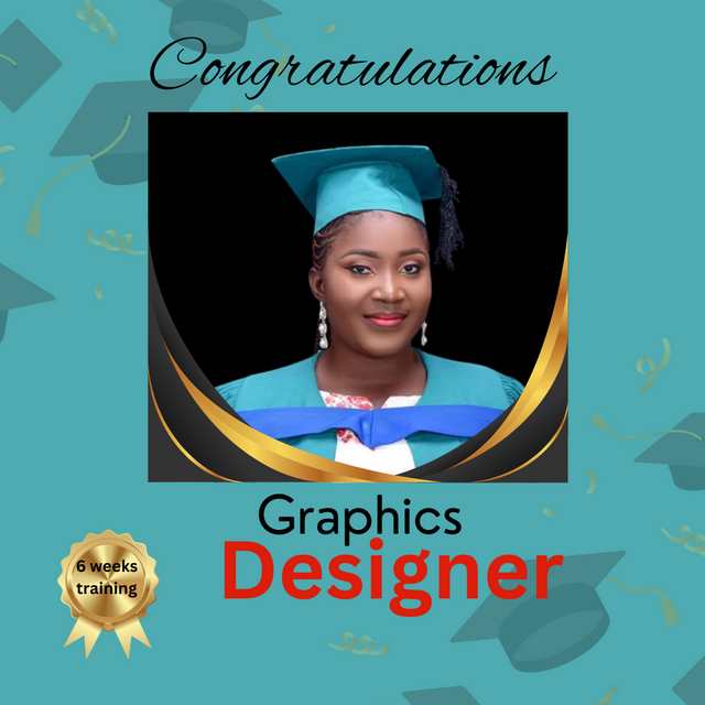
So I created a design with my graduation picture, signifying my success in this graphic design training. To complete the homework task I would like to show you how I create this beautiful design.
Things I considered before starting the design
- Colours
- Design
- Text to use
- Images used
I downloaded some free images and removed background using remove.bg I also used the same site to remove the background of my photo.
Then I opened my canva app and begin the creation.
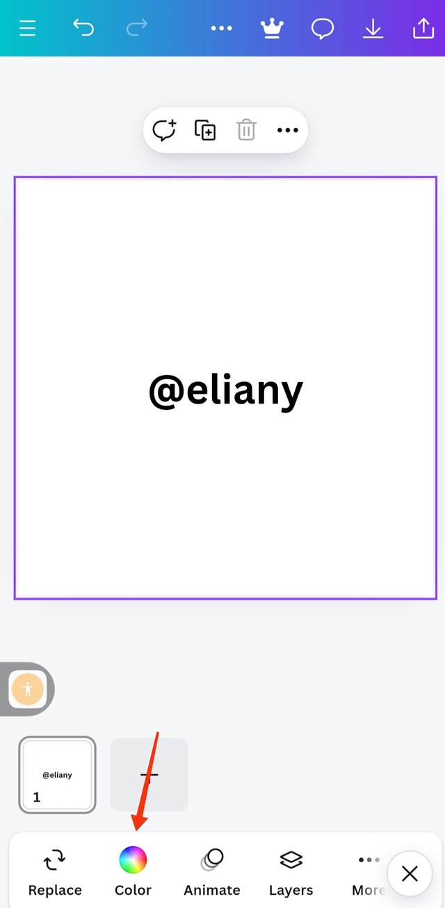
Step 1; Creating my work space and background colour
 1 1 | 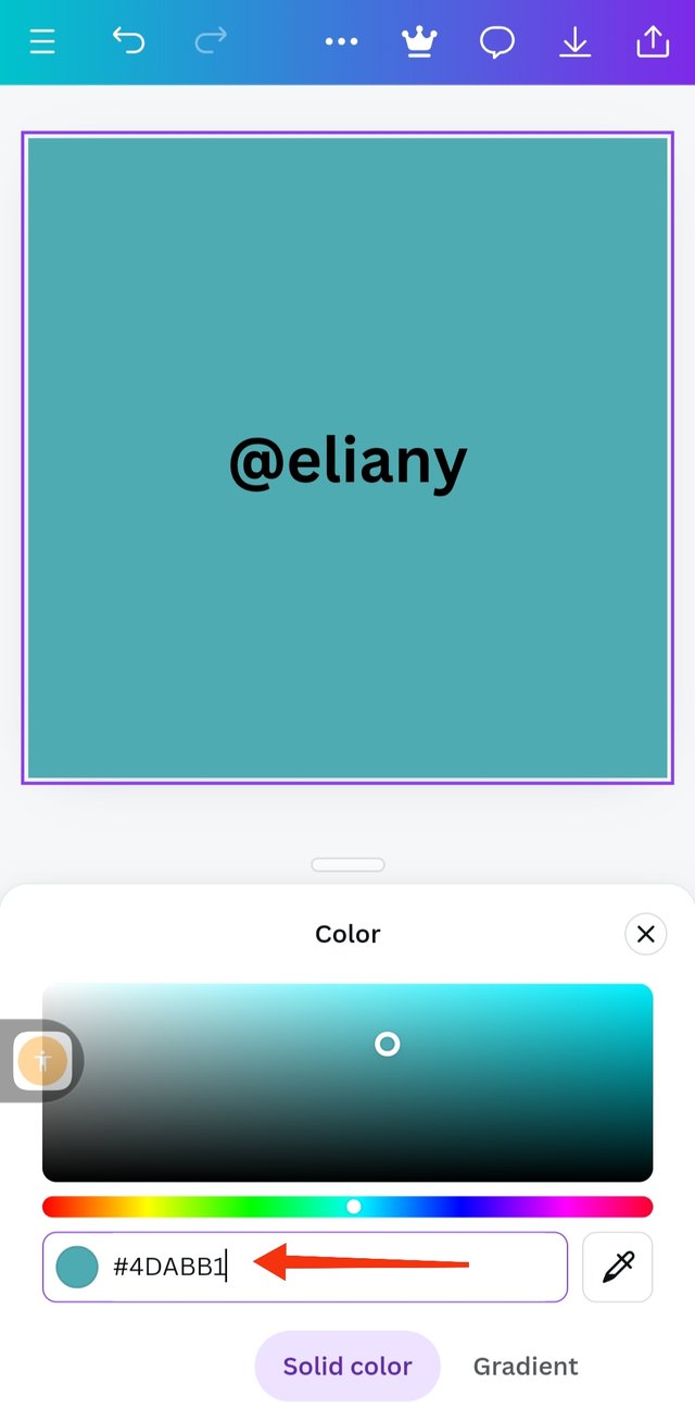 2 2 | 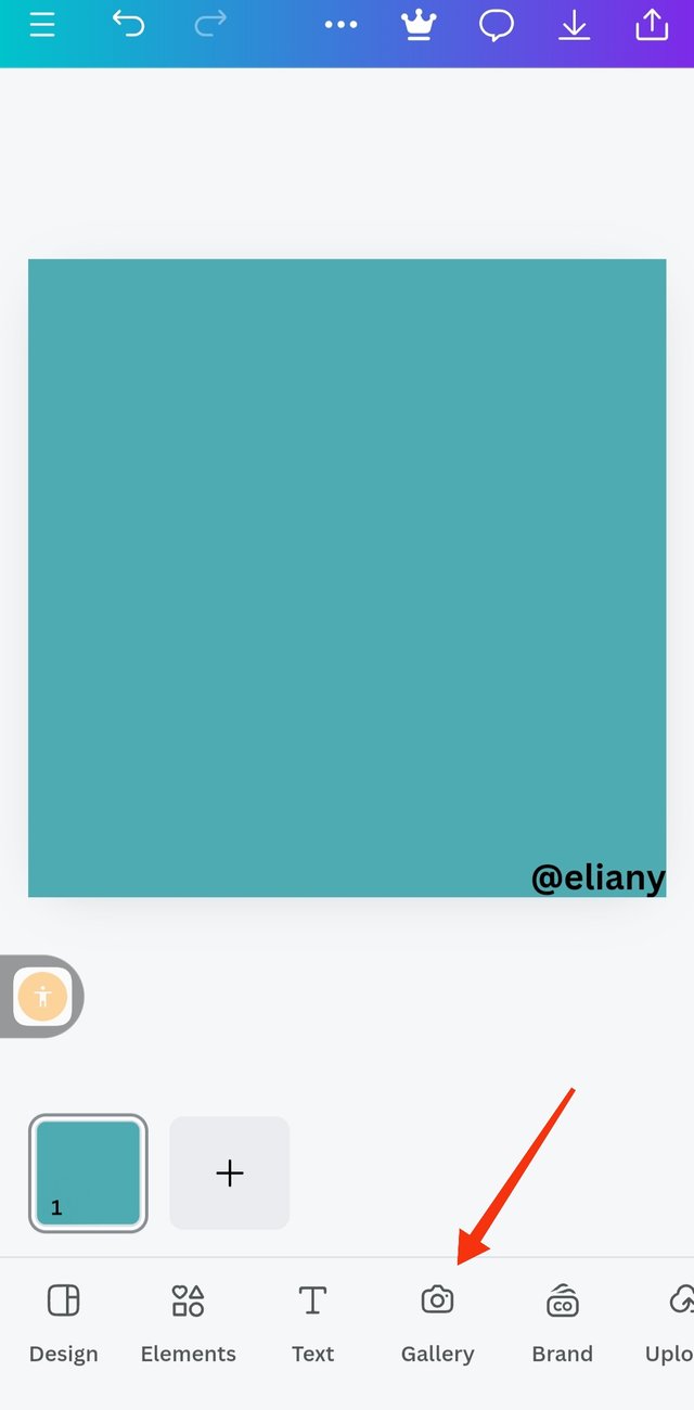 3 3 |
|---|
I created work space for this design using 1080 by 1080
I clicked on the colour icon and using the colour wheel I choose the exact colour of the image I will be using. Colour hex is #4dabb1
The background colour is set therefore, I proceeded to add the background image. So since it is actually a design that depicts success in learning, I choose to use a graduation cap as my background. Let's go to gallery
Step2; inserting background image
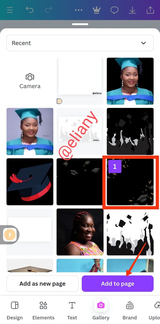 1 1 | 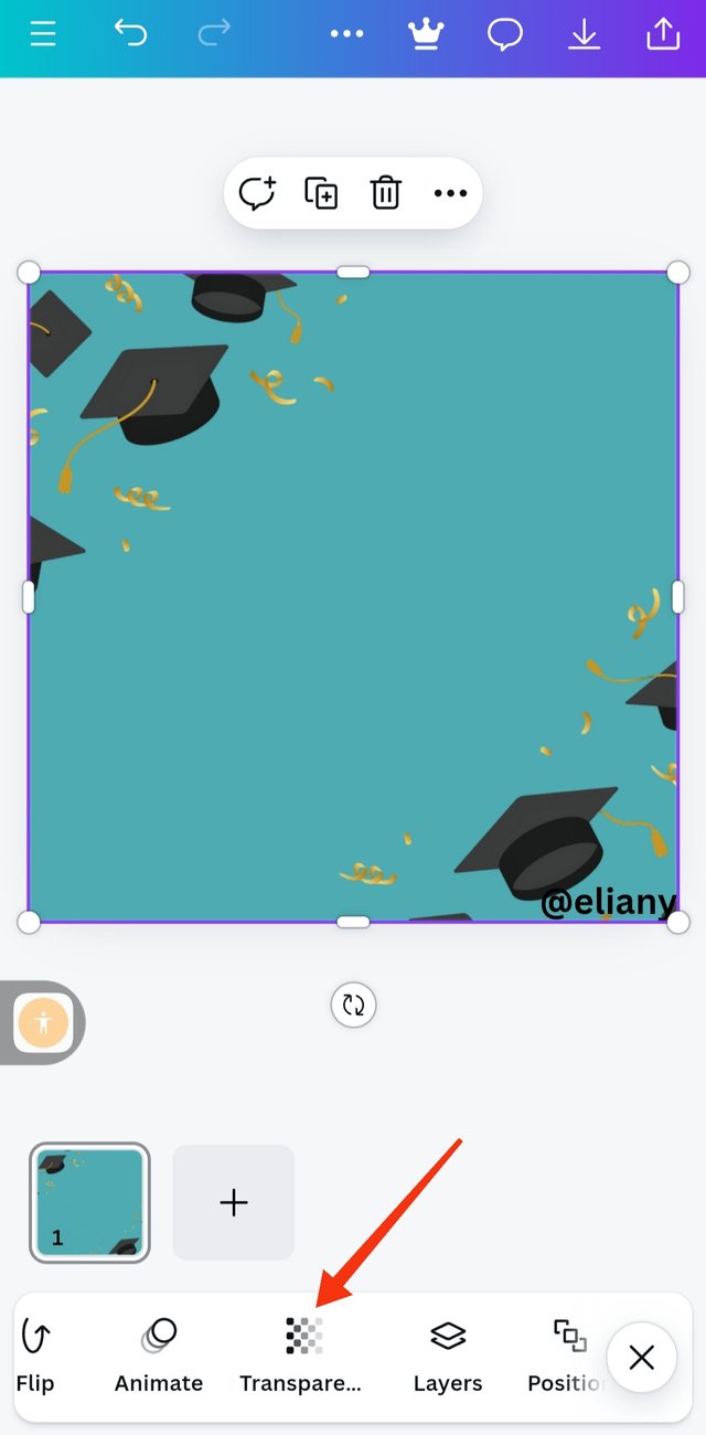 2 2 | 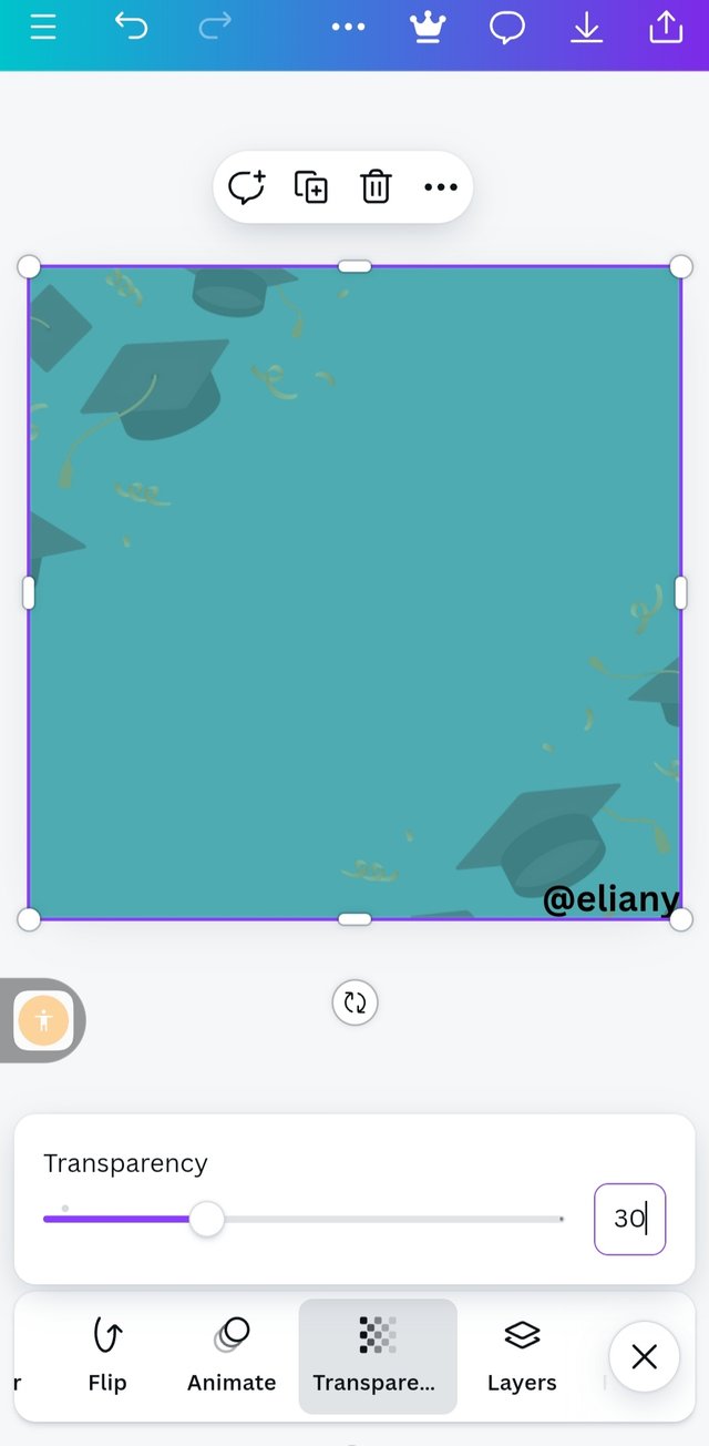 3 3 |
|---|
I already downloaded the image so I choose this image that is marked on this photo and I clicked on Add to page.
So this is actually the image on the background I expanded it to cover all the backgrounds then I went ahead to transparent it.
I click on transparency as seen in the image then I manually type in 30% because I didn't really want the image to go off.
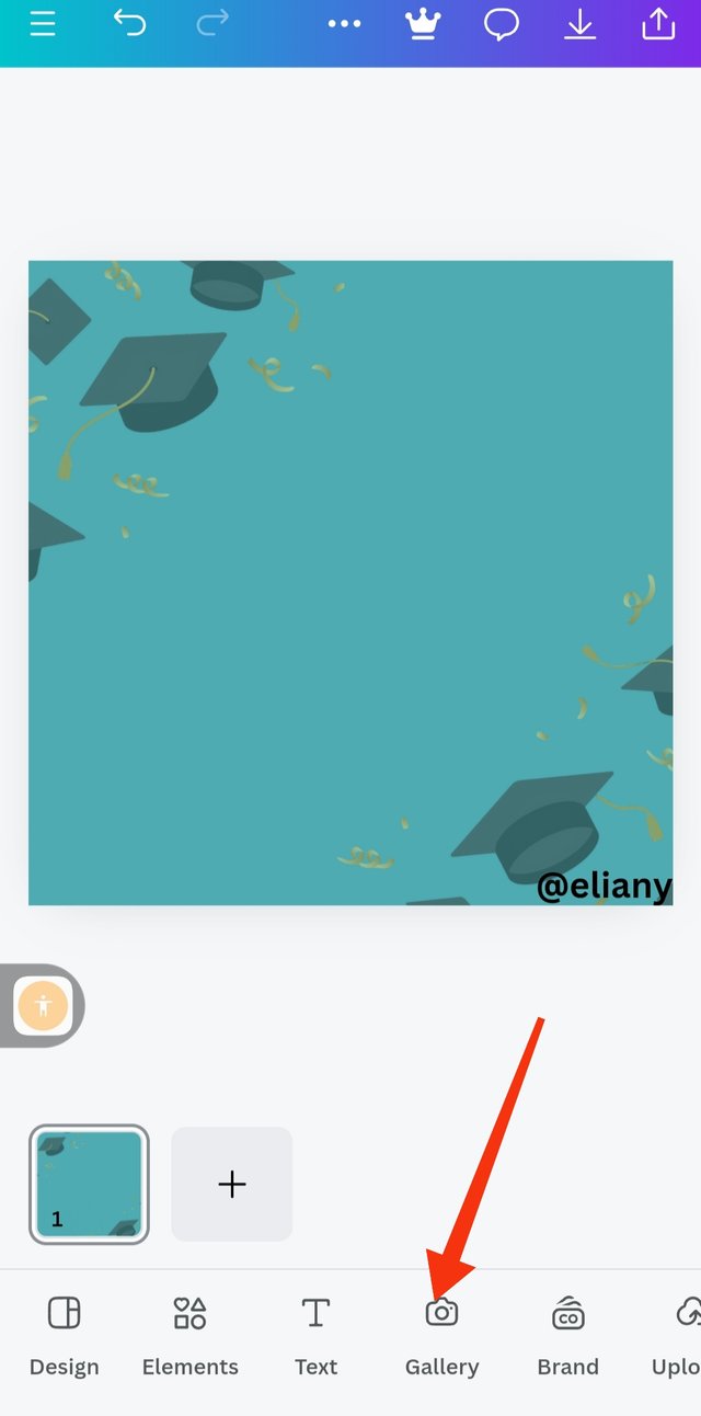
Step 3; Inserting main image
 1 1 | 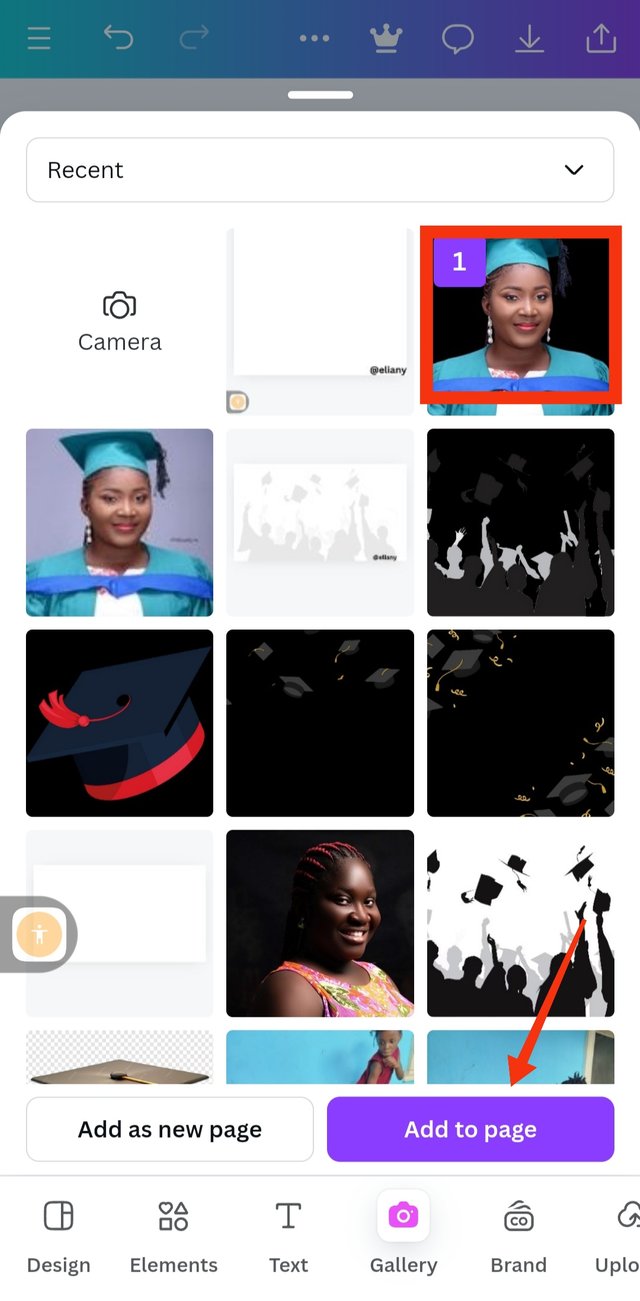 2 2 | 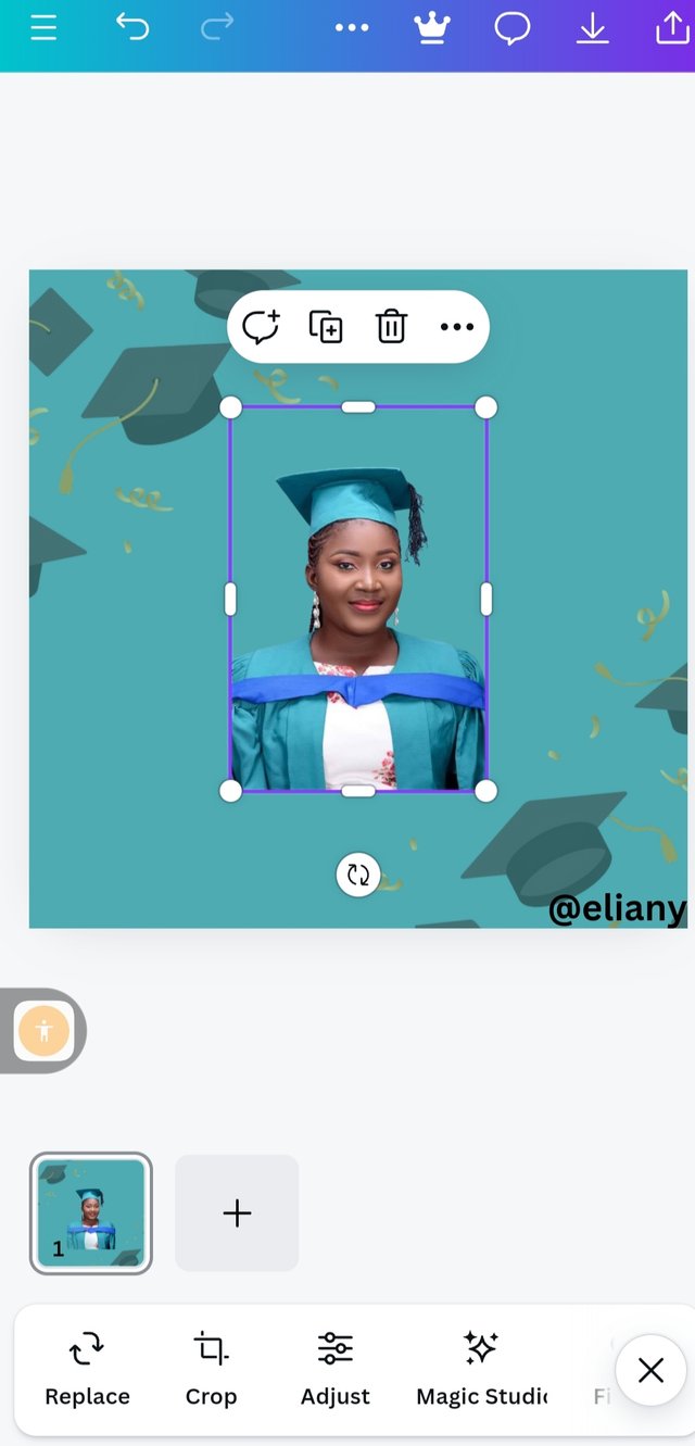 3 3 |
|---|
Next thing I did is addition of the main image, which is also a photo of me during my graduation. I choosed this image to depict my success in this graphic design training. So I click on gallery to select image.
I already edited this photo using the website that was introduced some weeks ago in this graphics design class, I click on the photo and then click on add to page.
That is the image as you can see the colour of my graduation down matches with my background colour.
Step4; adding background to the image
 1 1 | 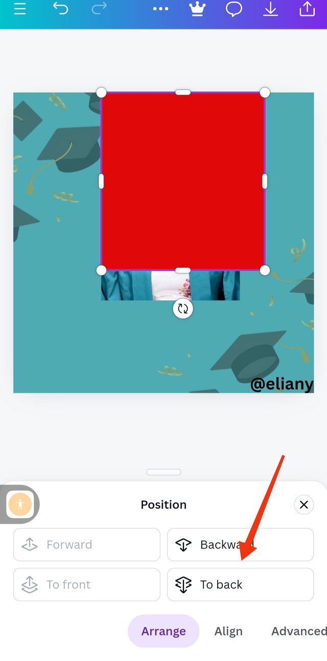 2 2 | 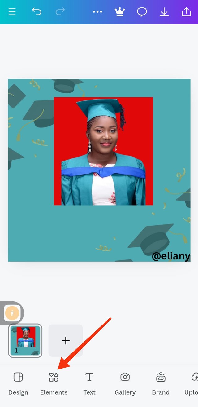 3 3 |
|---|
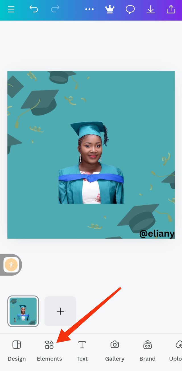
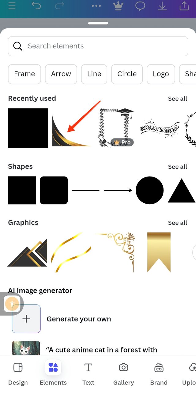
So because the image and the background has the same colour I decided to demarcate them so I introduced an element, I clicked on elements and choosed square.
The element is here but then it covers my image so I need to position it well by clicking on position and I choose backward to take the image backward.
Here the image looks so rough at the edges so I decided to add a border to cover the edges so I click on element to choose border.
Step 5; Adding of border
 1 1 | 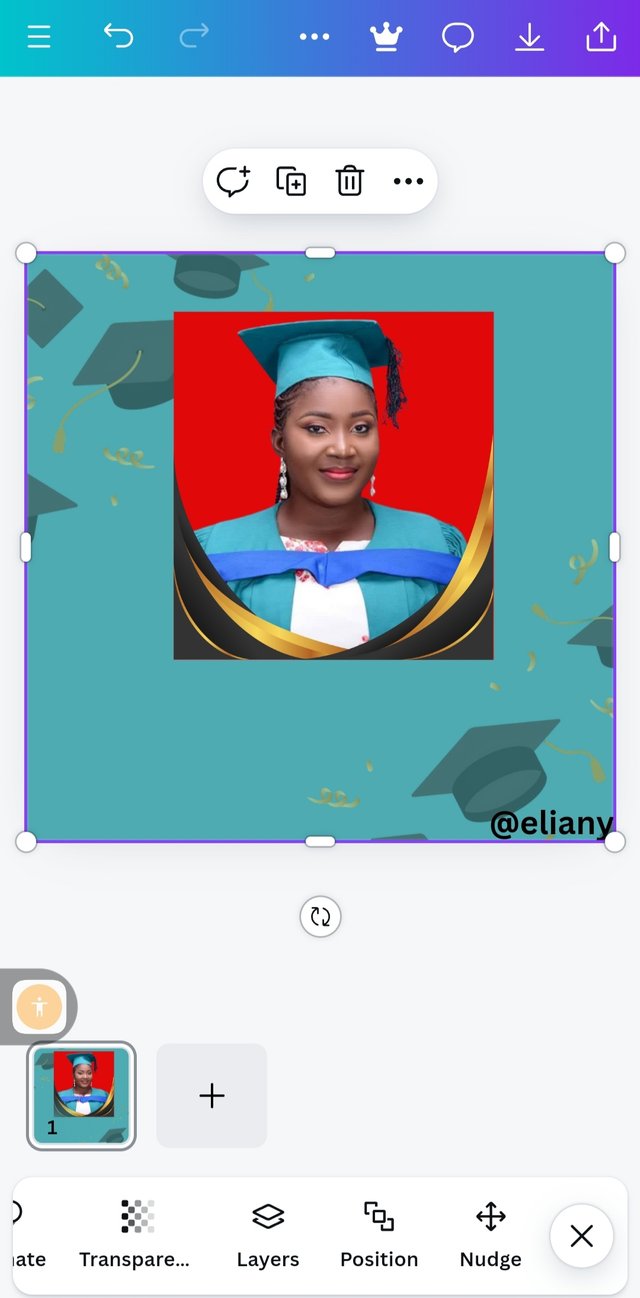 2 2 | 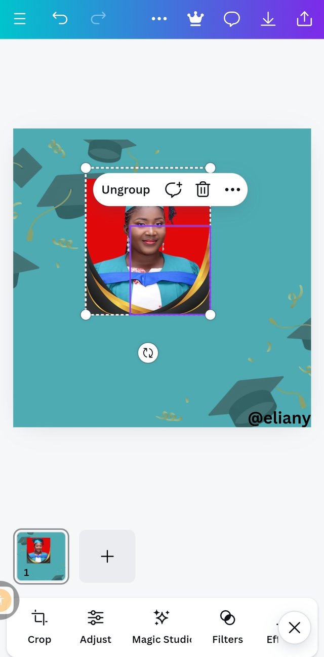 3 3 |
|---|
I clicked on elements it took me to were I can choose any border of my choice, so I use the search option to search for border and I selected this one.
I applied it on the image it took a little time here as I also flip over the same border and use it at the other end of my image to cover the down part of the image entirely.
To avoid scattering my work during editing I grouped the image, the border and the background together as seen in this picture. I also discovered that the red background on the image was too shouty so I changed the colour to black background.
Step 6; Addition and positioning of text, typeface and font
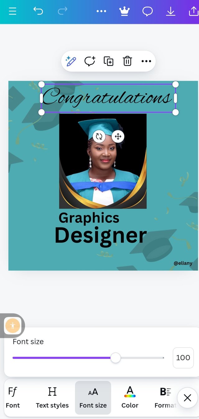 1 1 | 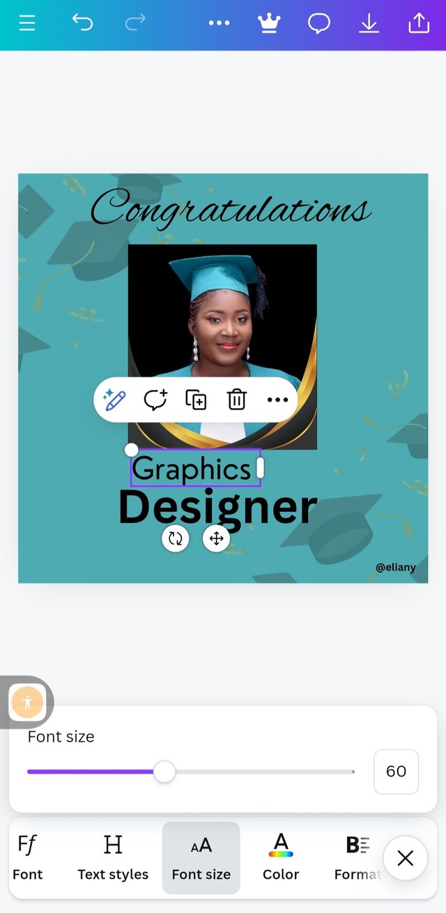 2 2 | 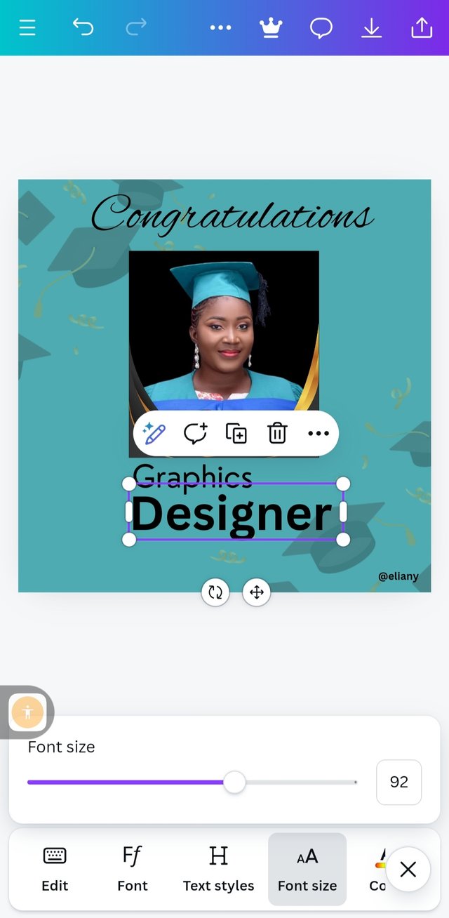 3 3 |
|---|
I typed the text I used "congratulations" "graphics" "designer" For the "congratulations", I used calligraphy and Alex bush as font then font size of 100%
"Graphics" font size 60, typeface ; Sans Serif, font; Nourd
"Designer " Sans Serif as typeface, canva sans as font and font size 92.
Step 7; final editing
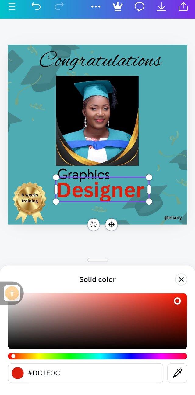 1 1 | 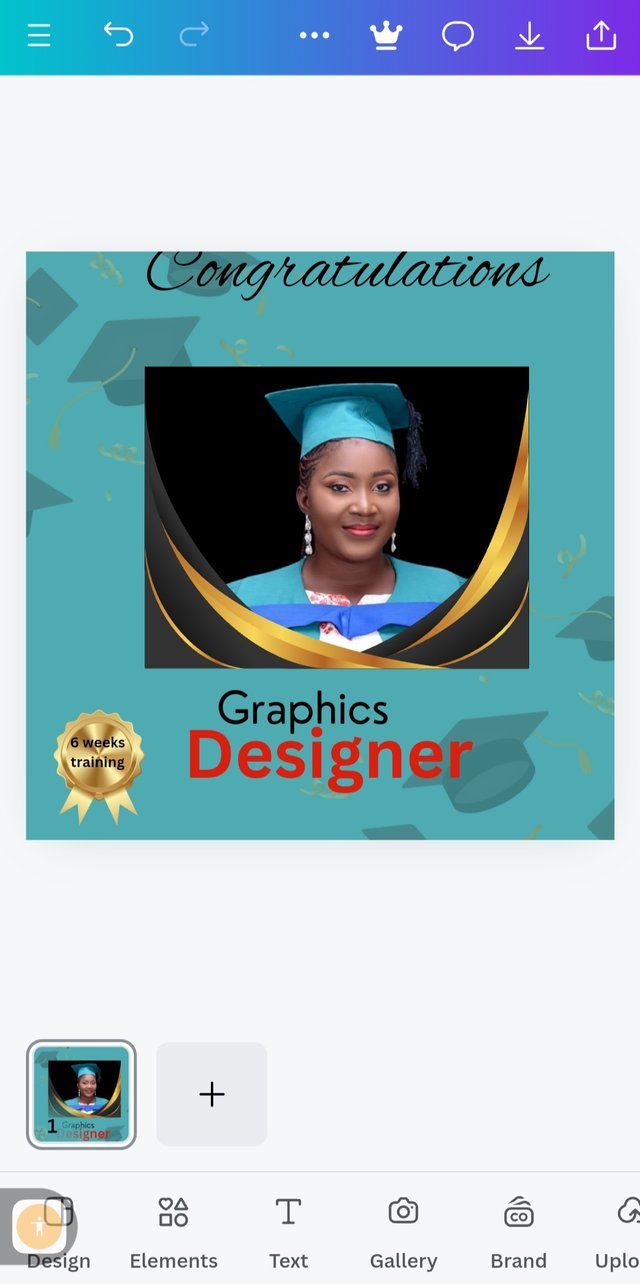 2 2 |  3 3 |
|---|
So I decided to add a gold medal for myself, it is not easy. Graphic designs need creativity so unleashing this creativity in me, I deserve a gold medal. On the gold medal I write the duration of my training that is 6 weeks training. I inserted this gold medal by using element icon then I use the search option to search for this element. I also change the text "designer" to red colour hex code of #DC1EOC
So I discovered that my "congratulations" is longer than my image so I adjusted and aligned them together.
Adjusted the text and the border and everything was okay before I downloaded it.
Final design
Principles used
White space; The space in between my texts and word are not to open neither there are two closed they are just normal they spacing is very okay.
Alignment; I maintain centre position all through and you can see that both my text and my elements are aligned. They are all centralised so I maintained that centre position which help my work to be aligned perfectly.
Emphasis; I used this principle when I made the text "designer" to stand out by using a bold font and a red colour on it. This is because the area of my success is designing so I really put emphasis on that word. I also used a border elements to make my image stand out because it has to do with success.
And lastly, since it has to do with success I use the word "congratulations" with a different font and typeface and that is the first thing on my design so it captures my viewer interests once they see "congratulations" they will be eager to stop by to know the reason why I am being congratulated. On this note, I applied this principle.
Unity; all elements used are in unison, they are in unity. They all are placed in order to achieve a better design to avoid distortion.
Balancing; All my work is balance, I applied this principle when I added border to be sure that they align and balance well.
I wish this class will continue I really want to learn more skills in graphics design. Thank you so much.
I like to invite @goodybest @max-pro and @casv to take part in this contest.

Hello @eliany thank you for participating in this week's lesson. We have assessed your entry and we present the result of our assessment below.
Feedback:
Let me start by apologizing for the late review, we had a little power outage here yesterday. I also want to appreciate you for coming this far with me on this six weeks course and also commending you for the effort put into this practical, I love the outcome of your step, your design looks cool.
You've got a beautiful design, the only issue is that you didn't give us the details of what you're celebrating via your design. You know graphic design is a visual communication. We really can't tell where you studied, what tool you used for your study, the organizers and some minor details...all these were not captured, a symbol is enough to show some of these things, it would have really complemented this awesome design.
In all, you did beautifully well and I must commend you for a job weldone, thanks for appreciation message, I wish I could do more in this limited period of 6 weeks, but then am glad I could still dish out value. Thanks for staying through the whole process.
Regards
@lhorgic❤️
0.00 SBD,
0.16 STEEM,
0.16 SP
Oh sorry about your outage I'm grateful you have been able to power your device.
I've taken note of it, I will apply it. You know I'm still learning, I appreciate your efforts so much and I really want this graphic to continue ooo this is the kind of skills we need here in steemit.
Thank you for your efforts too.
Thank you so much for this beautiful words, I really appreciate it. I have also decided to continue the lesson having gotten so many feedback from my students to do so. Here is my application.
https://steemit.com/teachingteam/@lhorgic/application-for-sec-s21-teaching-team-graphic-design-reloaded-teachingteam
This post has been upvoted/supported by Team 5 via @httr4life. Our team supports content that adds to the community.
This is so beautiful. You will be able to make use of pixellab quite well I believe