"SEC20/WK6: Graphic Design Hands - On Practical 3"
The 6th week of graphic design class is here and I am to show the practical aspect of the knowledge acquired in season 20 by creating a design made in celebration of successful completion of the six weeks course.
 Designed with Canva
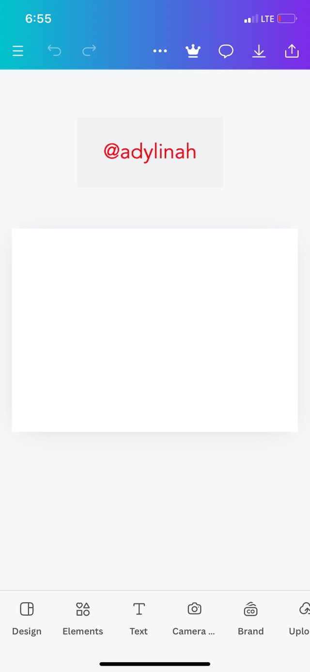
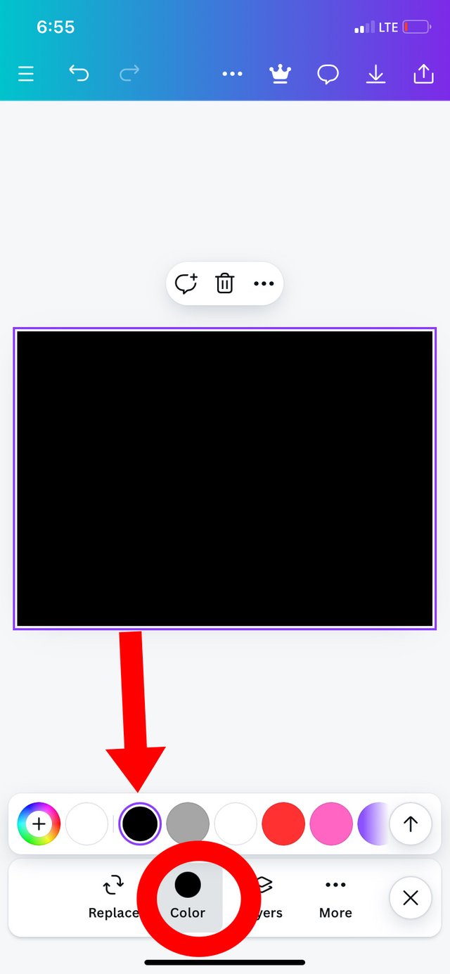
Step 1: I set up my workplace and changed the color from white to black
 |  |
|---|
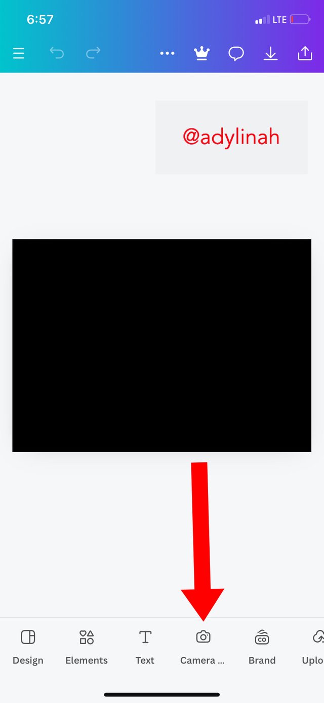
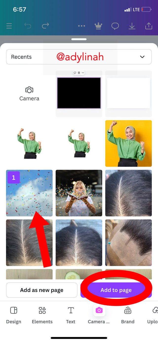
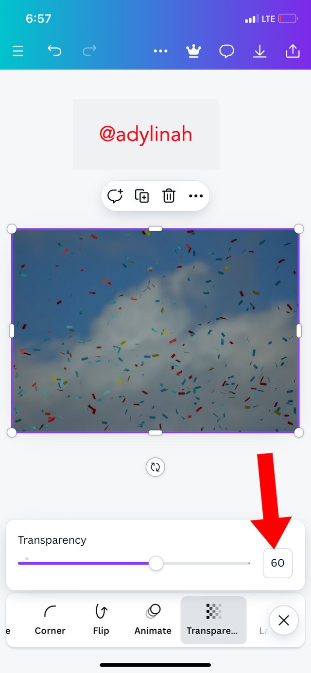
Step 2: I added my background image by simply clicking on camera icon, selected my preferred image and clicked on "add to page". I enlarged the image and reduced its transparency to 60.
 |  |  |
|---|
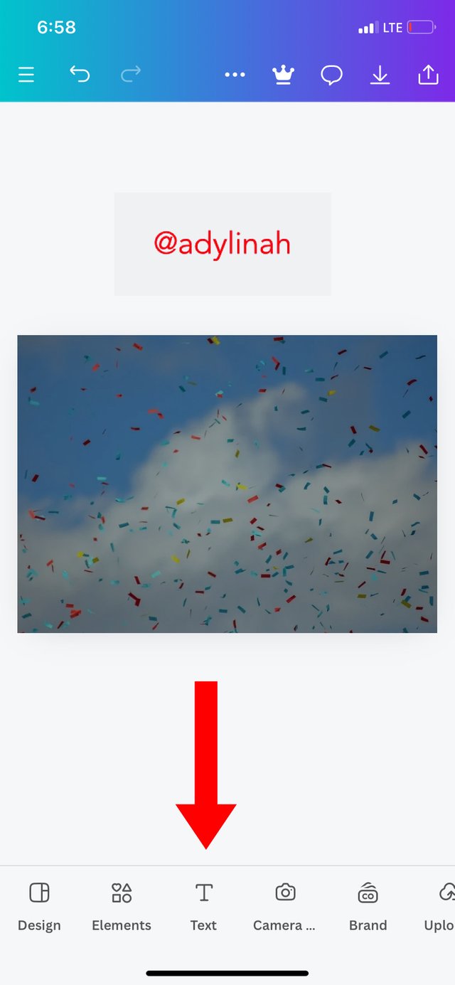
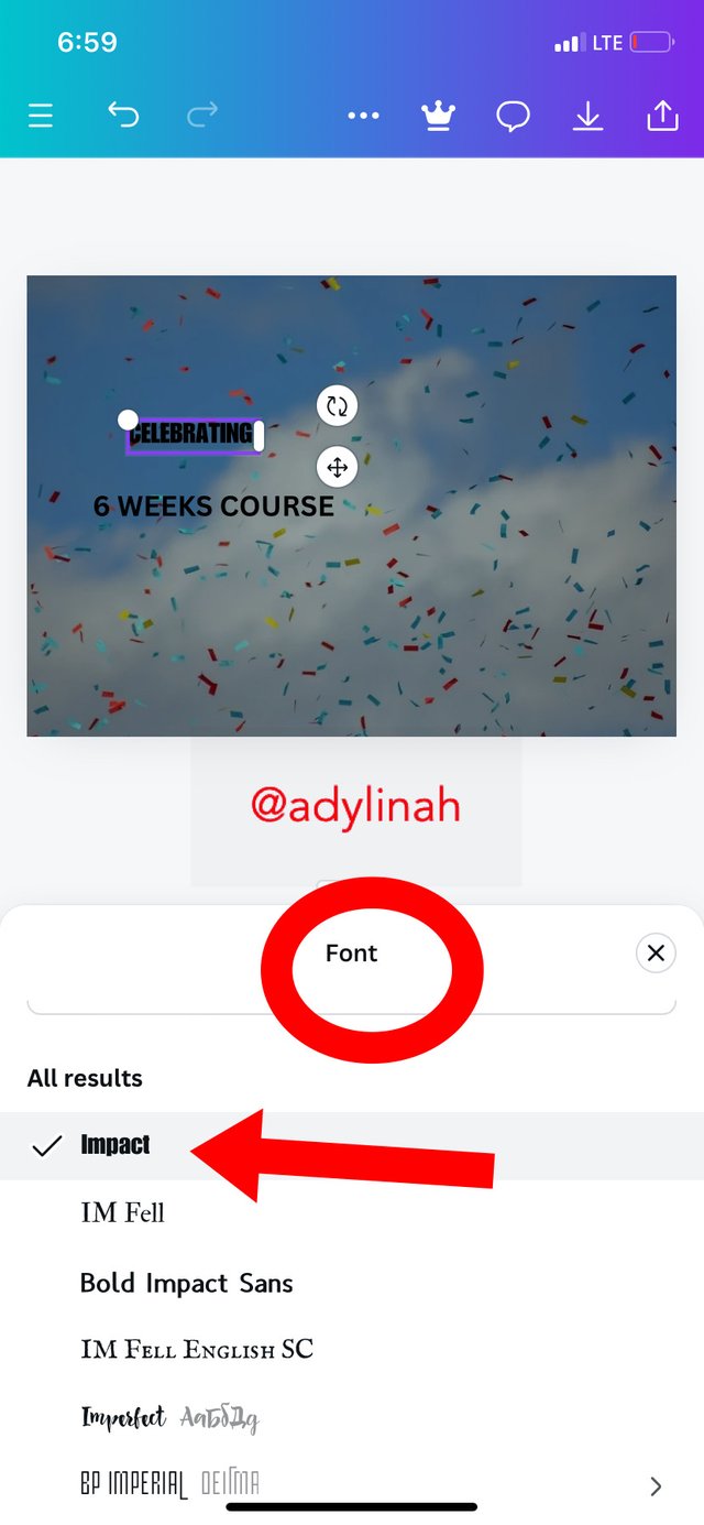
Step 3: I went to text icon, I typed "CELEBRATING", "6 WEEKS COURSE", then used impact as my font style.
 |  |
|---|
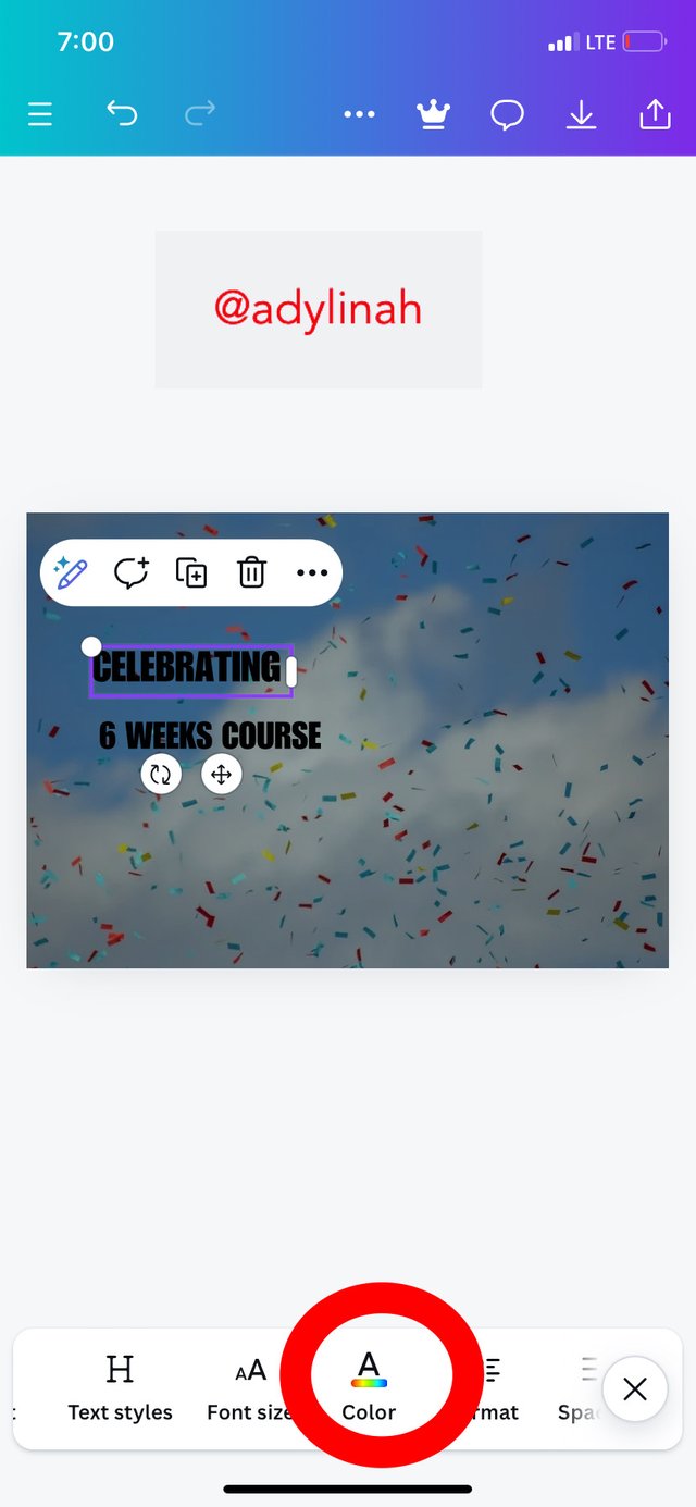
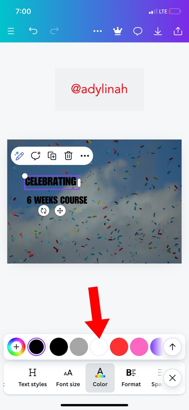
I also changed the text color to WHITE by clicking on color icon and select white.
 |  |
|---|
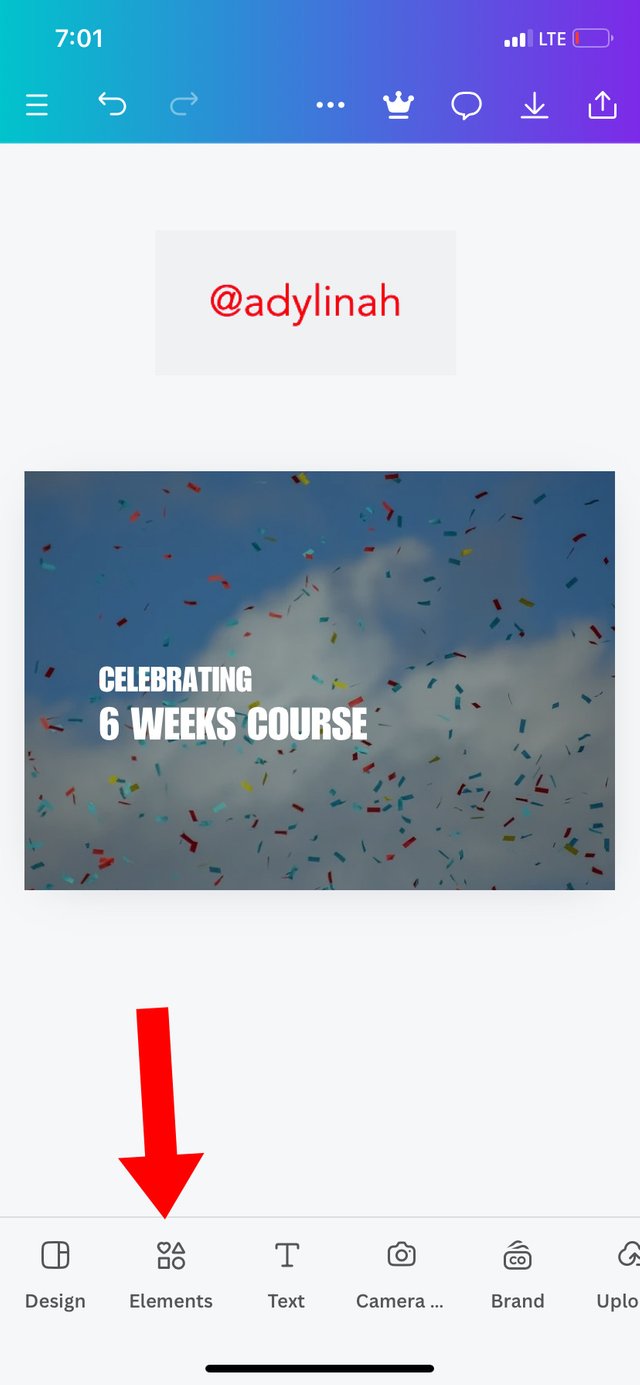
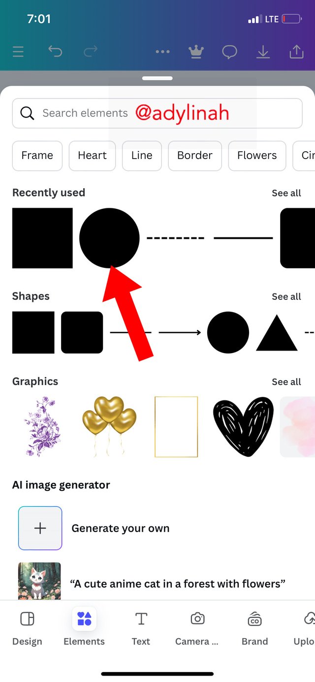
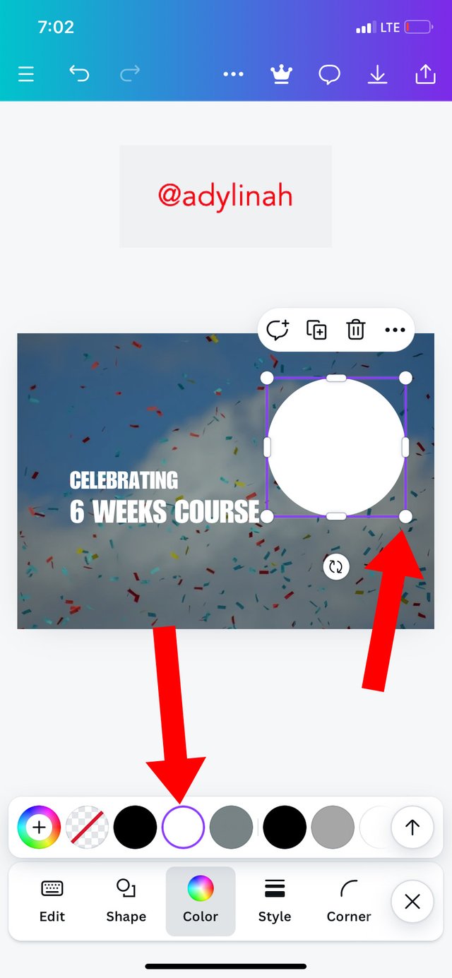
Step 4: I clicked on elements, selected circle shape, used a WHITE color on the shape and then enlarged it to my preferred size.
 |  |  |
|---|
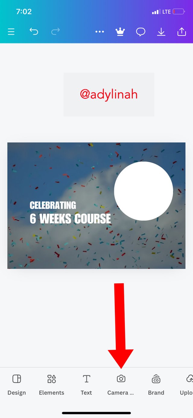
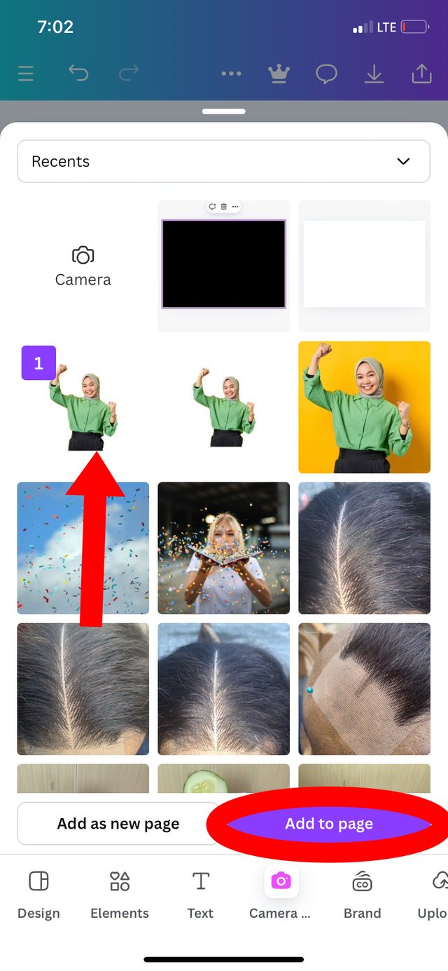
Step 5: I went back to my gallery by clicking on camera icon, selected an image which shows a sign of celebration and then clicked on add to page.
 |  |
|---|
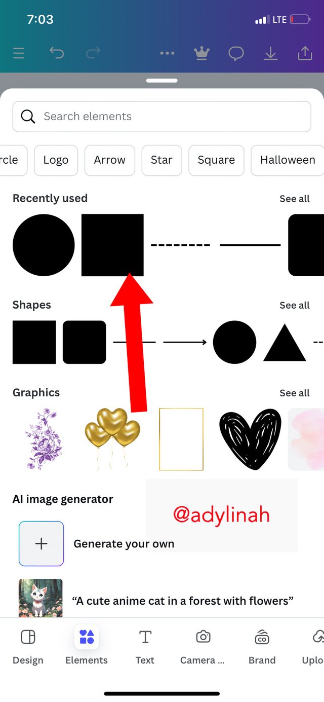
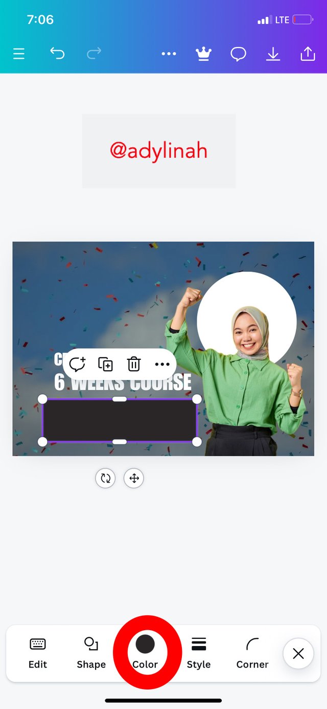
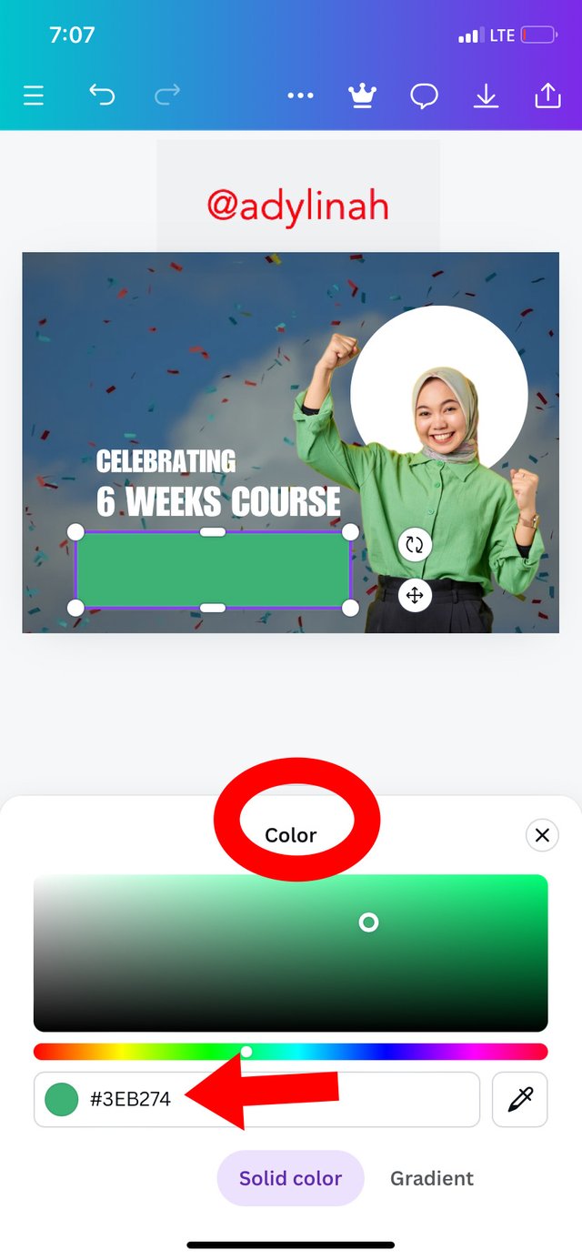
Step 6: I went to elements icon again, selected square shape, clicked on color and selected GREEN ( #3EB274 hex code).
 |  |  |
|---|
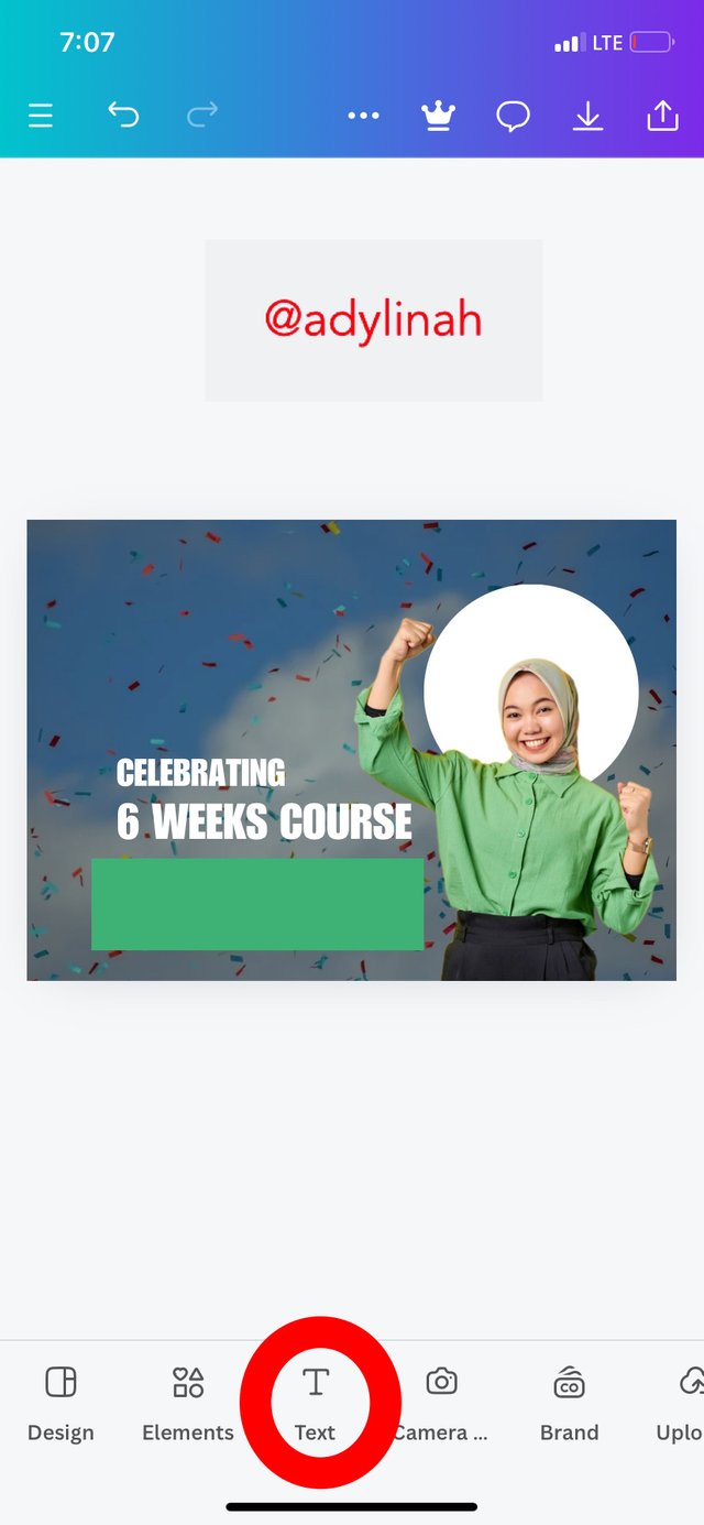
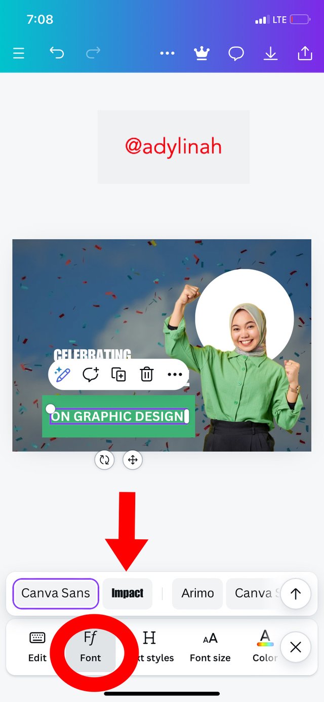
I also typed in text on the square shape ( "ON GRAPHIC DESIGN", used impact font and changed the color to BLACK.
 |  |
|---|
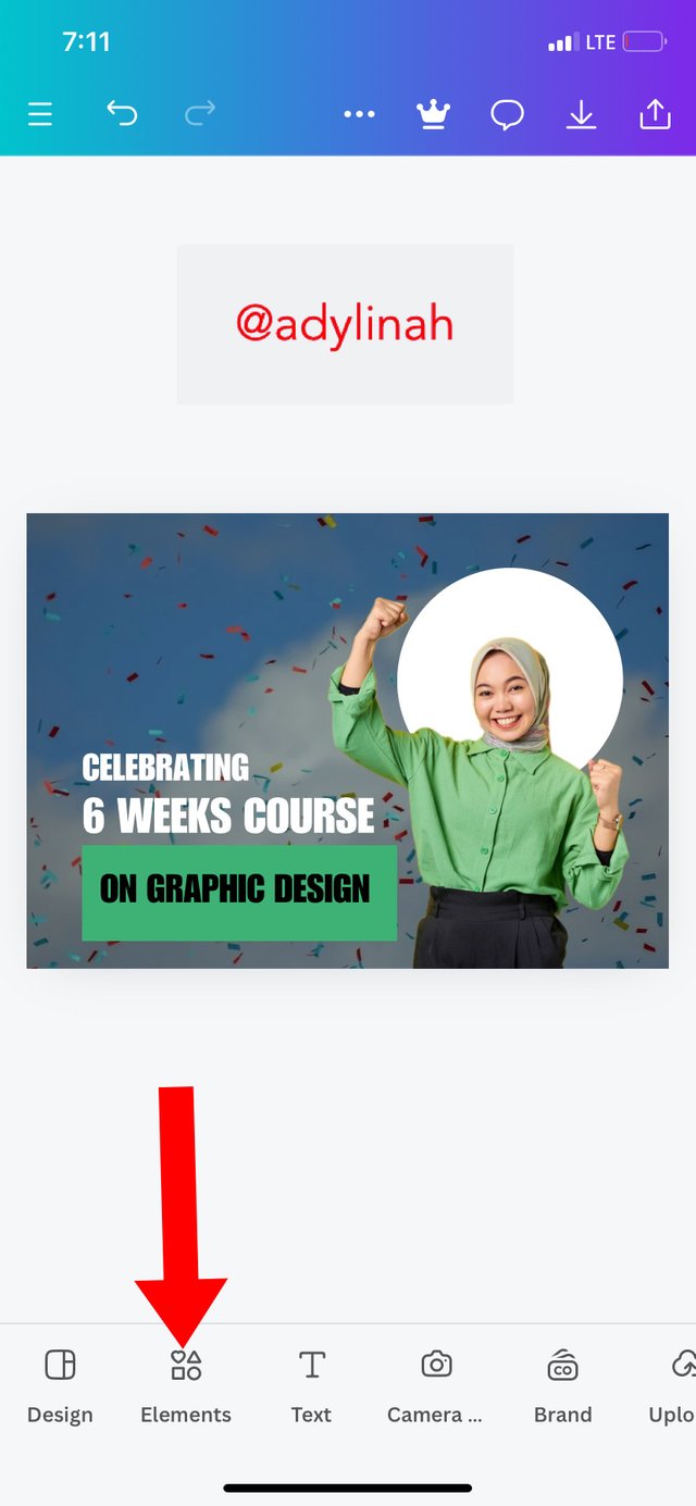
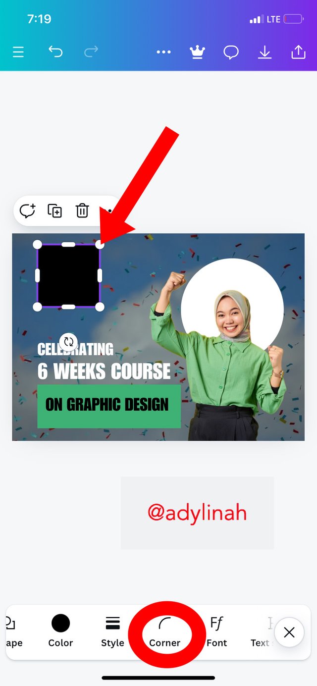
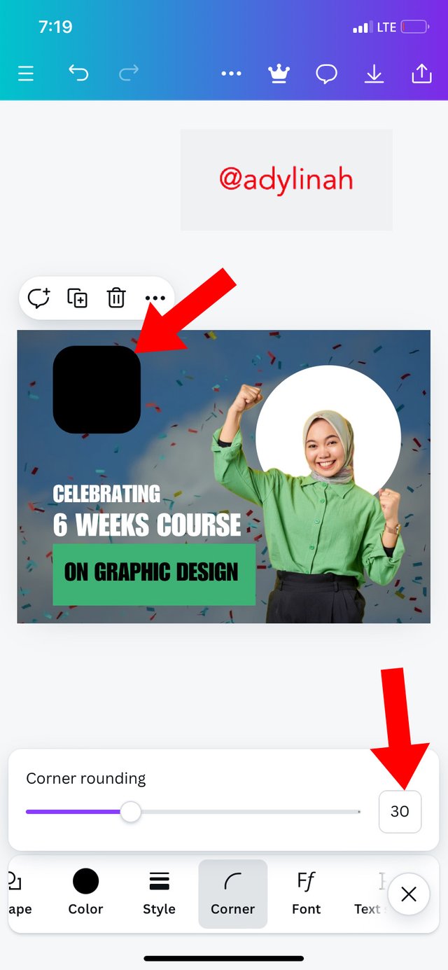
Step 7: I proceeded to adding another shape by selecting square again, adjusted it, clicked on corner icon, reduced the corner rounding to give me a beautiful shape.
 |  |  |
|---|
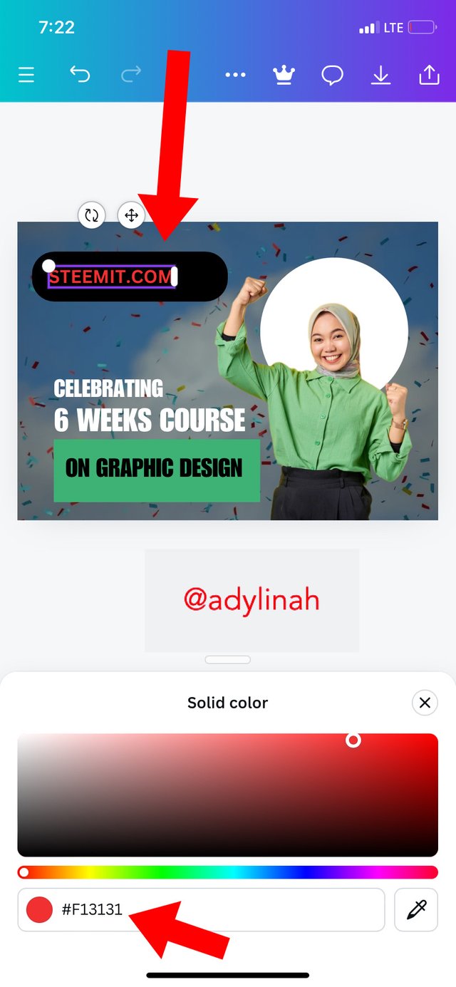
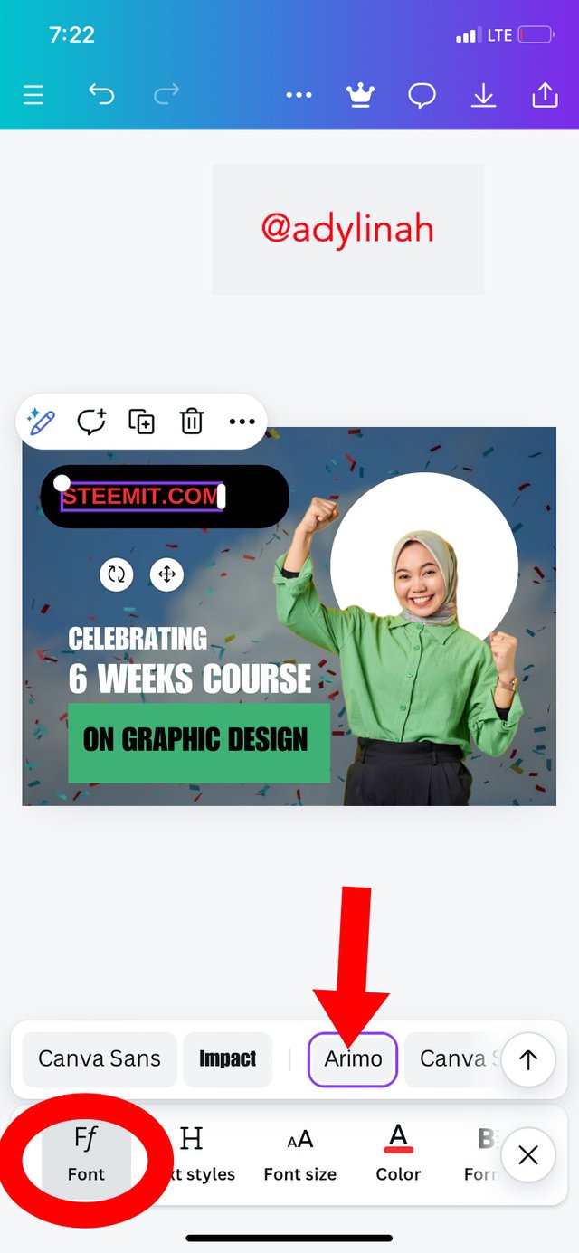
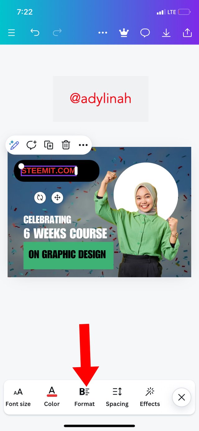
Step 8: I typed in a text ( STEEMIT.COM), used Arimo font and a red color of #F13131 hex code.
 |  |
|---|
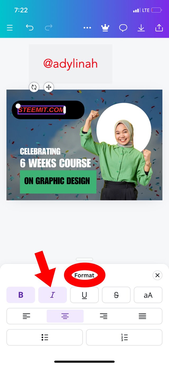
I went to format and clicked on italic to italicize my write up. Lastly, I added Canva logo to the design.
 |  |
|---|
Please refer to the first image above for the final result of my celebration design, you can see that it’s screaming YES, I MADE IT!
| The Principles Used |
|---|
| Principle | Description |
|---|---|
| Hierarchy | I applied the principle of hierarchy in my write up; "CELEBRATING, 6 WEEKS COURSE, ON GRAPHIC DESIGN" shows this principle. |
| Color combination | I was careful when combing my colors and since my background image contain multiple colors, it was easy for me to combine different types on the main design. |
| Emphasis | The background image and the actual image used gives a perfect description of CELEBRATION. |
| Alignment | Looking at the write up and the images used, the message can easily be passed across because they both align. |
Thank you so much graphics design teacher for your dedication and clear method of teaching during this season. I wish to continue this Graphic Design lessons in future.
I will invite @dequeen, @mvchacin and @ruthjoe to join the class.
Hello @adylinah thank you for participating in this week's lesson. We have assessed your entry and we present the result of our assessment below.
Feedback:
Let me start by appreciating you for coming this far with me on this six weeks course and also commending you for the effort put into this practical, I love the outcome of your step, your design looks cool.
Your design is cool although not well structured, the white space/blank space between your text element should have been managed properly by closing it and leveraging on the principles of design to bring perfect balance and structure to the design
In all, you did beautifully well and I must commend you for a job weldone. Thanks for staying through the whole process, I hope we continue this journey together in the next season. I wish us the very best.
Regards
@lhorgic❤️
Thank you for the review and corrections!