"SEC20/WK5: Graphic Design Hands - On Practical 2"
I am pleased to participate in the 5th week of this Graphic Design class. Last week, during practical 1, I had a good time replicating a design from the teacher which also motivated me to try out another for practical 2.
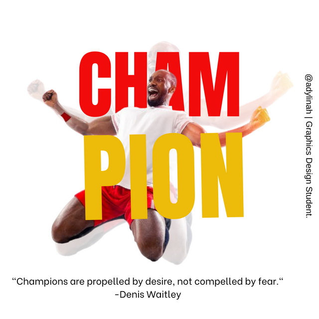 My final Design: made with Canva
Today, I am not just going to share a design but to pass a message concerning life motivation, strength and celebration of success as a CHAMPION.
Here are the steps I took;
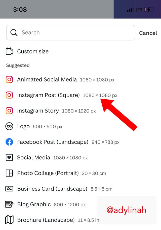
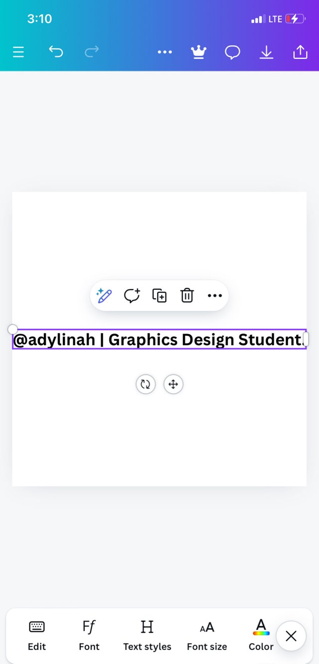
Step 1: I opened my canva app, selected Instagram post ( square) 1080 × 1080 then typed in my username and "graphics design student" first. Reason being that I would have it saved as my name.
 |  |  |
|---|
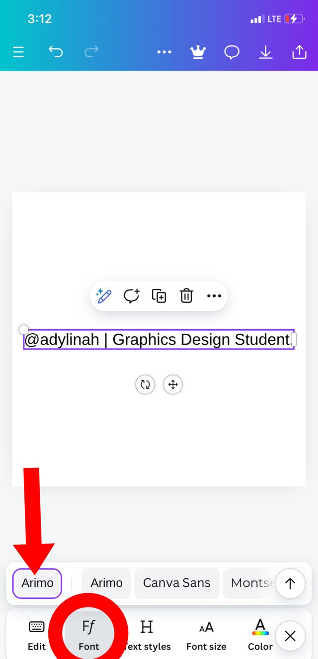
Since that was part of my design, I went to font then selected Arimo before adjusting my text to a more preferred position ( right end of my workspace).
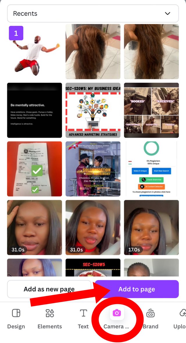
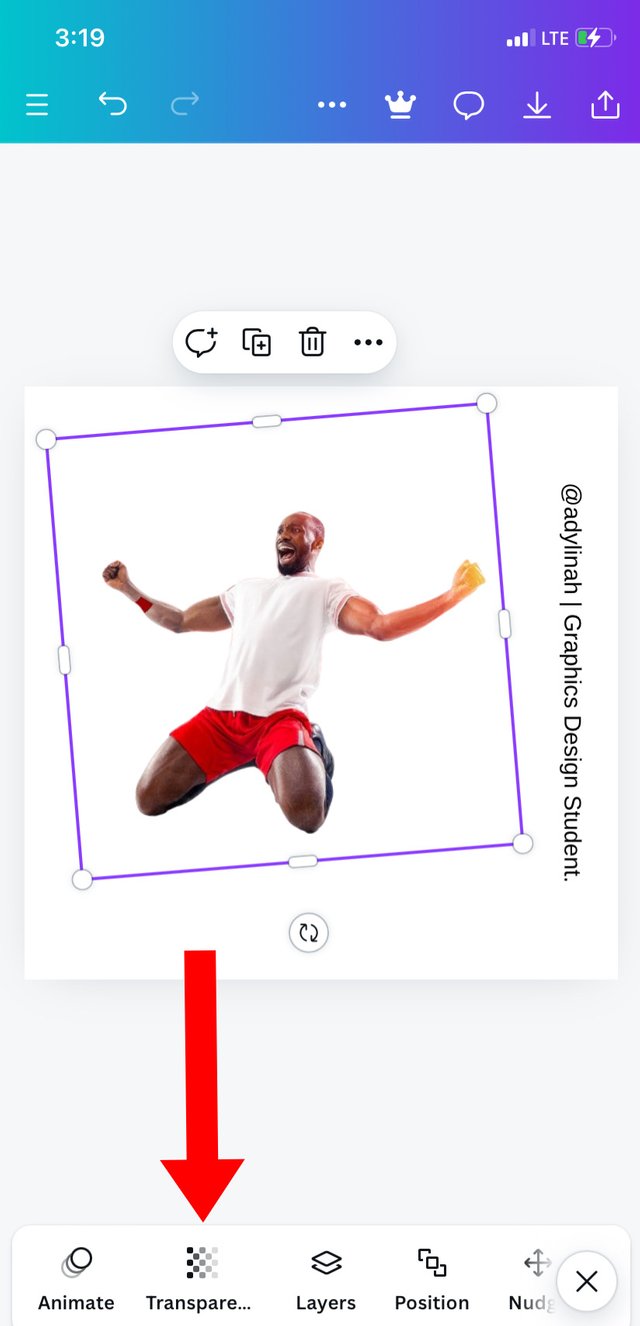
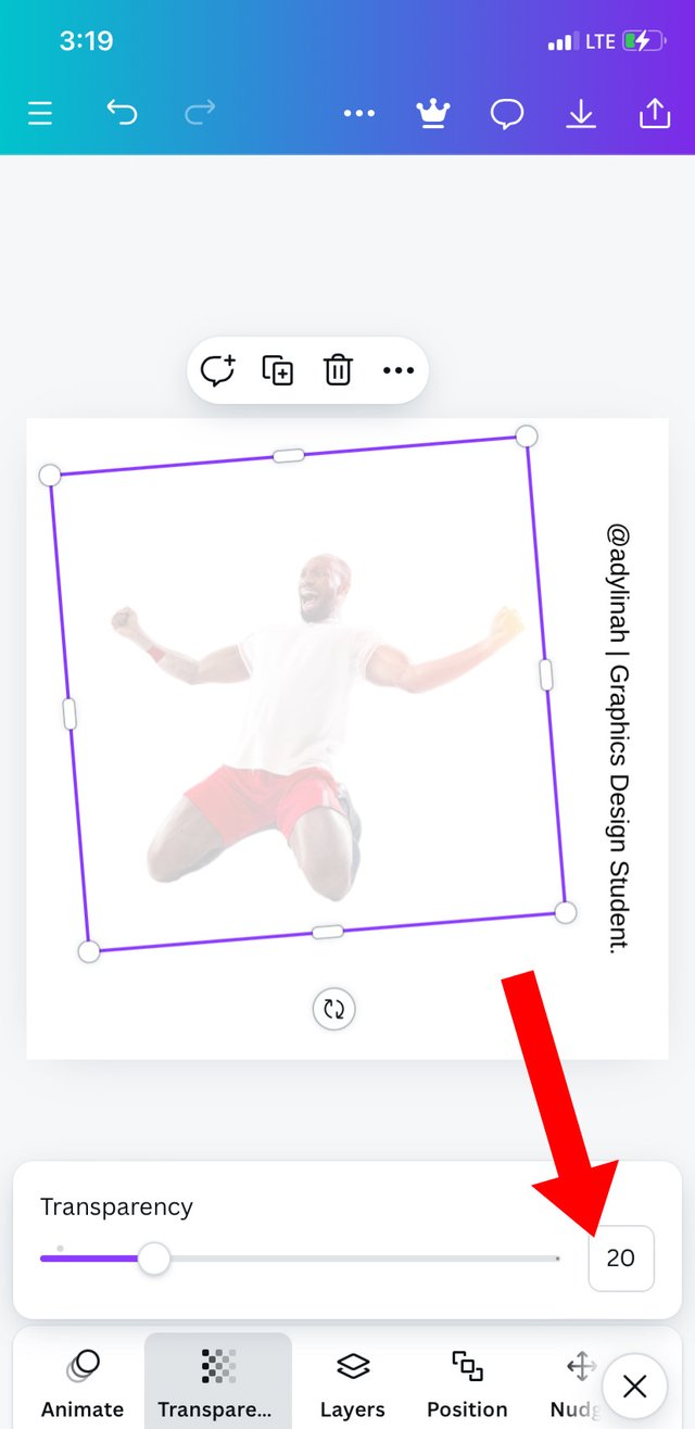
Step 2: I clicked on camera, selected my preferred image ( the sample from Graphic Design teacher), I clicked on "add to page", enlarged the image to suit my design then clicked on transparency and used the slider to adjust the image transparency by reducing it to 20%.
 |  |  |
|---|
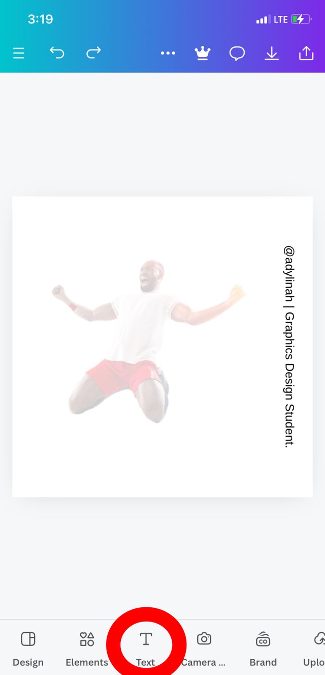
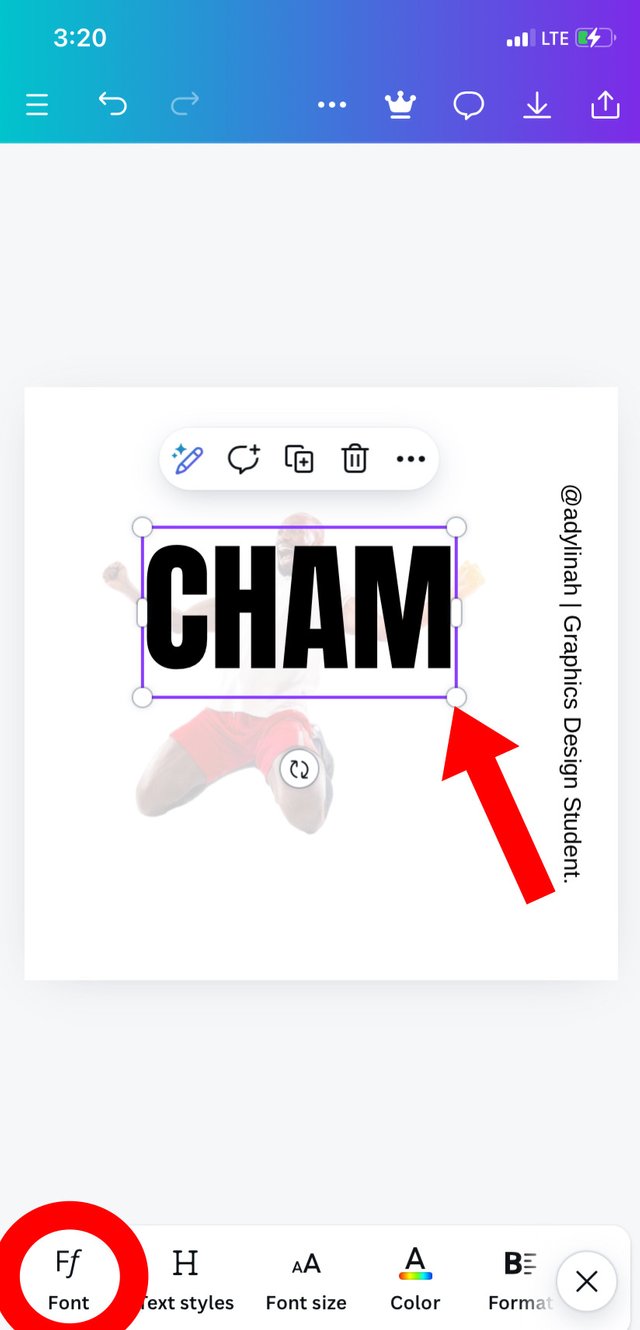
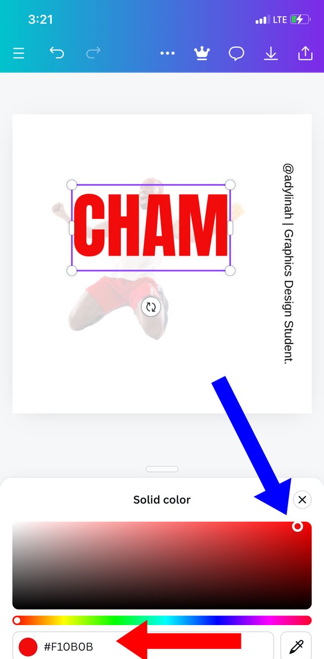
Step 3: I clicked on text icon , typed in "CHAM", add font style which is "Anton", I enlarged the text before going to select my preferred color; "red" using #F10B0B hex code.
 |  |  |
|---|
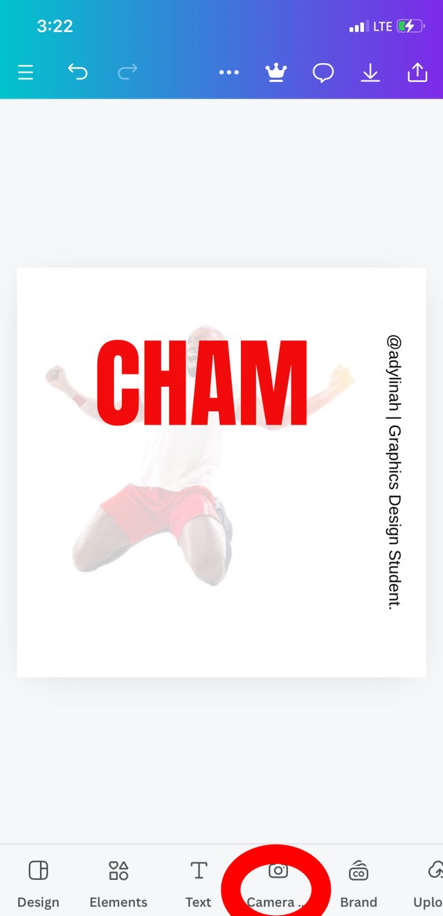
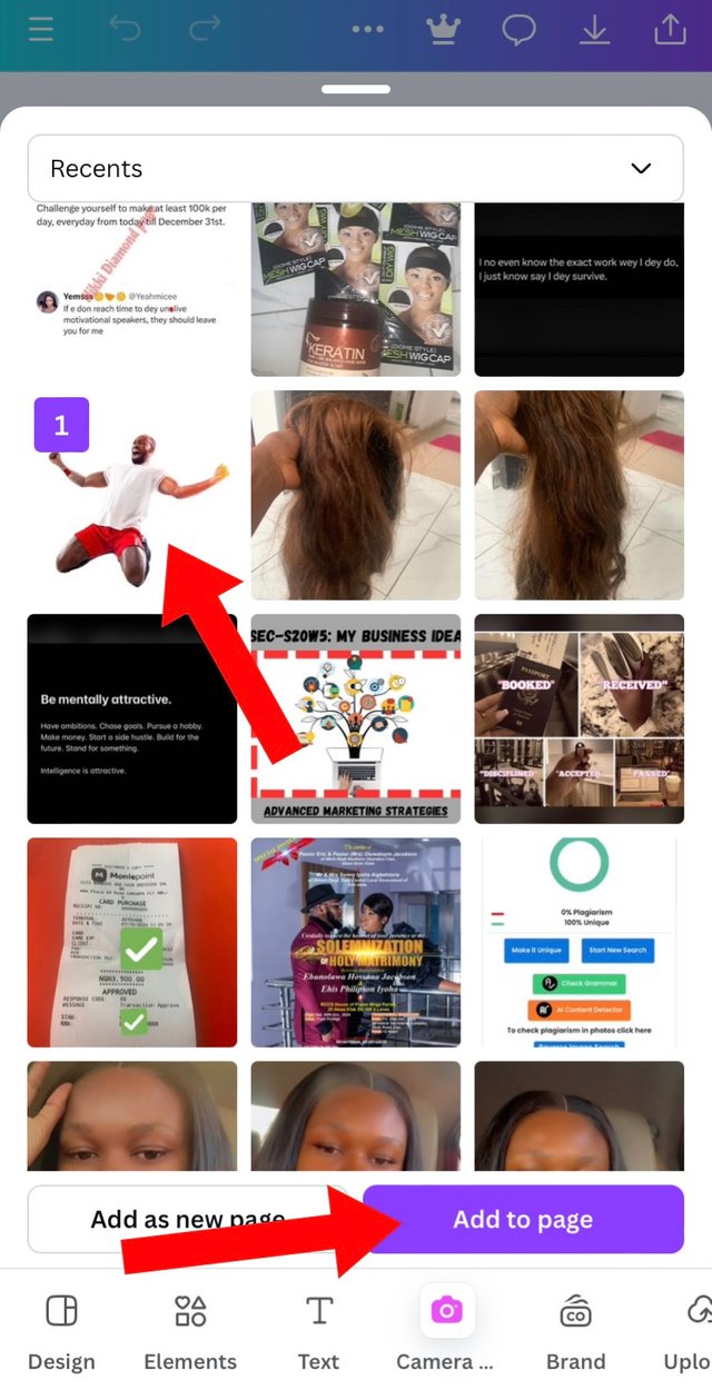
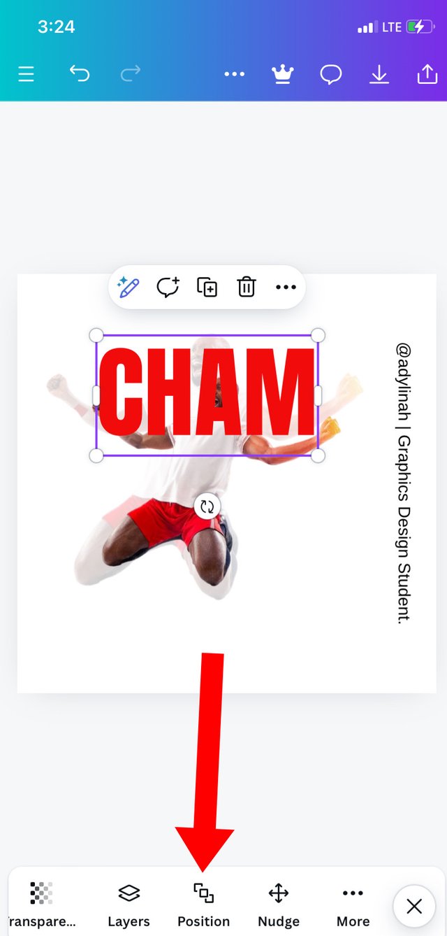
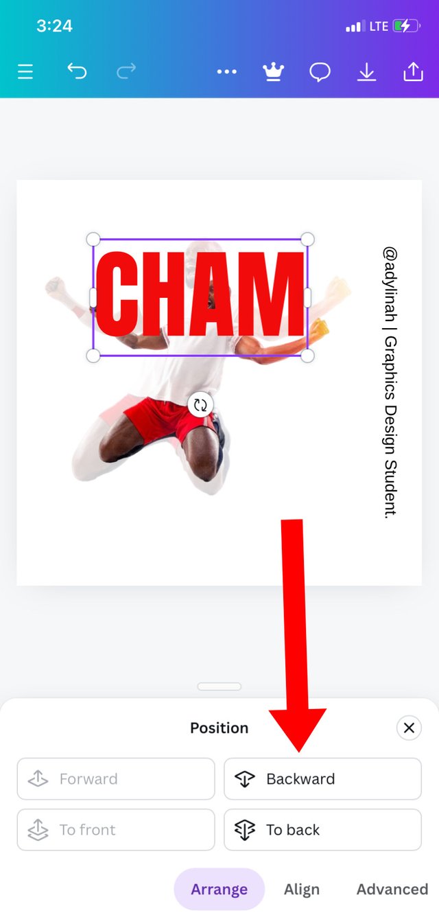
Step 4: I went back to my gallery by clicking on camera icon, selected same image and noticed that "CHAM" covered the face, so I sent the text backward by simply going to position.
 |  |  |  |
|---|
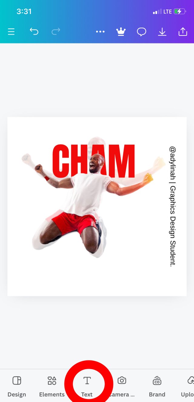
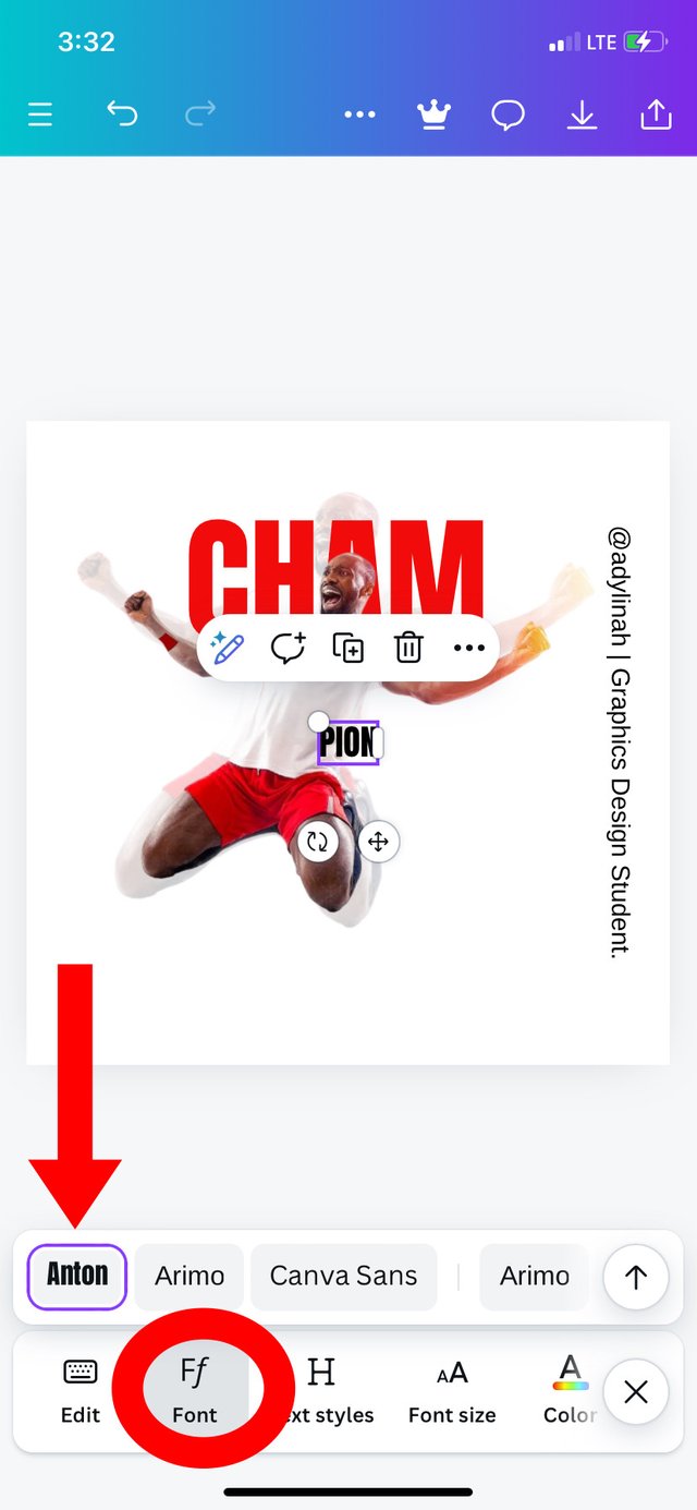
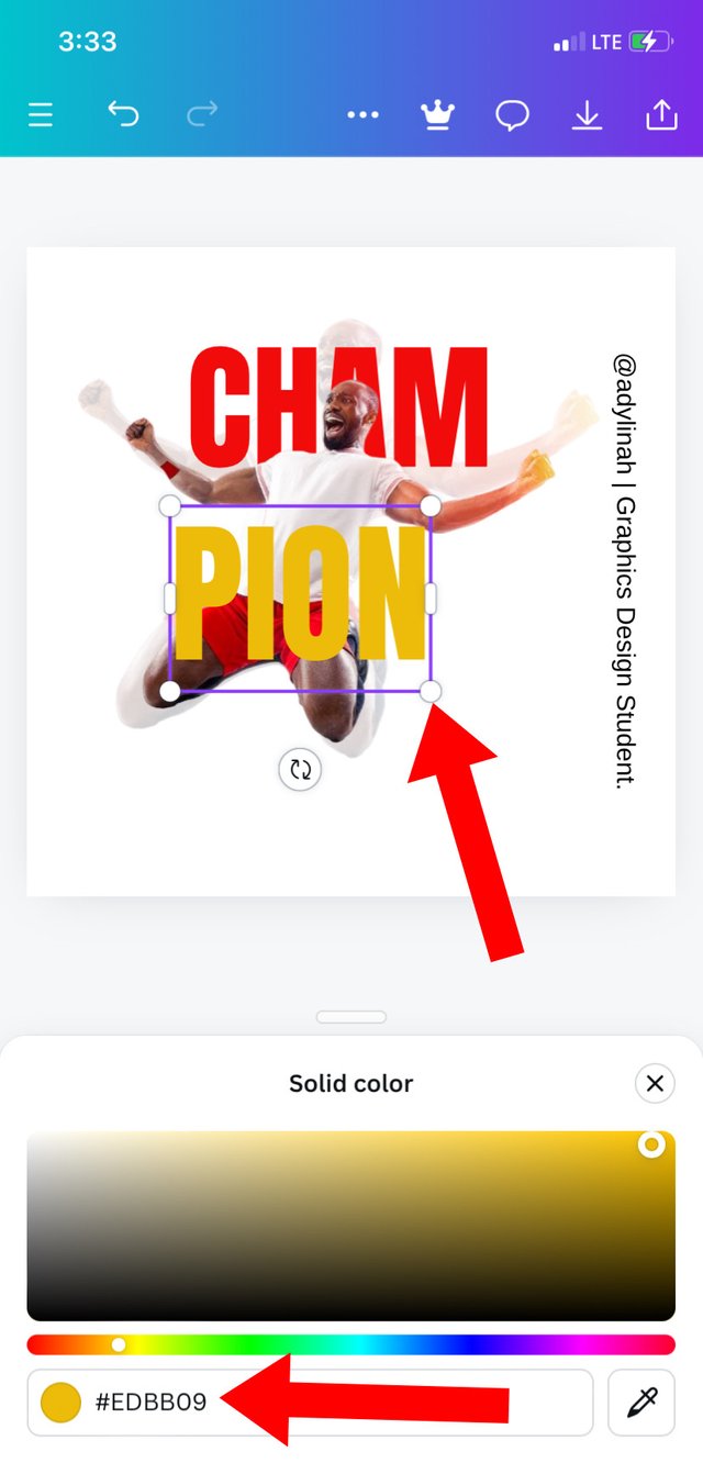
Step 5: I proceeded to complete the word; CHAMPION by going to text, typed in "PION", used font style; "Anton", I increased the size to align with "CHAM" before selecting yellow color using hex code of #EDBB09.
 |  |  |
|---|
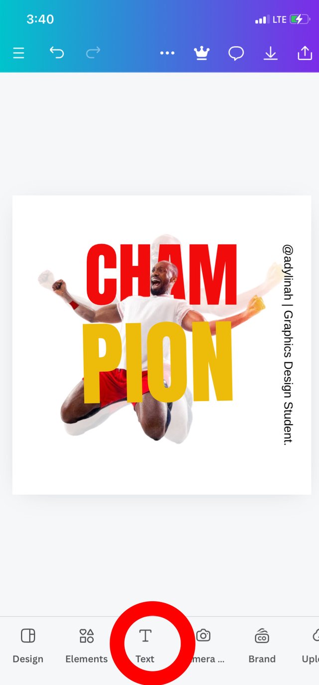
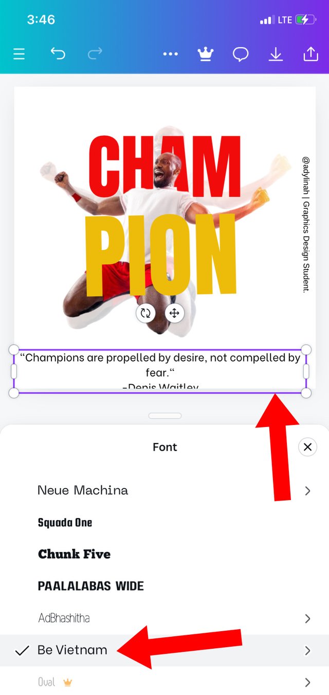
Step 6: I went back to text icon, typed in a quote from Denis Waitley about CHAMPION, I used font style; "Be Vietnam" and adjust the text to align with the image.
 |  |
|---|
I have come to an end of my design, please refer to the first image above for the final result.
In graphic design, we have different principles used in achieving great designs. I engaged the following principles in my design;
| Principle | Description |
|---|---|
| Alignment | I made sure that element and text presentation align with the message I'm trying to pass in this design. |
| Hierarchy | I applied this principle on the first and second image ( the transparent and the normal one) |
| Color combination | Red and yellow are attractive colors and since these colors has different shades, I was able to select my preferred shades using the color wheel for the combination. |
| Element Spacing | Every element on my design are well pronounce; the transparent image can be seen, the space between CHAM, the second image and PION are perfect. These elements are not crowded on a particular spot. |
| Emphasis | The image used gives a perfect description of an CHAMPION and the colors are bright enough for the expression of championship. |
However, other principles like; balance and design size / dimension were also applied during the process. Thank you!
I will invite @ruthjoe, @mvchacin and @dequeen to join the graphic design class.
Many thanks @eliany 🙏🏻
Greetings friend!🤗
Thanks so much for your invitation,I deeply appreciate, I have also participate in this contest.
In your post, I can see applying various design principles gives us a great advantage because that way we know if the work is going to have the positive impact we want to achieve.
The ones you used gave that innovative touch to the design and I congratulate you on the final result. I wish you much success in this week engagement challenge...
Thank you for acknowledging my invitation and also dropping a positive comment on my article.
Oh this is impressive, we learn everyday and of course I can see your beautiful skills in this graphic design.
I know how much time is required to make this work, well done 👍
I wish you success.