SEC20/WK1: Introduction to Graphic Design and Principles
Hello Everyone
I'm AhsanSharif From Pakistan
Greetings you all, hope you all are well and enjoying a happy moment of life with steem. I'm also good Alhamdulillah. |
|---|
PixabayEdit On Canva
This is my favorite challenge in which I will learn graphic design and I will implement what I like here. I would like to thank the contest organizer who organized this challenge and thought of giving us information about graphic design.
Graphic design is an art through which we create visual content to communicate with others to convey our message. It includes typography images color and layout designs etc. that communicate ideas or facts effectively. Graphic designers work on various media including digital platforms, advertising, branding, etc.
The main objective of graphic designing is to convey your content to the audience by making it visually appealing, clear, and attractive.
This is why in graphic design we use a variety of image shapes and designs. So that the message we want to convey with it is attractive and easily enjoyably reaches the audience. This is the content that makes me understand why we do graphic designing.

The principles of graphic design are the basic guidelines that help a designer create a visually appealing and effective composition. I have chosen three of them including Alignment Balance and Contrast which I am going to explain further.
Alignment
Alignment refers to placing elements in a particular order in any design. They are lined up to create a visual connection between them. The purpose of placing it is that it creates a clean, structured look that guides the viewer's eye. Likewise, it makes the design easier for others to understand. This ensures that no elements are placed arbitrarily but are placed in a specific order.
There are some types of alignment which are listed below:
Left Alignment:
In left alignment, elements are placed on the left edge, which is commonly used. Because we naturally read language left to right. As we go from left to right in English. It is therefore reserved exclusively for text.
Right Alignment:
In Right Alignment, elements are placed at the right edge for a specific and unique modern look. Generally, if we talk about Urdu language, then we read it from right to left. Urdu language we often set the right alignment.
Center Alignment:
In center alignment, we place elements on the center axis so that we can create a formal and symmetrical design.
Justified Alignment:
In justified alignment, we place text on both left and right edges. For this, we include newspapers and books as examples.
Balance
We use balance to distribute visual weight within our design. The main goal is to create a sense of balance in our design. So that no part of our design is too heavy or too light. Balanced designs are visually appealing and comfortable to look at. It therefore determines how the elements are arranged about each other which affects the overall stability and flow of the mixture.
There are some types of balance which are listed below:
Symmetrical Balance:
In symmetrical balance, the elements are equally distributed on both sides of the central axis. They form a mirror image. Such symmetry is often used in traditional designs.
Asymmetrical Balanced:
Asymmetrical balance refers to the arrangement of shapes, colors, and elements in a way that creates balance without mirroring. This type is the most interesting which is often used in modern designs.
Contrast
Contrast refers to differentiating between different elements in our design. We incorporate color, size, shape, texture, etc. into our designs to create visual interest. The main purpose of this is that we have to highlight our important elements. So that the viewer's attention is read on it easily. If a design does not include contrast, it will show a flat design.
There are some types of contrast which are listed below:
Color Contrast:
Color contrast means that we use both light and dark colors in the design. We use white with black to create a strong contrast.
Size Contrast:
Size contrast means that we have to vary the size of the elements in our design. A large heading next to a small body text is for visual classification.
Shape Contrast:
Shape contrast refers to how we combine different shapes in our designs. Like circles and squares, we combine to create an interesting design.

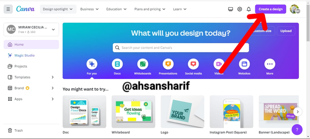
In the first step, we have to open our Canva and click on Create Design on it. When we click on it, we will have different sizes open. We will select the size we want to make. I will choose the Instagram banner.
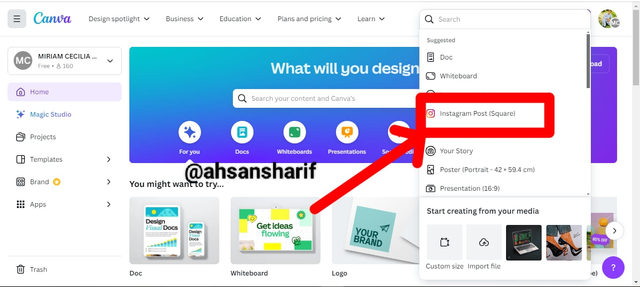
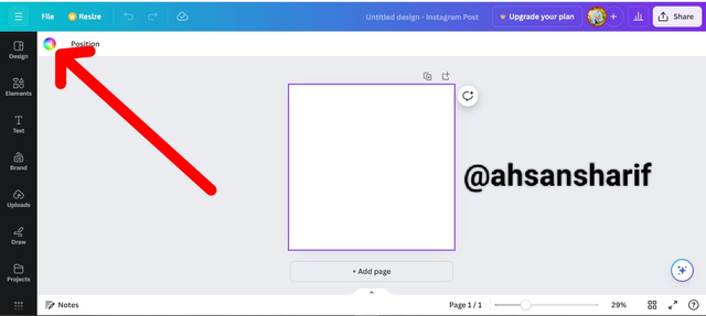
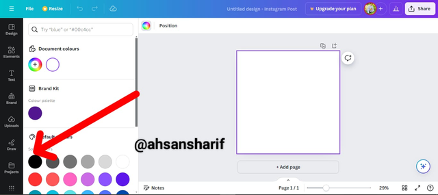
Now that we have set our design, we will open a new interface. Above our selected design will open. We have to click on this design, and as soon as we click on it, an icon of color designs will be showing in our left corner. On that, we will click when we click on that we will have different types of colors show up. We will select black color among them.
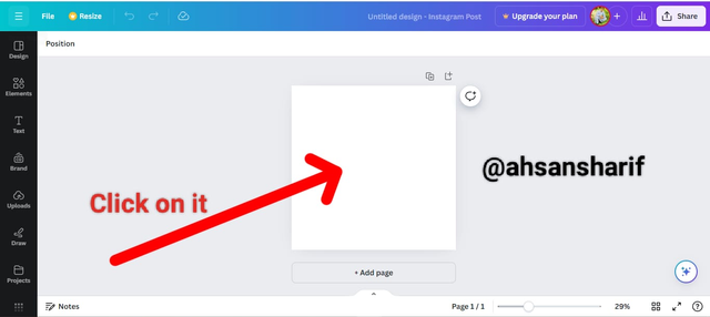
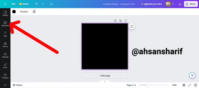
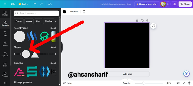
Once we've set the color of our template, we'll open Elements again. When we open these elements, we will have a new interface show. In which recently used items, graphics design items shapes, etc. will be opened. From there, we have to go to Shape and select Circle.
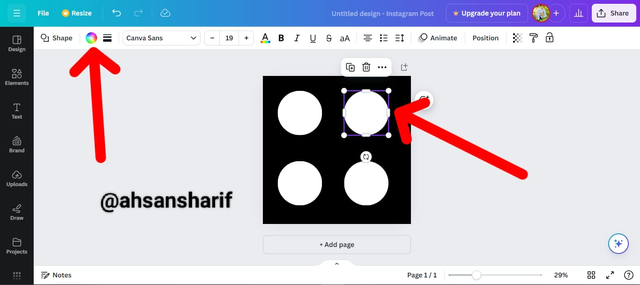
When we select that circle, it can be any color. But we have to change its color according to our design. Click on the circle to change its color. And then by clicking on the colors icon on the left corner, we will open different types of colors. From there, we have to choose the white color of our choice.
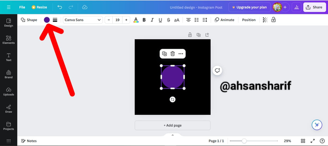
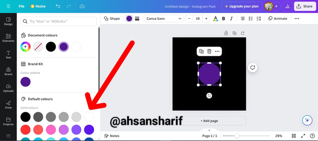
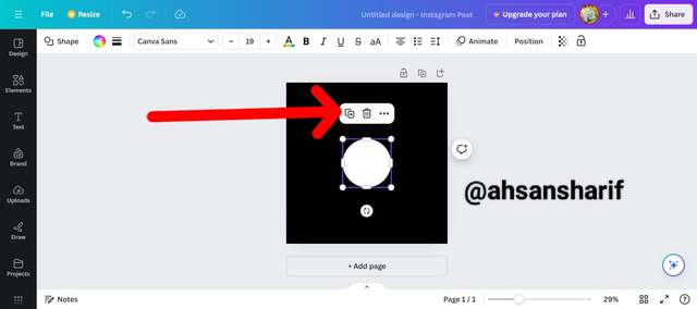
After setting the color, when we click on the circle again, we will see a plus sign above it. The more times we click on it, the more copies will be made of this circle. If we want three more copies, we will click on it three times. With the help of which a random four circles will be formed. We have to arrange these circles so that if those circles come square, then we have set them.
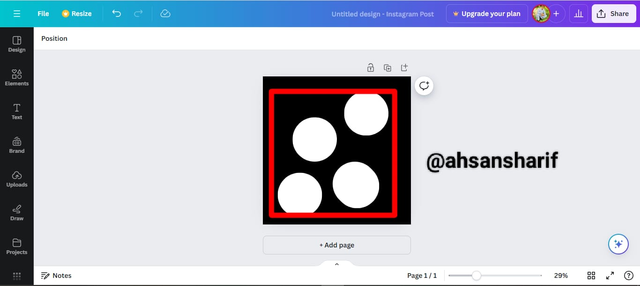
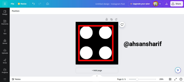
According to our question, our right upper circle is almost yellow. We'll select it to set its color. By going to the color icon and opening the different colors, they will select the color from there.
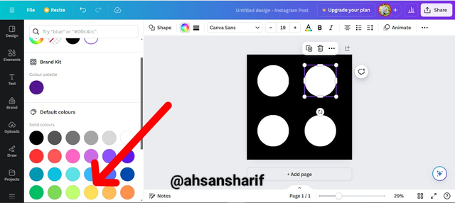
Following all these steps our final design is ready. Which you can see in the picture below.
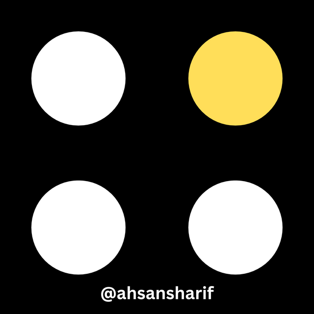.png)

I have tried to do my task well. Hope you guys like it too. If there is any mistake or omission, you can mention it, thanks.
I invite my friends @josepha, @eveetim, and @rumaisha to join this challenge.
Cc:
@lhorgic

X:
https://x.com/AhsanGu58401302/status/1833221220411838577
Thanks for inviting me, I just submitted my entry a few minutes ago. Good luck to you.
Ohh really I visit soon.
Upvoted. Thank You for sending some of your rewards to @null. It will make Steem stronger.
Nice to learn about graphic design in this detailed post. You really took time to analyze the topic to a common understanding, you're indeed good at your craft.
Best wishes!
Thank you so much dear friend for your kind words. I wish you more success.
Thanks a lot dear @wilmer1988 for your kind support and love. Many blessings to you.
Hola mi querido amigo @ahsansharif, un placer saludarte
Has realizado un buen trabajo amigo, mis más sinceras felicitaciones, tomaste en cuenta cada detalle y cada instrucción dada por el profesor para llevar a cabo este 1er curso y tener un buen resultado en tu desempeño, has realizado un trabajo bastante detallado lo cual te permitió llegar de manera exitosa al resultado final exigido por el profesor.
Te deseo mucho éxito. Un abrazo 🤗
Thank you so much for visiting my task and noticing my points where I done my job perfectly. I wish you more success.
This is a very educative post, Kudos