Building A Better Business Episode 1: Website Design

Today we will look at some key features that one should focus on with their website design.
The design is the FIRST thing that people see when they go to your website. This can also be the first reason people have to not continue to look at your business. We need to look at a few things that we could do better with our designs.
GONE are the days where we pay someone $47 for a website design that consists of a header, background, and footer. HERE are the days of simple and responsive!
Before we get into this, understand that I am using examples of my own websites, and while the example may have been a good example in 2009, it is no longer a good example today. We also have to understand that if our website design was not built with the most current version of html,css,js,etc... we NEED to upgrade our design.
We also have to understand that there is NO SUCH THING as a perfect design. BUT, there are thousands of bad designs...
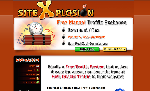
Let's look at our first example that I pulled from the WayBackMachine:
![sitex_old.png]
( )
)
Here are a few things wrong with this design:
- The entire design is built with images. Everything from the header to the background to the footer and menu buttons are all comprised of images. This is no longer necessary with the advancements made in CSS and HTML.
- The logo is not its own piece. It is a part of the header.
- The entire design is a fixed width. This was great when everyone had the same size monitor. Not so great today when looking at websites from phones, tablets, notebooks, etc...
- The images used outside of the design do not have the same "feel" as the design. Everything should "feel" similar.
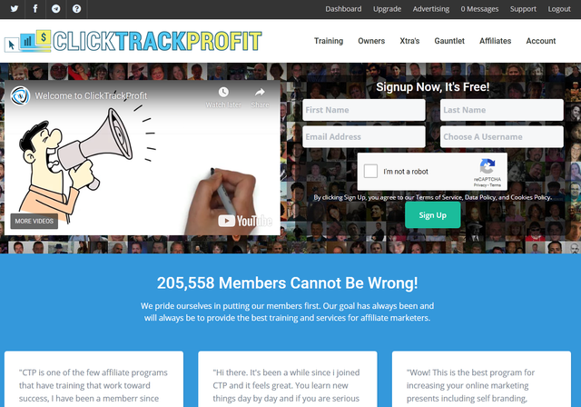
Here is our next example:

Here are good things for this design:
- The entire design is built on HTML5 and the most up to date versions of CSS and JS.
- The logo is its own element and the entire site was built around the logo so everything "feels" similar.
- The design is responsive, meaning you can view this with almost any size monitor and it will still look good.
- NO images were used (except the logo) for the design, everything is built using CSS. This is extremely helpful when we want our sites to load fast!
- The design is simple and flows!
My "bad" design example is definitely NOT the worst thing that I have seen on the internet, and that site no longer has that design. This is just an example of what would be considered a bad design. There are sites out there today that have absolutely horrible designs that need an upgrade.
If you need an upgrade or just need a design, here are the general steps that I follow when designing:
Get the logo FIRST. You can get really good looking logo's for cheap too. I like using fiverr for my new logo's. The prices can range from $15-$150+ depending on what you want. I get all source files as well so that I can edit the design at any time if I feel it needs an update (or christmas lights around the logo during christmas time!)
You can either hire a designer or purchase a pre-made design the choice is yours. I like to look at pre-made so that I can adapt them to my project. A great place to look at designs is ThemeForest. For $40 you can get a good design that can be easily adaptable to anything that you want.
If you hire a designer look at their portfolio. Ask for links to current websites they have designed. Go look at the designs. Right Click and "View Page Source". If the first line is not: RUN AWAY. This is the most current version of html and is what you need to be using.
DO NOT go crazy with colors. Pink and Orange may be your favorite colors, but a page that is nothing but pink and orange will most likely be not very pleasant to the eye's. Keep colors simple and only use a few.
Make sure your design is responsive so all devices can see it correctly.
Use CSS. CSS is your friend. You do NOT need or want a design that is built on images. CSS can do all the cool things and faster than images.
I hope you enjoyed reading this episode, stay tuned for more episodes of Building A Better Business!
If you have a design DO or DON'T please comment and let me know!
Thanks Blain. I need this as I've been struggling trying to figure out a design for my personal website. I'll visit ThemeForest today. Hopefully I'll find the perfect design that will end up being the best $40 investment I've made this year.
Yeah, they have a LOT of great designs that are fairly inexpensive and easy to implement!
Congratulations @blainjones! You have completed the following achievement on the Steem blockchain and have been rewarded with new badge(s) :
You can view your badges on your Steem Board and compare to others on the Steem Ranking
If you no longer want to receive notifications, reply to this comment with the word
STOPDo not miss the last post from @steemitboard:
Vote for @Steemitboard as a witness to get one more award and increased upvotes!
Good article one can only hope that some take the advice offered here.
Yeah the overall goal here is to help people out. Get everyone to bring their designs into 2020!!
That is really great advice @blainjones, a responsive and clean design made with code looks great and loads fast, keep up your great work and stay awesome.
This is Awesome Content, and it has been manually curated with an upvote of 60% from @thisisawesome and it will be included in our Awesome Daily report in category Awesome CTP Curation for more visibility.
The goal of this project is to "highlight Awesome Content, and growing the Steem ecosystem by rewarding it".
I really like & needed the info in this post but I feel that I can't learn the CSS needed to redo anything I've done. I'm having enough problems getting things done as it is. But maybe someday I'll catch up to the "newest" stuff.
Most of the CSS you will need you can get already included in a simple design from ThemeForest. You just have to take a bit to learn what each element does.
Awesome Blain, you nailed this one!
Of course, owning the logo means you will keep the intellectual property rights. If your website does well and you put on the open market, the logos and other IPRs could be worth a lot.
That's why using your suggestion of hiring a designer to do the design graft is the best approach.
website design gets overlooked by so many struggling site owners.
you hit on be visible on all devices, so many overlook the cellphone.
and colors, well that is a topic by itself.
My first thought is do not stay on the "2000"s.
So many people remain outdated, and wonder why sales are down.
Flashing words or ===== graphics did to disappear for good.
If you can't CSS, please do everyone a favor and pay for it.
Great tips here. Thanks for the shoutout to fiverr. It is a resource that blesses small entrepreneurs, just like ctp does.
First post I say when I logged in. like to come back and read again so I follow you now.