Design | Logos for @steemxp
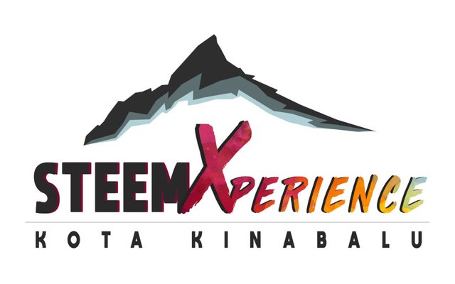
First Things First
I can't believe I have not posted these designs for @steemxp up before. I guessed because it was rejected. Yes, there are bad days and good days over my one year of designing and creating designs for people. I picked up designing when I started Steemit and there are times when the designs just aren't working but what I can say is, I've always given my 110% to designing these design. Bad ones (which I agree) included. I wouldn't want to let these logos go to waste so I've decided to just post them up and the thought process behind them.
What is @steemxp?
We are a South East Asian Guild which provides support to steemians in promoting the Steem blockchain in South East Asia (taken from their Steemit profile). It is initiated by our #teammalaysia and lead witness, @bitrocker2020 to promote the Steem blockchain around SE Asia. He created @steemxp together with other leads, @danieldoughty, @veenang, just to name a few because they wanted to organize big events for Steem. As big as steemfest!
And they did! They've successfully organized a blockchain event by @steemxp committees that all included #teammalaysia members and it was held in Sabah just a few weeks ago. It was the first time a Malaysian official came and officiate the event, because of that, it was a HUGE SUCCESS. Kudos to the team who are behind it, definitely there are more to come.
Steem Experience Logo Design

The Idea
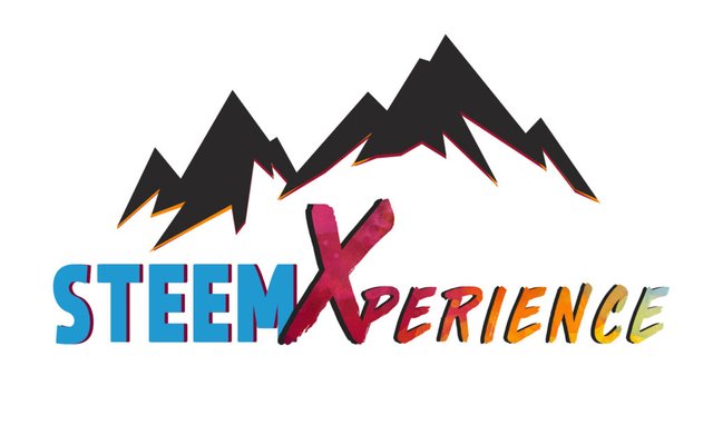
At first, the whole idea of the event was to let Steemians from all over the world come 'taste' the cultural and landscape diversity in the island of Borneo where heavy jungle thrived. The event was to be held in Sabah, East Malaysia and Sabah is famous of it's highest mountain peak, Mount Kinabalu. Having this gave me an idea to use this as an iconic symbol for the logo. Steemians who come for the event will also experience a few days of hiking, white water rafting and many more. We wanted to bring the 'experience' to our guests. With that in mind, I wanted the fonts to shoutout it's diversity and raw, fresh experience that guests would be experiencing.
Creating the Key Elements
This logo had two key elements. One was the famous silhouette of Mount Kinabalu, the other was the word 'xperience'. Firstly, I took an image from the internet and traced the mountain's peak with a pen tool. Because it looked really flat, I decided to use various grey tones to solidify the element. Take it as like the shadow of the mountain.
After that, I created the text fonts for STEEM with a more 'textural' font for 'xperience'. Reason being, the experience that Steemians would be experiencing during the few days event would range from hiking, rafting, wildlife observation and many more. Hence, the font had to have a little of the 'adventurous' type. After being happy with the placement of the fonts and the mountain, I began enhancing these elements with more colour.
Enhancing the Elements
Malaysia is a multicultural country with various ethnic groups. In the Borneo Island especially, there are many ethnic groups with very diverse cultures. All this flavours add up to what Malaysia is today. The colourful font of 'Xperience' is supposed to tell this story and purpose.
To solidify the font text, I added a sharp drop shadow for STEEM and Xperience and it looks much better than having just flat fonts.
I pieced the elements all together and wualah, there u have it. It was looking pretty alright to me. I later added some little text below the logo to state where the location of the event would be.
Finalize

There you have it! The finalized logo design that I've created. Honestly, during this time, I wasn't 'great' at graphic design. This whole logo looked more like a thumbnail banner to me and not a logo. So on that part, I didn't actually make it. So my other designs were also not used. From this mistake that I've made, I come to learn what people actually expect from a logo and how a logo should look like. So it was a graphic design 101 for me and I'm glad from then on, I started learning the concept of logo design. Haha.
My other designs :
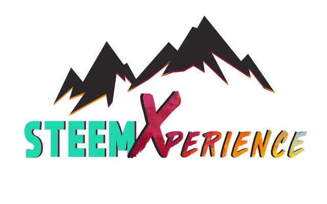
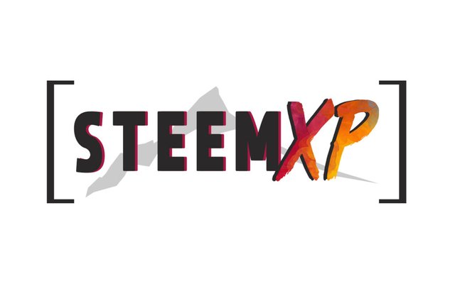
Thank you for taking the time to look at my thought process behind these logos that I've made. I have actually spent quite an amount of time doing this and it was also during my busy peak season of fulltime job. So I decided to not let my effort go to waste and post this up as a learning curve for me.
Thank You
If you like what I do, check out my other posts on meetups, animation, and designs.
Get your Personalized Steemit Profile Banner,Logos & GIFs
Posted from my blog with SteemPress : http://zord189.vornix.blog/2018/10/11/design-logos-for-steemxp/
Really great work! I like the first one and it's powerful simplicity!
Even though it wasn't selected, it is a great design! Fabulous! 😊
Thanks :) Yea, I spent quite some time to design them so I thought why not just monetize it by posting it up so my effort doesn't go to waste.
Really good, but I prefer the others ones
Yea, me too. Haha
magnificent logo, Super design! I love the colors and concepts, love your style zord.
Thank you! <3
This was cool, getting a glimpse at the design process.
Thanks!
Thank you foe the grea5 dsign bro
Posted using Partiko Android
Thanks bro!
Nice what... I like the last version :)