Want to see what the world actually looks like?

Ever tried comparing country sizes by directly placing one on top of the other? Well, what you see is not exactly right.
The Mercator Projection is the reason why some countries looks bigger or smaller than others. Putting a 3D planet on a 2D map was a challenge for early cartographers and so a Flemish geographer and cartographer named Gerardus Mercator though of a solution. In 1569 he designed a map which could be accurately used for navigation, but this came with a downside, the system distorted the size of objects depending on their position in relation to the equator.
The correct size estimation of countries can be found on https://thetruesize.com, which lets you move landmasses into different locations.
I played a bit on this site and here is what I found!
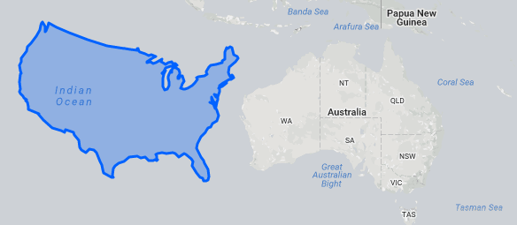
US Moved Down Next To Australia Looks Unbelievably Small
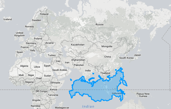
Russia On The Equator Is Not A Giant Siberian Bear Anymore
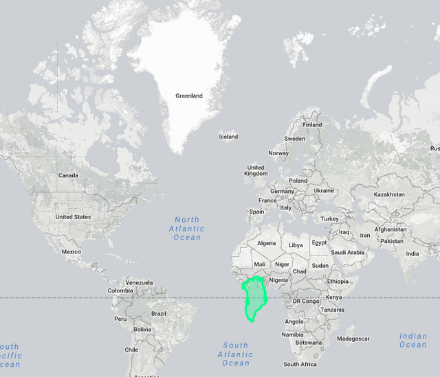
Greenland Is Unbelievably Small
Canada At The Equator Is Hardly Larger Than Brazil

Suggest you folks to check this site out..and it will change the way you look at the world..
Cheers!
follow me at https://steemit.com/@blueskyy