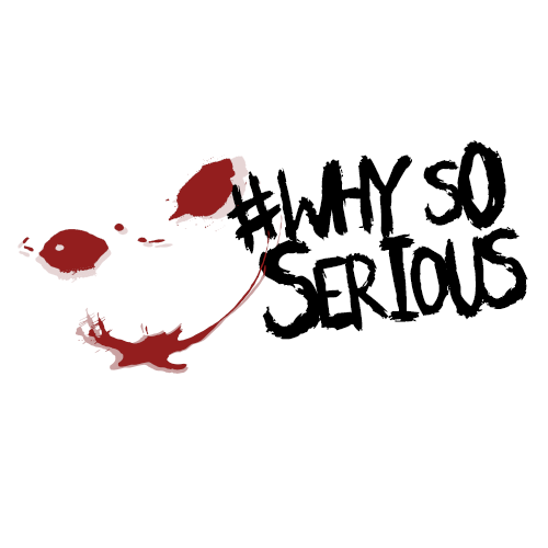
#whysoserious LOGO CONTEST
This is my entry for the #whysoserious logo contest by @dumar022.
Informations about the contest you can find on THIS LINK.
All images are 500x500 pixels.
LOGO DESIGN


Other variations with a black background can be viewed on this LINK.
TYPOGRAPHY
For this one, I use two kinds of fonts, one for the text of "why so serious" and one for the shape of eyes and mouth.
For text : Scratchies Font .

For shape : Split Splat Splodge.

Logo is made with Adobe Photoshop 2015
Hope you like it.Support me with follow, upvote and resteem ! PEACE!

I like it very much, especially the last one!
Awesome work! Keep up
@originalworks
@OriginalWorks Mention Bot activated by @antoniokarteli. The @OriginalWorks bot has determined this post by @antoniokarteli to be original material and upvoted it!
To call @OriginalWorks, simply reply to any post with @originalworks or !originalworks in your message!
For more information, Click Here!
@antoniokarteli got you a $1.31 @minnowbooster upgoat, nice! (Image: pixabay.com)
Want a boost? Click here to read more!
Congratulations @antoniokarteli! You have completed some achievement on Steemit and have been rewarded with new badge(s) :
Click on any badge to view your own Board of Honor on SteemitBoard.
For more information about SteemitBoard, click here
If you no longer want to receive notifications, reply to this comment with the word
STOPCongratulations @antoniokarteli! You have completed some achievement on Steemit and have been rewarded with new badge(s) :
Click on any badge to view your own Board of Honor on SteemitBoard.
For more information about SteemitBoard, click here
If you no longer want to receive notifications, reply to this comment with the word
STOP