A small talks about web design: Accessibility
“The power of the Web is in its universality. Access by everyone regardless of disability is an essential aspect.” — Tim Berners-Lee, W3C Director and inventor of the World Wide Web
What makes a good website design? Is it the good looks? The fonts, the colors? Is it the user experience?
I'm not an expert but I just want to share a story.
A couple weeks ago I saw a junior programmer wrote a few lines on the terminal, and in a second, he already have a boiler plate of Nuxt.js based website. it's a good structured website, with good reactive design standard. Now all he has to do is browsing some JavaScript libraries, and make a rapid prototype using bootstrap.
Relatively easy.
But then come the real problem. He should convince his web designer about the prototype and the structure. The designer barely know anything about coding. He know some CSS but that's it. The designer wants to implement many fancy things, cool fonts, big artsy illustration for background. The coder on the other hand wants the design to be simple, to reduce website loading time.
Both of them has a point. And me, as a person who just love to see them fight, just stood at the door, drinking my home made mojito. Lol.
I was a website designer myself. I've spent some years designing website built with WordPress and Drupal with Adobe Photoshop. There were no Adobe XD, Sketch, or Figma. jQuery was still dominating the frontend. No React, Angular, or Vue. And no Laravel too.
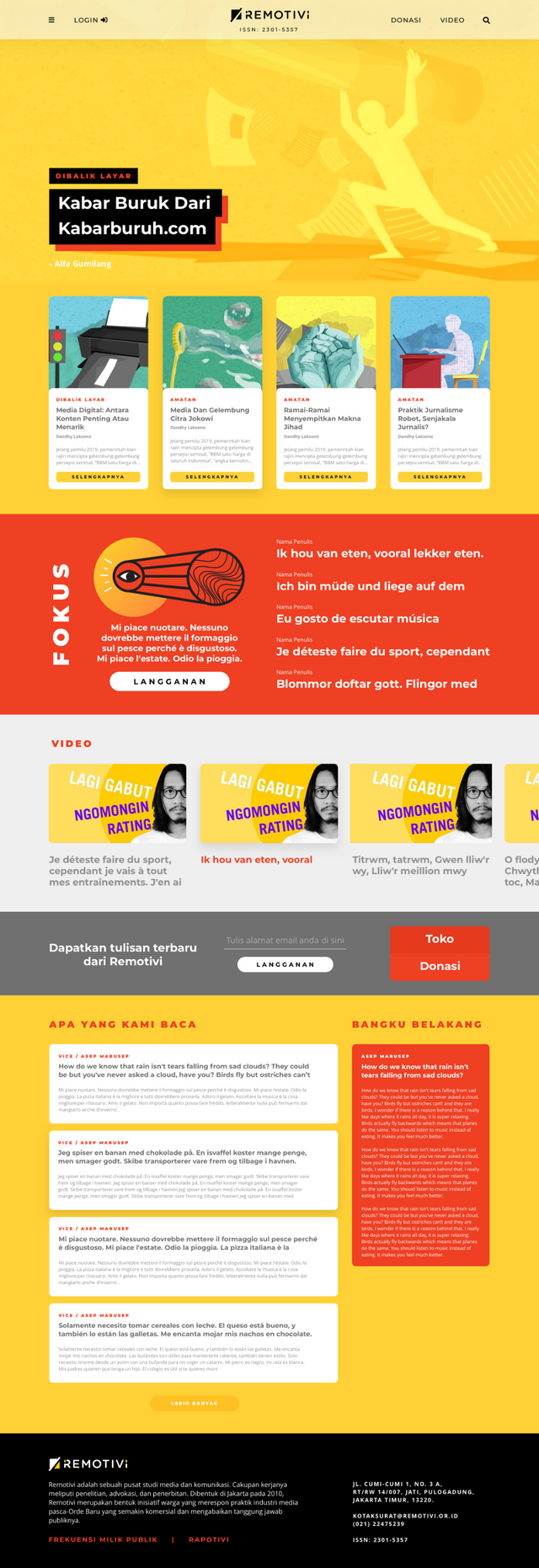
Here are some example of what our teams were designing, I love the aesthetics by the way:
Seeing how rapid these web design related technology has developed, It's really fascinating. So about that two boys, I can relate to the web designer, at the same time, I understood what that coder wants too.
I'd say both of them are missing one crucial point. At the end of the day, their work would be presented to me and my two other colleagues. And we will ask them about one thing: accessibility.
Accessibility is the practice of making your websites usable by as many people as possible. We traditionally think of this as being about people with disabilities, but the practice of making sites accessible also benefits other groups such as those using mobile devices, or those with slow network connections. (source)
But isn't accessibility in web design should thought later. After we settled in mockup, or even, beta launch?
Frankly, I noded my head to that thinking before. But one of my colleagues--for now, let's call him as Jack-- is all about paradigm. Unfortunately he is also acts as the loudest guy in the room. So when he talks we tend to listen.
He strongly believe that accessibility lies on the design paradigm. To design for accessibility means to design for everyone. Mainly, of course designing for the targeted users, but users outside of the target demographic should be included too. Same goes with users with disabilities, and users from different cultures and countries too.
That means, we expect that the designer would put that paradigm since the start of design development. Not all of accessibility features should be there. God, no! Actually, what we want to hear is more about the argument. The arguments about how web design should be responsive, fast load, intuitive, that would be basic. No need to argue on that. The technology stacks we have nowadays help a lot. It's easy to design rough mock-up, even to make prototype with these tools. We need to talk more about how the web would be accessible for everyone.
So it happened. Those boys showed their work to us.
"Where is the RTL mock-up?" asked Jack.
"Ummm.., we think we'll add that feature later..." answered the web designer.
Wrong answer.
"I also think that we need to add text-to-speech feature... later...." said the front-end coder, probably as an act of solidarity.
Oh, no..
"I mean... we won't targeted users from middle-east, rite?" asked the web designer.
Triple strike.
Jack couldn't stand it. Then he start to ranting about his favorite stuff: the design paradigm. An old boring speech. Classic Jack. I yawned.
Jack stopped the rants and asked my opinion for these boys' work.
So I started to talk:
"Good design is good design. It has to be creative, obviously. It has to be intuitive. But it will be much better if that good design works for as many as possible users. Well, of course, planning design for accessibility could add some limit to design itself, but the key objective is one functional product that work..."
I was in the middle of my speech when Jack interrupted me.
"Please, don't call our user as 'users'. They are people, person with real characters. Calling them user is unethical..." said Jack.
Damn you, Jack.
I've lost my train of thought. So I went silence. Uncomfortable silence. Awkward.
Anyway, that's the end of the story. I called that meeting off. The boys were not ready. Heck, I was not ready. Jack is being too conceptual most of the time. He is typical urban Jakarta guy.
Here are some articles If you want to read more about web accessibility:
Photo by Paul Green on Unsplash
Bagus banget! Yang paling aku suka logo fokusnya 👏🏽👏🏽 Bravo!
Btw, I would say that a good design should come with user friendly interface and a flawless browsing experience. It should be ok to focus only on those in our target market, even though it’s a small niche - I would say leave others behind and just think about the accessibility for that particular market. There are so many people trying to get attention from everyone and they will receive from none. Focusing on a small niche will do a bigger effect and maximize our chances to monetize their time spent on our website. I think 🤔
I absolutely agree on niche market. And I'd also like to put more effort to penetrate that market the most efficient way, to capture the whole pie. But looks like most of designers i'm working with were putting a lot of effort to achieve the creative and aesthetic side, ignoring accessibility. I strongly believe in the next couple of year, the design trend will be about accessibility and saving energy (with dark mode, or any other tricks that consume less electricity).
Indeed, if that niche is full of customers who love to take selfies, I can see why the look is very important. That’s why we need someone like you to bridge the gap.
Wah senangnya Ada Parisien mampir. Mersi boku! Hehehehe.
(Sayangnya itu mock-up ga jadi dipakai dan remotivi Akhirnya makai yang sekarang Ada di website mereka :D )
Right, @puncakbukit reblogged to thousand followers.. So many thanks to choose @puncakbukit as your witness.
Questo post è stato condiviso e votato dal team di curatori di discovery-it.
This post was shared and voted by the curators team of discovery-it
This post was shared in the Curation Collective Discord community for curators, and upvoted and resteemed by the @c-squared community account after manual review.
@c-squared runs a community witness. Please consider using one of your witness votes on us here
Hello @gibic, thank you for sharing this creative work! We just stopped by to say that you've been upvoted by the @creativecrypto magazine. The Creative Crypto is all about art on the blockchain and learning from creatives like you. Looking forward to crossing paths again soon. Steem on!