Crafting a Site: Designing my own website
Today I'm going to walk through the design process of my personal website, driftinghorizons.com. I'm using Photoshop to design it, pretty simple. I'll be walking through the process step by step, as I thought it'd be good for designers just getting started to have some insight into the process. A note: At the time of writing, the driftinghorizons site remains at it's old design status. It looks like shit. It has not been revamped to this yet. So, let's get started.
1: Choosing your Canvas
I'll be using a canvas of 1200x2200 px today, but realistically, I may need to screw around with that later. So, at least it's a nice starting point. Everything in design is flexible, of course. This will fit most desktop screens quite well, and in terms of responsive design, allows for some easy conversions.
2: The Navigation bar
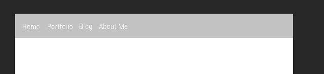
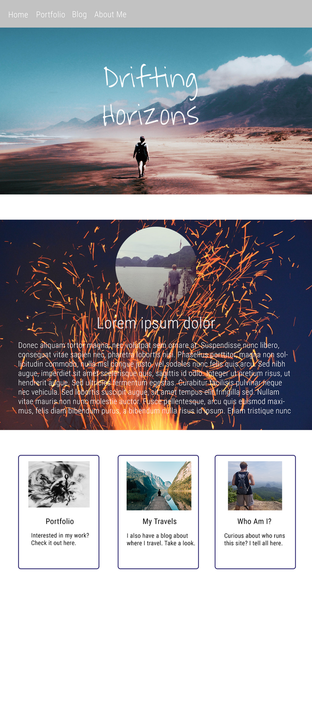
In my opinion, the navigation bar is one of the most important parts of a website, and one that is too often overlooked. It brings a sense of unity to a website, since the user sees the same one on each page. And how often have you been on a site, and had a navigation bar that just looks awful? I think that it's something that you can really judge the quality of an overall design on. Therefore, it should be sleek, minimalist, and functional. My personal philosophy is less is more, so my nav bar should reflect that.
One can use either a top aligned bar, or a side (left or right) aligned bar. I have a strong preference for top alignment, so I ran with that. I chose a light gray, hex code #c2c2c2, for it.
Next, one has two decisions. How many pages do you want in your site, and what font do you want in your navigation bar? Now, each font has a different feel and character to it. I chose Roboto from Google fonts for a few reasons. The first is that it's free and licensed for open use. That's really important. It's also a sans-serif font, which in my opinion,in general looks much cleaner than serif ones.
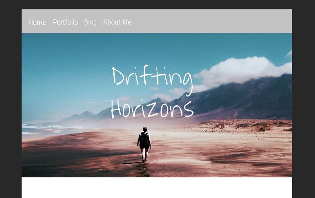
3: Header image and title
Usually, you want the first thing a user to see on your site to be both attention grabbing, and something that conveys the general image of your website. When a user goes onto your site, just what is it that they're going to get out of the experience? Is it a tech blog? Is it about a business, or maybe just your personal page? Whatever it is, the user needs to see it right away. In my case, it's both a travel blog and my portfolio, so, the image I chose is one that should make the user think of travel. I chose one from pexels.com, and added my website name on top of it in another font from Google fonts.
4: The introductory section
Next I want there to be a small section about myself, what my site is for, and it's major goals. Those goals lie somewhere between portraying myself as the freelancing designer that I am, and, a traveler as well. So, I picked a picture that shows dynamicism. Then I got a round pic of myself, and some placeholder text for the time being. I'd rather not get bogged down on content at the moment, and simply focus on layout.
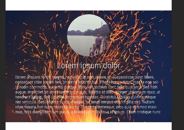
Something I need to note is that this text color does not work with this picture. In the final, I'll either alter the picture's color, or the text color. Another thing too, is in the final web version, I want this section to have a cool sliding animation coming in from the right.
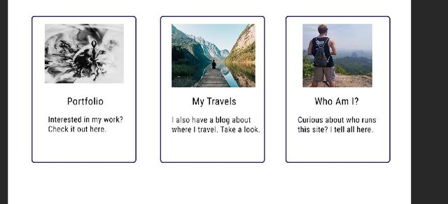
5: Buttons
Finally, I have some buttons at the bottom that show off each section of my site. The About me, My portfolio, and my Blog. Basically I just grabbed some pics, had a short description on each button, and boom, there it is. Not a lot here. There might be an animation for these buttons too.
6: Final page!!
Here's the final product! In my next post, I'll go through designing the About Me page.
Hope you enjoyed this! It's my goal here to start some dialogue with other designers, and maybe help those who are just getting started. Best of luck out there! Remember to upvote and comment!! It'd mean a ton to me :)
Congratulations @driftinghorizons! You received a personal award!
You can view your badges on your Steem Board and compare to others on the Steem Ranking
Do not miss the last post from @steemitboard:
Vote for @Steemitboard as a witness to get one more award and increased upvotes!