Logo Proposal for Sharemusic
REPOSITORY
LINKED TASK REQUEST
This logo contribution is not an entry of a task request on Utopian, I directly search for valuable project that I think needs logo in Github. Here is Github issue link where I tried to propose my logo to project owner
PULL-REQUEST
ISSUE
PROOF OF USE
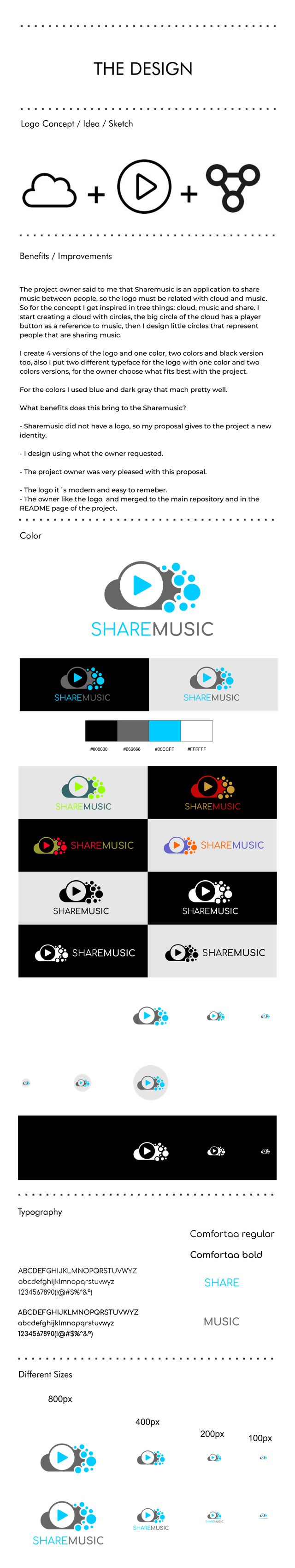
Tools I used
CorelDRAW_Graphics_Suite_2017_19.0.0.328 (logo design)
Photoshop_CS6_Extended (mock-up design)
PROOF OF AUTHORSHIP
PROOF OF WORK DONE
FONT: Confortaa
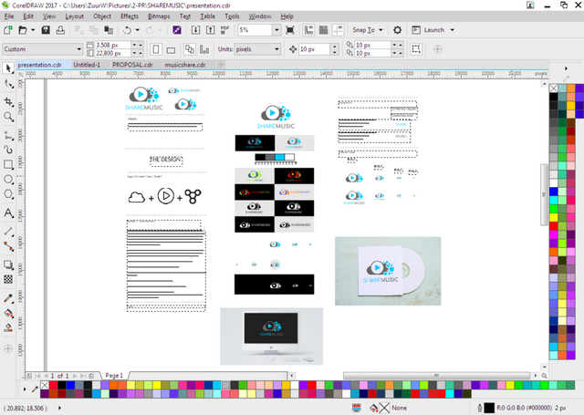
IMAGE COVER
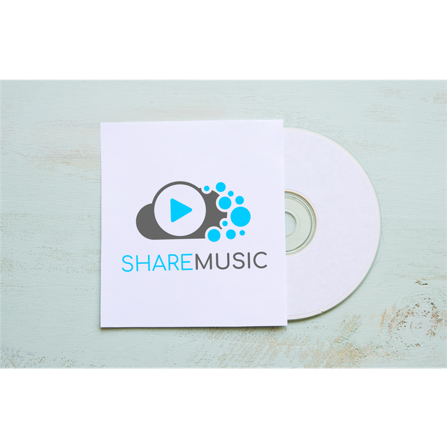
IMAGE 1
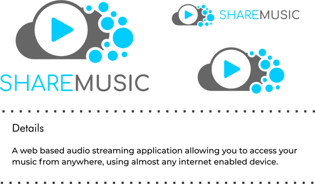
IMAGE 2
IMAGE 3
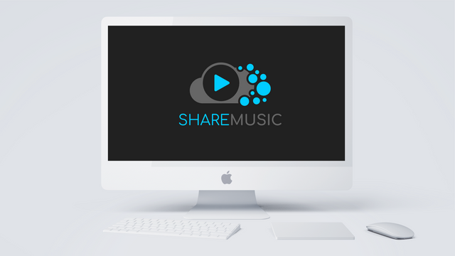
MOCKUP
LOGO FILES
This work is licensed under a Creative Commons Attribution 4.0 International License
Thank you for your contribution.
The circles (that represent sharing) looks like a bunch of bubbles, too many of it make the logo looks bad in small size.
Your contribution has been evaluated according to Utopian policies and guidelines, as well as a predefined set of questions pertaining to the category.
To view those questions and the relevant answers related to your post, click here.
Need help? Write a ticket on https://support.utopian.io/.
Chat with us on Discord.
[utopian-moderator]
Hi @nilfanif, thank you for your review.
Thank you for your review, @nilfanif!
So far this week you've reviewed 8 contributions. Keep up the good work!
Hi, as it was mentioned at your other submission, you should work on the format of your posts. It appears that you follow just the category points and you forget that you share your work with other people on the platform as well.
Mastering markdown will give you hints on what you can do with Markdown. Always check in the app previewer (Steemit, Busy, Steempeak, ...) how your post will look like. The Utopian templates are there to give you a hint on the basic structure of the post. However, it does not mean that you can't adjust it for your needs and improve the format of the whole post.
Also, is there a reason why you put all your text in the images? I could notice that you use the same presentation with only a few changes in wording and images. Do you think that having different presentations which suits better your designs could bring you more readers?
The format of the posts is one of the evaluated aspects of the submissions. I could notice that you were not given feedback on that but know that there is a lot to improve. Afterall, you could use these posts to back your portfolio and make it more appealing instead of using the same post format without improvements.
Although your designs are interesting, their presentation should be meaningful.
Hey @zuur
Thanks for contributing on Utopian.
We’re already looking forward to your next contribution!
Want to chat? Join us on Discord https://discord.gg/h52nFrV.
Vote for Utopian Witness!