Logo For Depensy
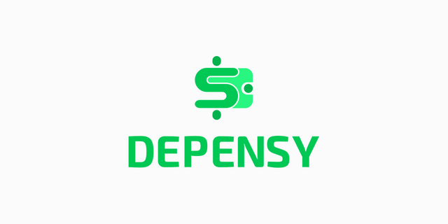
Repository
https://github.com/sabiou/depensy
Previously this project did not yet have a logo, then I offered to design a logo on the project owner. And the project owner accepts it.
In the first conversation with the project owner, (Github issue Link). There the project owner likes one of the logos of the three logos that I design. After that, I make a pull request first and the project owner has merged it.
After a few days later, the project owner asks for help to change the color of the logo in blue to green, to match the appearance of the app. (See the conversation on the telegram link). Then I make a second pull request to change the color of the logo and icon. And the project owner has also merged it.
Details
Depensy is a work-in progress simple budget management app - features latest android technologies. An app to track your daily expenses. The app is built with Kotlin, Koin, Material components and Android Architecture Components.
Logo Result
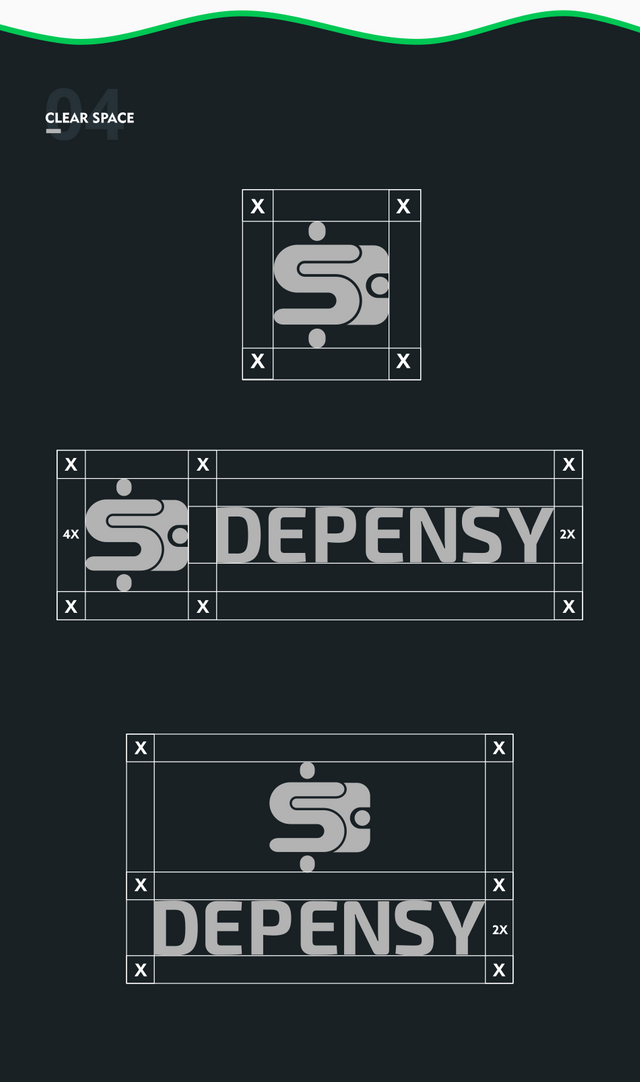
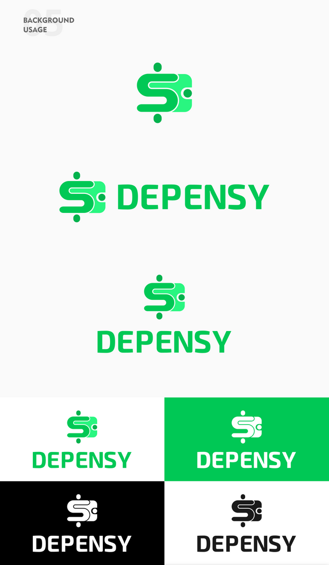
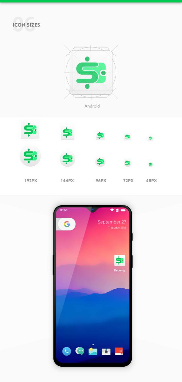
Benefits / Improvements
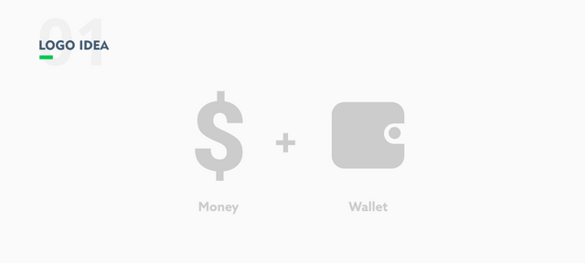
This project deals with daily expenses. Therefore this logo is inspired by the dollar currency and wallet icon.
The dollar means that this app is related to money.
And the wallet is related to expenses.
Then I combine the two objects. And make the logo look simple and modern. To make it look unique on the dollar symbol I made it from the letter S and a shape circle above and below it.
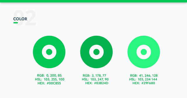
As suggested by the project owner, I use bright green and dark green colors on the logo.
Green has financial meaning because this color matches this logo.
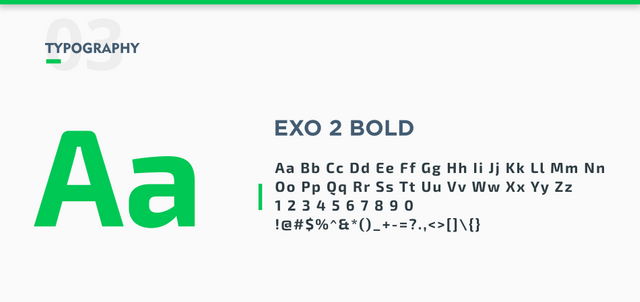
And on the logotype, I chose the EXO 2 Bold font because it looks like it matches the logo.
The launcher icon is designed based on the Android icon guide.
Proof of authorship
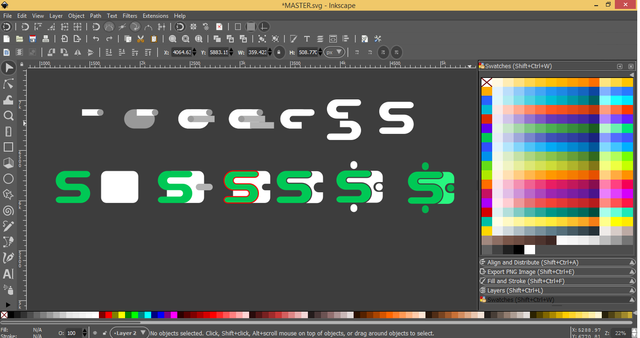
Tools
Inkscape (Logo Design) & Adobe Illustrator CS6 (Export to other vectors)
Original files
Drive Link
Font Link
Mockup Link
Proof of Work Done

This work is licensed under a Creative Commons Attribution 4.0 International License.
Hey @zularizal ,
Thank you for the contribution.
I liked your ideas and combination between the dollar icon&wallet but the logo design seems not understandable in small sizes. However, I appreciated your work!
Your contribution has been evaluated according to Utopian policies and guidelines, as well as a predefined set of questions pertaining to the category.
To view those questions and the relevant answers related to your post, click here.
Need help? Chat with us on Discord.
[utopian-moderator]
Yes, I just found out. Thank you for your review.
Thank you for your review, @baranpirincal! Keep up the good work!
Hi @zularizal!
Your post was upvoted by @steem-ua, new Steem dApp, using UserAuthority for algorithmic post curation!
Your post is eligible for our upvote, thanks to our collaboration with @utopian-io!
Feel free to join our @steem-ua Discord server
Nice logo.

In the event that you or the project owner decide to simplify it further, be careful, or you might get the Sparkasse logo! (German bank)
Hey, @zularizal!
Thanks for contributing on Utopian.
We’re already looking forward to your next contribution!
Get higher incentives and support Utopian.io!
Simply set @utopian.pay as a 5% (or higher) payout beneficiary on your contribution post (via SteemPlus or Steeditor).
Want to chat? Join us on Discord https://discord.gg/h52nFrV.
Vote for Utopian Witness!