Steem Welfare Studies Part 1: Dmania Bot Upvote Analysis. Lorenz Curve and Gini Coefficient of Upvote Distribution.

Introduction
Steem blockchain, with the introduction of various decentralized applications built on top of it, is able to serve more and more diversified opportunities to its users with regard to increase their user experience. Each of those decentralized applications, in line with Steem Blockchain’s ground breaking in built incentivization method, also function as decent income sources for the Steemit users. One of the other features of the dcent applications is that they also provide a valuable proxy for the users to receive more stakes (SP) and increase their reputation points in most efficient way. As in most cases, dcent applications attract users by holding huge amounts of SP in a bot account. Again in most cases, this SP at stake is delegated by huge SP holders like @Ned, @freedom, @blocktrades, @misterdelegation.* Delegating huge amounts of SP to a bot account which follows an algorithm is the smartest way of circulating the SP which was remaining frozen. Naturally this results in more wealth for more users when they meet the defined prerequisites for an upvote. In sociological terms, this carries a huge potential to provide equality of opportunities to the Steemit.com users.
Since having a just distribution is one of the fundamental aspects of sustainable economic systems, Steem ecosystem requires considerably good ratios of wealth distribution among its users. Steem Welfare Studies aim to explore the distribution of the resources by creating a gini coefficient. This article, as being the first part of analysis series, focuses on @dmania ‘s upvote activity.

Methodology, Operationalization, Practical and Theoretical Limitations
Note: This part contains technical information about the analysis. The users who are not familiar with the terminology used here, or do not wish to read about technicalities can jump into the empirical findings section.
- In order to access the data i used steemsql database.
- In order to read & filter the data, i used Dbeaver program which offers a user friendly interface to filter the data even without manually typed sql queries.
- In order to make sense of the and run further operations on it, i used Stata 13.0
- For the specific purposes of this article, i patched Stata 13.0 with glcurve, lorenz & fastgini sub-programs.
- For the data visualisation i used both stata and RAWgraps.
The latest data point covered in this analysis is from 09.02.2018
SQL queries
I ran 3 different queries to get the data in desired format.
To get the whole data, i only used voter filter. I used the interface to filter the voter as ‘dmania’. This brought me the whole voting activity of dmania bot.
In the second step i filtered the data to see received upvotes per user with the sum of weights. (only with positive weights)
- SELECT author, SUM(weight), COUNT(author)
FROM DBSteem.dbo.TxVotes
WHERE voter = 'dmania' AND weight > 0
group by author
In the third step i ran the same query to see the flagging activity of the dmania bot
- SELECT author, SUM(weight), COUNT(author)
FROM DBSteem.dbo.TxVotes
WHERE voter = 'dmania' AND weight < 0
group by author
Then i exported the data to stata to run further operations
Stata Operations
In stata do files // are used for definitions. Only the italics are the real commands
- *gen avw = tw/upvcnt *// to create average upvote weights for 1 post of a user
- egen tot = sum(upvcnt) // to create a variable contains total number of upvotes
- gen perc = upvcnt/tot100* //to create a var shows the percentage of the user in total upvotes
- egen others = sum(perc) if perc<1 //creates a var which contains total percentage of the users who holds less than 1% of upvotes
- *egen pupv = sum(upvcnt) if perc<1 *//Creates a var shows the total number of upvotes of the users who holds less than1% of upvotes
Empirical Findings
The most striking emprical finding is that 1530 upvotes are distributed to 459 distinct users. And 12 of those users received 23,39% of the all upvotes.
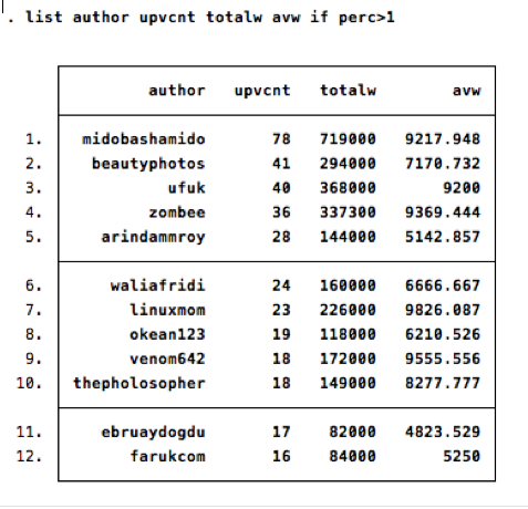
as the table shows, @midobashamido @beautyphotos and @ufuk are the top three users.
The column totalw indicates the total upvoteweight that the user received until today. aw column shows us the average upvote weight. @linuxmom is the best among the top 12 in average upvote weight. The user @thauerbyi is the top user with 10 upvotes and 10000 average upvote weight.
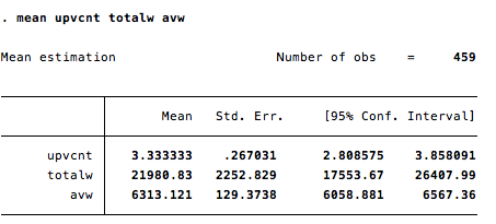
here we see the mean upvote number, average upvote weight total upvote weight scores of the dmania community.
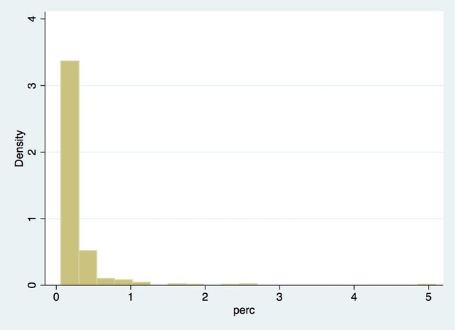
This graph summarizes the distribution of upvote percentages among the users. Since dmania is still on the launching period, the skewedness of the distribution doesn't refer to any structural distributinal problems or strenghts yet.
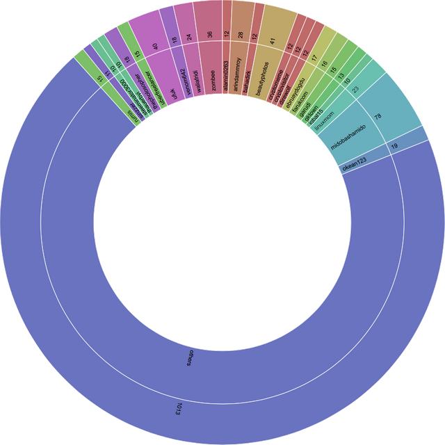
This the general visualisation of upvote distribution.
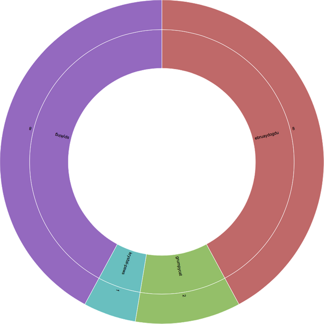
And this graph shows us the flagging activity of the dmania bot. It is so interesting to see that most of the flagging activity happened in one day. 35 days ago. Probably this happened due to dmania's rule update about the language restrictions. The user @ebruaydogdu got flagged 8 times. What makes her special is that she is also one of the top upvote receivers of the platform. This could imply that users tend to apply try&error method on their dmania activities.
Lorenz Curve and GINI
Lorenz Curve and Gini coefficient are two fundamental statistical tools mostly used by economists to asses the distributional inequalities. Lorenz Curve was invented in 1905 and relying on this curve gini coefficient was invented in 1902. Those two over 100 years old tool still enlighten us in our analyses.
The basic idea behind the lorenz curve is to show the cumulative distribution of any resources. The statistical programs that we run nowadays draw the curve in less than 1 second. The curve doesn't mean much by itself. It has to be compared with the 45 degree line of perfect distribution. With the perfect distribution %1 percent of the population holds the 1% of the resources. The distance of the curve from that 45 degree line is being calculated and scored by gini coefficient. Gini coefficient by relying on the mathematical equation gives us a number which is between 0-1. 0 means perfect distribution and 1 means only one person possesses all the resources in the society.
Here is the lorenz curve of the dmania upvote distribution:
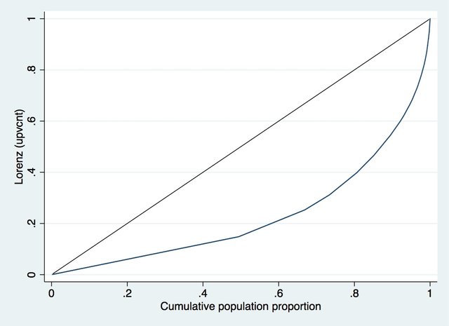
So we are interested in making the sense of the area falls between the 45 degree line and and our Lorenz Curve of dmania upvotes. Here personally i don't know about the mathematical calculation of it, but fastgini command of the stata does that for us and results the gini.
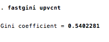
The gini score is 0.54. This tells us that the inequality of the distribution of upvotes is quite high but still close to the tolerable levels. Normally the gini scores more than 0.4 is considered a bad sign for an economy (EU has average 0.3 gini ie).Here taking into account of the fact that dmania is still on launching process, we can say this number is relatively okay. When we compare it with the steemit.com's totalpayout gini, which is about 0.8** dmania has such a good distributional equality levels.
I will redo this analysis in regular intervals to make longitudunal database of steeem ecosystems distributional levels.
In the following articles i will focus on utopian.io, dtube, dlive, busy and dsound.
*Special thanks to the mentioned accounts for their delegation
** Steemit.com analysis is still on the progress. It will be published in the following days.
Posted on Utopian.io - Rewarding Open Source Contributors
Your contribution cannot be approved because it does not follow the Utopian Rules.
Dear @tubi, I'm sorry, but I'm rejecting your contribution because I think there are several smaller issues with it:
STEEMIT_1_PERCENTwithout distinction.You can contact us on Discord.
[utopian-moderator]
Don't understand 🤣.
Not sure if you apply macro economic terms to a digital economy ( in a meaningful way that is)
Hey @Vander, thank you for sharing your opinion. I have noted Crokkon's criticizations. I'll try to fix the problems as soon as possible. Additionally to Crokkon's list, If there are any other issues that you think i should work on please let me know :)
I appreciate the analysis. Even though I admit, I honestly don't understand everything, this is the kind of posts I like to force myself to read.