STEEM UI Defect: Fixed height for iFrame
Although #Steemit has very flat and clean UI which gives great user experience but I have found small UI defect on Steemit. It seems small but in user perceptive it's not odd. It gives bad user experience.
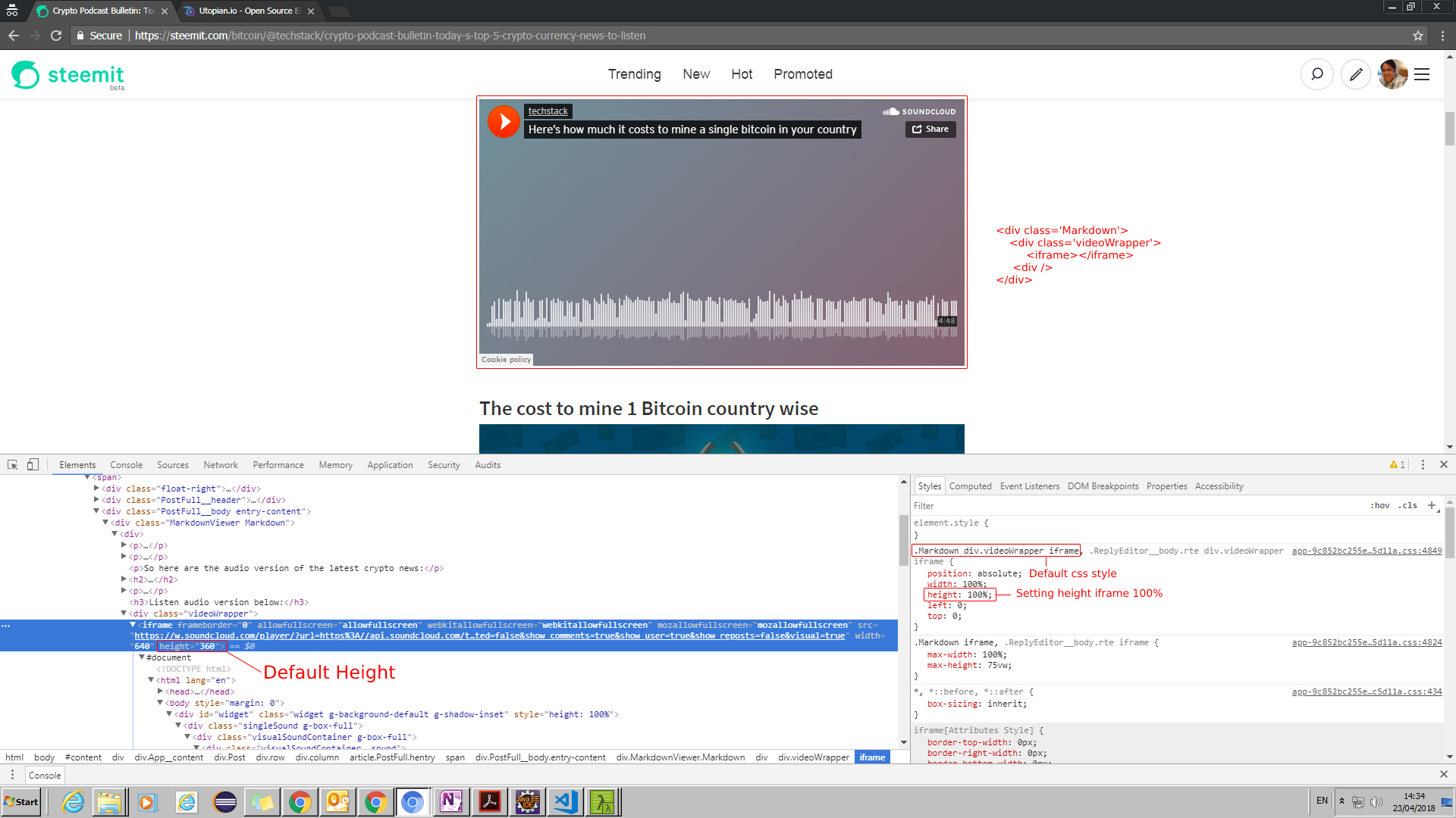
In my last post Crypto Podcast Bulletin: Today's top 5 Crypto currency news to listen I had used embedded code to show the audio player which includes iframe and it had fixed height='166' but due to fixed height='100%' in CSS class .Markdown div.videoWrapper iframe the audio player not rendering correctly.
Here is following screen shot with default CSS class style:
.jpg)
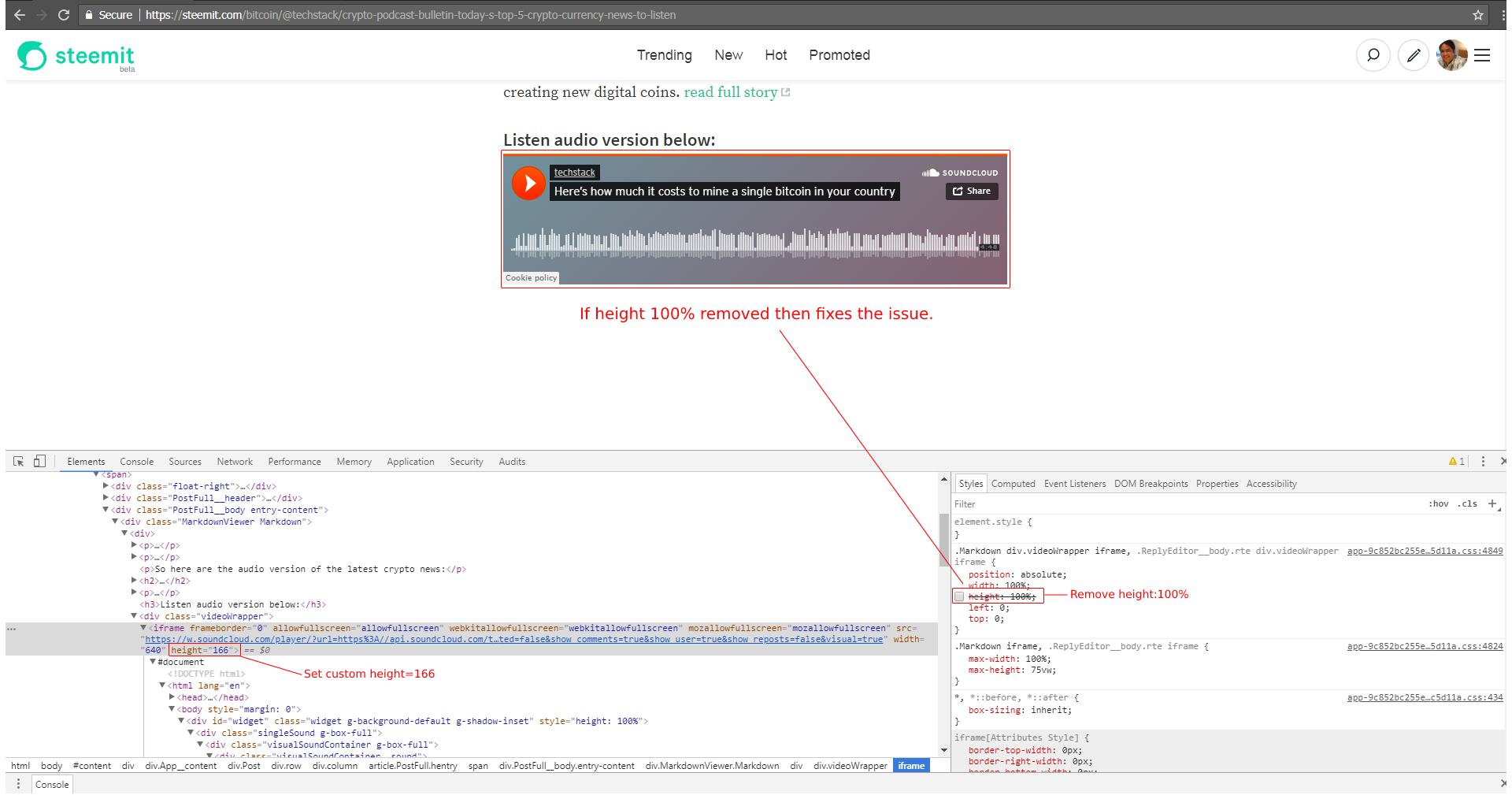
If I changed the iframe height to 166 in the console it still didn't change the height because of fixed height='100%' in .Markdown div.videoWrapper iframe which is forcing element to render 100% height. See below screen shot:
.jpg)
Now if I remove height='100%' in CSS class .Markdown div.videoWrapper iframe it fixes the issue. See screen shot below:
.jpg)
It should not use height='100%' always. Some it depend on situations but you should always test in various scenarios.
I hope some one will notice this and correct it.

very informative post. thx :)
upvoted
Thanks @crypto.piotr