Inclusion of a colorful tab barrier
Components
Lucid browser is an open-source apps that allows its users to surf the internet freely and is secured.The browser uses a custom homepage that loads locally for quick start-ups. Although it is small in size and lucid browser is also fast in browsing.
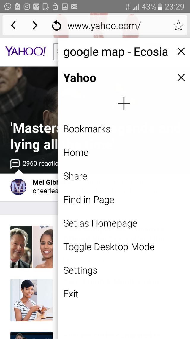
I also noticed when adding tab the tabs all look alike which is confusing
Proposal
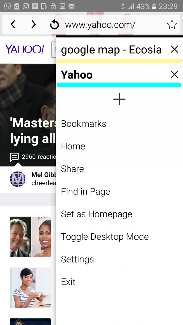
I propose that a color effect should be added to the tab to differentiate between tabs
Mockups / Examples
how the browser tab looks
.
How it looks when the effect is added

Benefits
This would make the browser more user friendly
And would make the tab easy to differentiate when using the browser
It reduces mistakes made when choosing among tabs .
Posted on Utopian.io - Rewarding Open Source Contributors
@suleimanz, Upvote is the only thing I can support you.
Hello @suleimanz, Your contribution can not be approved as this seems to be really trivial and non technical.
You are adviced to always suggest things that will most probably have great impact on the project.
Example of good contributions can be found here here here and here
please do well to look into the sample given to avoid submitting low quality contribution in the future. Thank you.
You can contact us on Discord.
[utopian-moderator]