Tutorial : Designing Product Packaging Using Inkscape Software
Good morning everyone, hopefully you are always healthy and can do activities and daily routine as usual, and hopefully earlier this week better than the previous days. On this occasion I again wanted to share a tutorial of course still about graphic design using Inkscape Software.
Maybe you are bored with the tutorial from me, because it always peel and discuss about this inkscape software, but I have another reason, why I always discuss open source tutorials about Inkscape, I think we better learn a software to a new finish then we try to learn other software. So that we get the science maximum and really able to master the software.
Well, on this occasion we will learn to make graphic design how to make product packaging by using inkscape software. But, before we enter the tutorial session, as usual I will first introduce this inkscape software to all of you. However, the explanation of inkscape software in this tutorial is only general. For more details you can read and searching on the internet.
Inkscape
Inkscape is an open source software that is almost equivalent to corel draw, although not as famous as the corel draw itself. But this software already meets the standard XML, SVG and inkscape CSS can also run on windows operating system, so this graphic device is really friendly with you who have talent graphic designer.
The main goal of inkscape is presented is to be one of the current cutting-edge graphics tools. Okay friends, that's a glimpse of information about this inkscape, now we go into tutorial session.
That's a glimpse of information about inkscape, hope you guys novice designers like me can understand and are interested to follow this tutorial from me. Because the tutorial we will study this includes a long and slightly complicated discussion.
Tutorial
Designing Product Packaging Using Inkscape Software

1. Package cover design
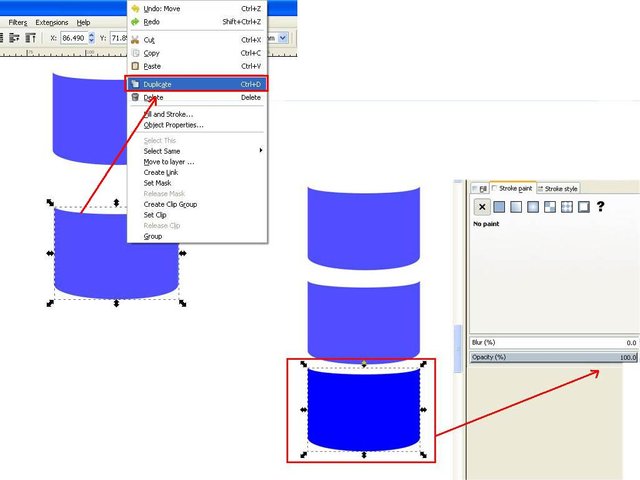
For the first step, open inkscape then click the rectangles icon on the side bar and create a square object, for the color you can use whatever color you like available in the task bar, then edit the path by nodes icon on the side bar too, then click on the top middle and bottom and then pull down just a little, so it appears curved, then set the arch with the coordinate points on the corner of the object. Then subtract the object's opacity on the fill and stroke command screen and right-click on the object and select duplicate, make two duplicate.
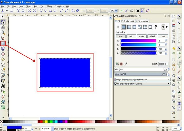
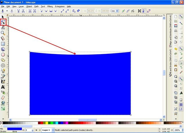
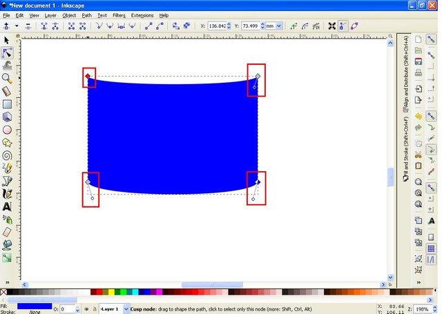
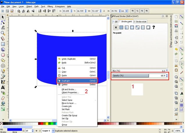
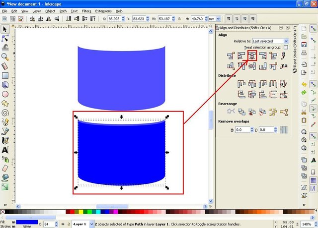
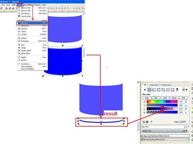
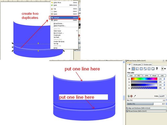
The second step, to duplicate the first and second distinguish the color, then join both and give a little distance, click the center icon on vertical axis on the align and distribute objects command then click the path on the menu bar and select the difference. The result will be a line-shaped object, then make two duplicates as well and set the position of the two lines below with two different colors, and one line at the top of the packing cap. At this point the packing cap is already formed for the block thoroughly and click the icon group on the menu bar.
2. Body packaging design
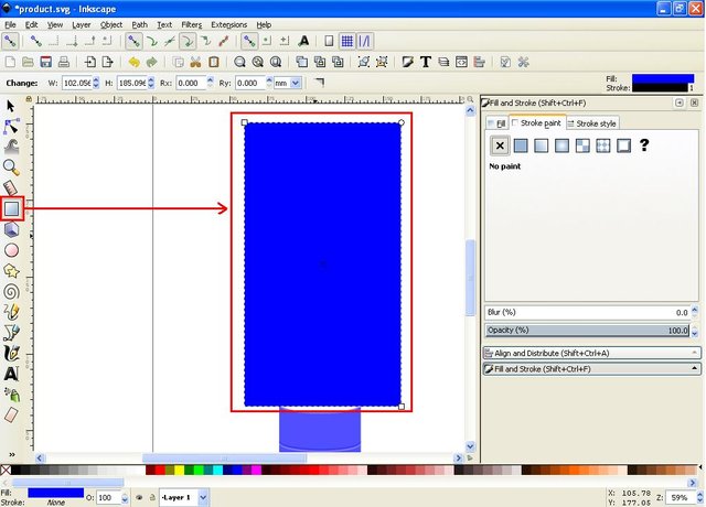
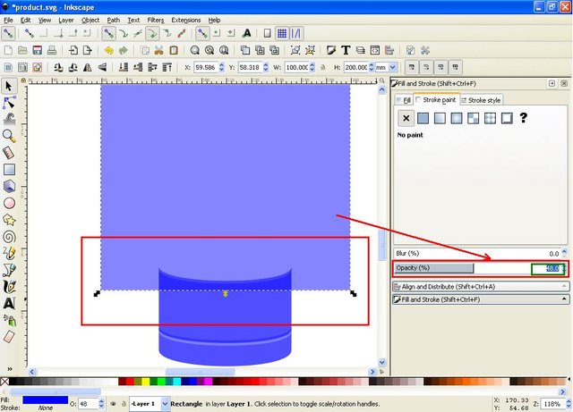
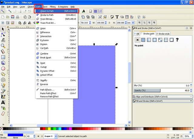
For the first step click rectangles on the side bar, and create a rectangular object, then subtract opacity on the fill and stroke command screen, then click the path on the menu bar and select object to path and leave the object in the active position, then click edit icon path by nodes on the side bar, then set the shape by clicking point point at the corner of the object.
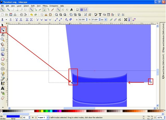
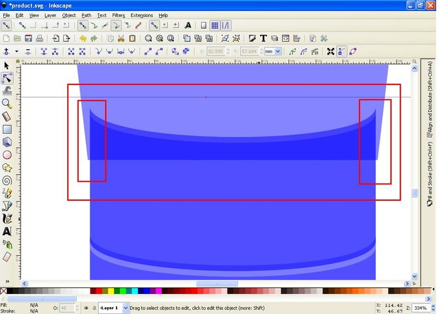
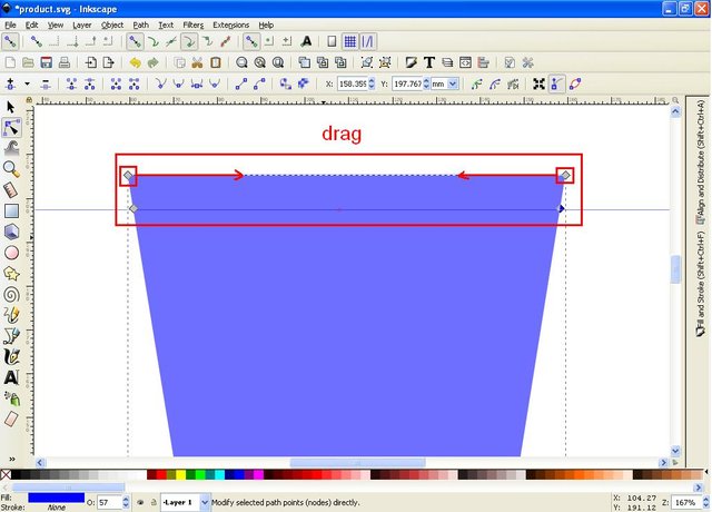
The second step is, drag the coordinate line on the upper rule by using the mouse, then place it on top of the lid, then click the edit path by nodes icon on the side bar, and point the pin point at the top of the packaging cap, double click on the object body packaging, then set the arch like a pack in general.

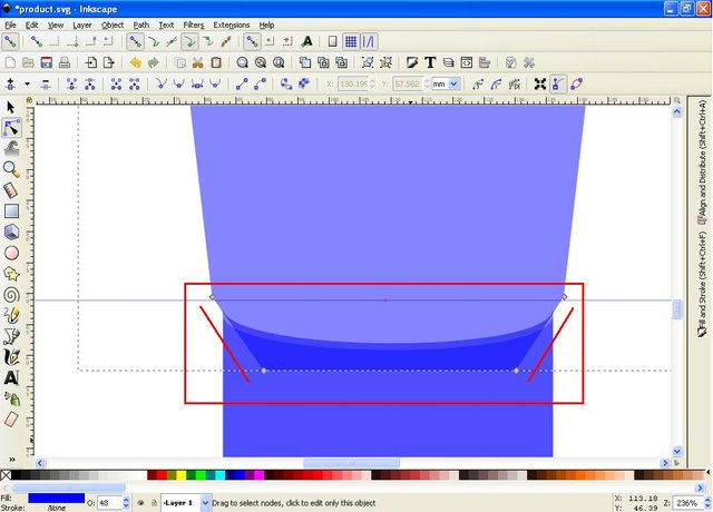
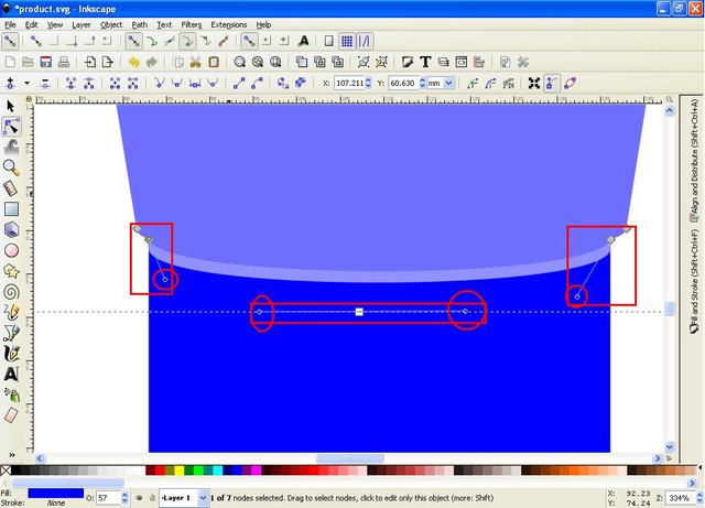
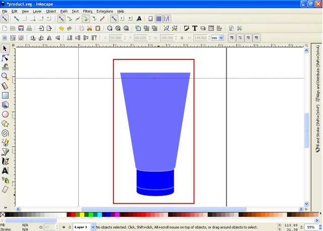
The third step adjusts the top of the packaging, clicks and drags the coordinate line on the top rule of the screen and places approximately ½ inch for the top, then clicks edit the path by nodes again and make the point points as on the bottom of the pack in the second step before, and set so that the form of a package.
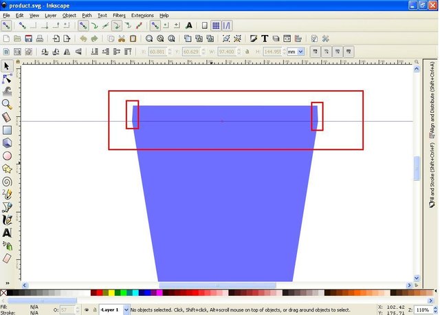
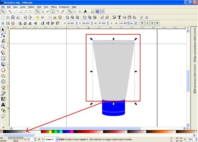
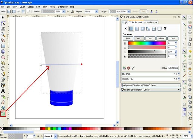
The fourth step, change the color of the packaging body to white, by clicking the color icon on the task bar and select 10% color or 20% gray. Then click on the icon create and edit gradients on the side bar, and set the color and lighting, by clicking on the grid line twice to give a point point, here I just use one extra point point in the middle, then click on that point and choose the color you like, make one by one, here I use light blue for the starting point, and white for the second or middle point and light blue for the last point. This line can be placed vertically or horizontally.
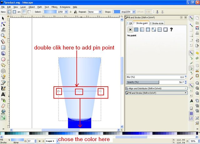
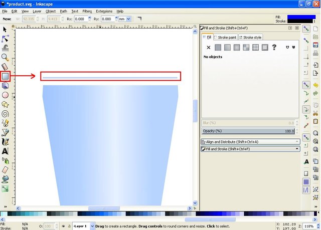
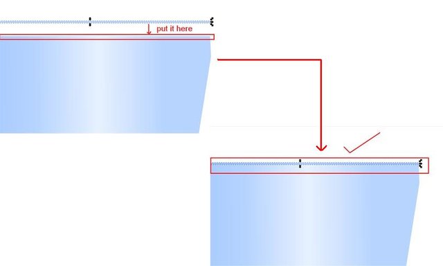
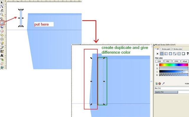
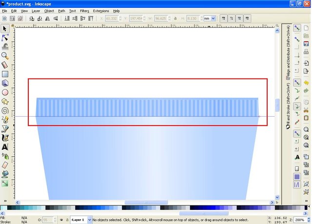
The fifth step set the top of the pack, click the rectangles icon on the side bar then make a rectangular object in the shape of the line, then give the same color as the packaging body, then put on the top, then make one more object with the same color but different sizes, and with horizontal shapes, then make duplicate and duplicate the same color as the packaging, then make duplicate both and as many as necessary to reach the tip of the packaging body. Up to this stage the packaging body is finished, do not forget to group all the objects on the body of the packaging.
3. Decorative packaging
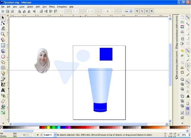
The first step to prepare an image that is suitable for the packaging of the product we are working on, here I use a photo of my friend, because I tried to make packaging for female cream products. Then prepare some of the decorations you want.
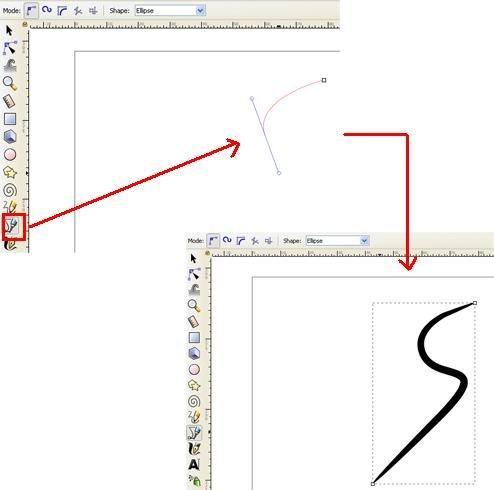
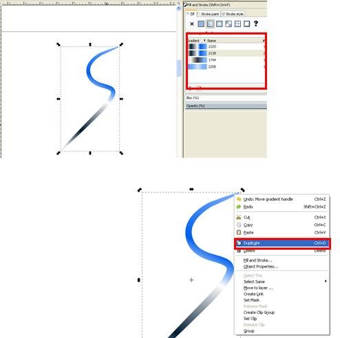
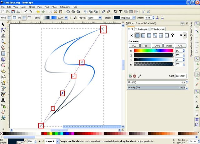
Step two, click the draw icon Bezier curves to create a symbol or product logo, by clicking the Bezier draw icon, then select ellipses on the shape column then make the logo you want, here I make the S-shaped logo because the product I want to create is branded SUN SHINE then bet the logo and set the color and lighting on the fill and stroke command screen and create and edit gradients line, logo color may be different from the packaging form, there may be little similarity,
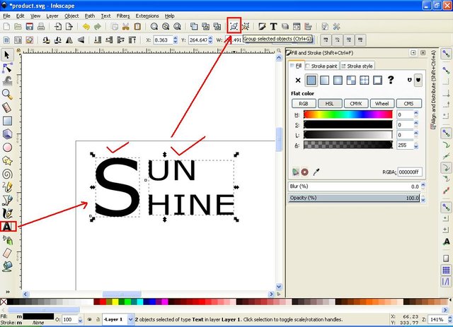
The third step make the writing, by clicking the icon create and edit the text object, then set according to your wishes, do not have to follow this tutorial, because in terms of designing needed a way of thinking that is creative and innovative, for it play feelings and imagination when designing it.
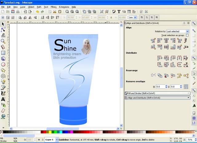
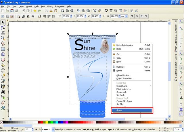
The fourth step set the decoration position so that the packaging becomes attractive and elegant, if it is finished, click the icon select and transform object then block all objects then right click and select group.
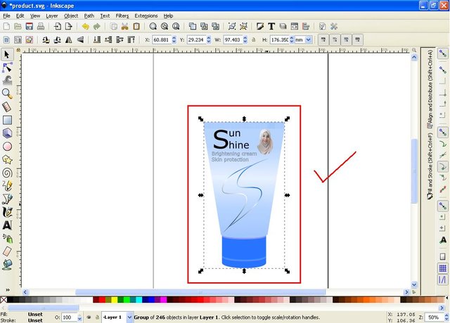
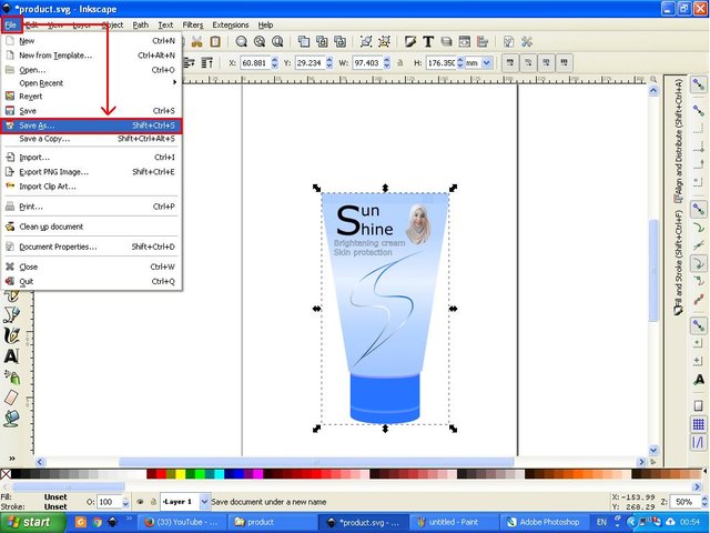
The last step, save the file, click the file in the menu bar, then click Save As and select one of the format to save the file, but I suggest to save your file in two format only, first choose SVG format, and second choose PNG format.
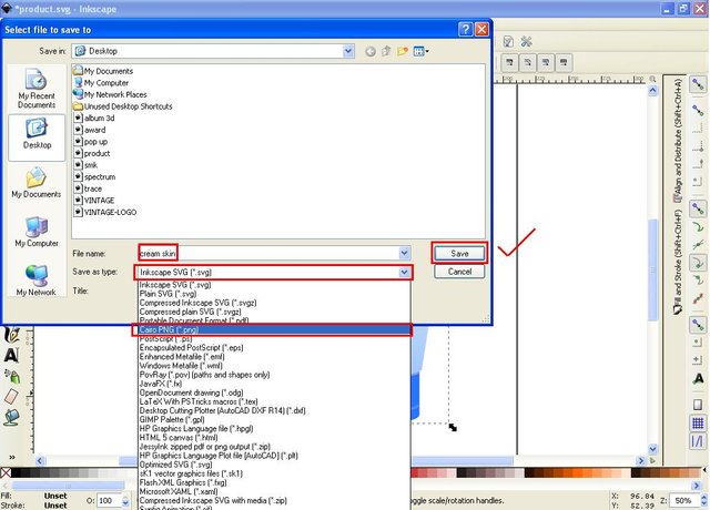
Okay ,,, that's all I can share in my tutorial this time may be useful for all of us. Thank you for reading and tutorial from me, good luck and good luck. Best Regards @saini88
Posted on Utopian.io - Rewarding Open Source Contributors
https://steemit.com/streetphotography/@rajamuradi/happy-friday-steemit-beautiful-wildflowers-275384dd7f2bf
Congratulations! This post restemed by @resteempost
Hello, you received a boost courtesy of @steemdunk! Steem Dunk is an automated curation platform that is easy and free for use by everyone. Need a boost? Click me
Upvote this comment to support the bot and increase your future rewards!
Thank you for the contribution. It has been approved.
You can contact us on Discord.
[utopian-moderator]
Thank you very much @slempase #utopian-moderator
Hey @saini88 I am @utopian-io. I have just upvoted you!
Achievements
Suggestions
Get Noticed!
Community-Driven Witness!
I am the first and only Steem Community-Driven Witness. Participate on Discord. Lets GROW TOGETHER!
Up-vote this comment to grow my power and help Open Source contributions like this one. Want to chat? Join me on Discord https://discord.gg/Pc8HG9x