Logo design for DiceKit / Approved and used in the project

Repository
https://github.com/Samasaur1/DiceKitLinked Task Request
https://github.com/Samasaur1/DiceKit/issues/35Details
This post is about the presentation of a new logo for DiceKit which was requested by the owner of the project once I delivered a logo for another project that is being developed. DiceKit is a Swift module to simulate real and unreal dice. the owner of the project requested a logo design for a project called MailKit in which I made a contribution and, once the work was finished, he asked me in a conversation if I could create the logo for this new project. So I put my hands to work.
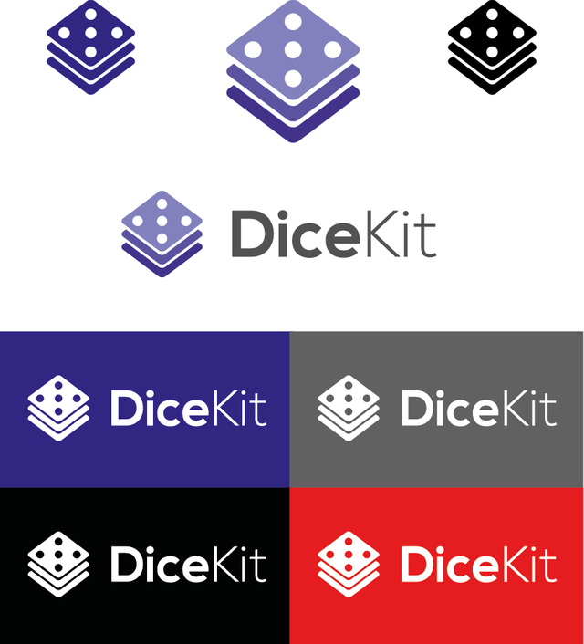
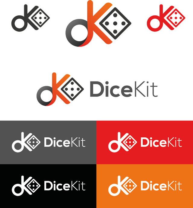
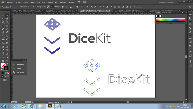
The project owner requested a specific design of the logo to be coformated, it is a three layer structure where the upper layer represents a DICE. However, I wanted to show a second proposal that represents the DICE at first glance but due to the project's own criteria the logo should be as requested by the owner.
I start to work and I generate two designs one based on the criteria requested by the owner of the project and a second alternative presented by me, I create a small model and show it to the owner without emabrargo I select the design of the three layers
Primary Color System
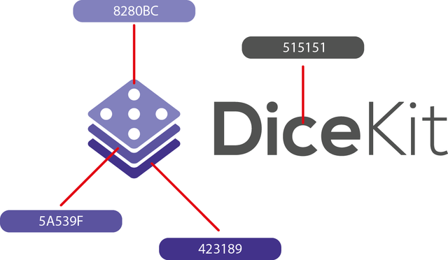
Typography
NEXA

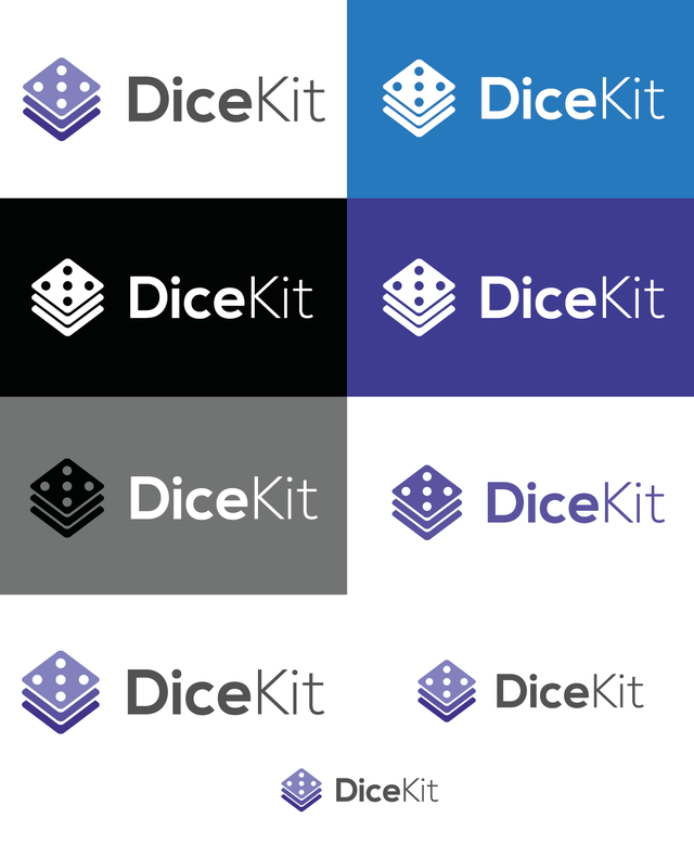
Variations
Safe area

Benefits / Improvements
*Easily express the function of the project
*Flexible in any size
*Easy to remember
*It can be used in different colors
*It represents the main idea that the project owner had
*All files in vector format for future modification
Proof of Authorship
Tools

Original Files
Google DriveProof of Work Done
https://github.com/Samasaur1/DiceKit

This work is licensed under a Creative Commons Attribution 4.0 International License

Your second proposal logo design seems unbalanced. Square shape seems not belong to logo design. All elements has different color variations, thickness and empty spaces. Also, it has some alignment problems.
However, thank you for the contribution. I liked your logo design which one is approved from project owner. It would be better, if you provide different color variations of the logo design. Maybe you can try to use gradient or etc. It would be good to see.
Your contribution has been evaluated according to Utopian policies and guidelines, as well as a predefined set of questions pertaining to the category.
To view those questions and the relevant answers related to your post, click here.
Need help? Write a ticket on https://support.utopian.io/.
Chat with us on Discord.
[utopian-moderator]
@baranpirincal Thank you very much for your valuation I will follow your recommendations greetings.
Thank you for your review, @baranpirincal!
So far this week you've reviewed 1 contributions. Keep up the good work!
Hello @richardbmx, thank you for sharing this creative work! We just stopped by to say that you've been upvoted by the @creativecrypto magazine. The Creative Crypto is all about art on the blockchain and learning from creatives like you. Looking forward to crossing paths again soon. Steem on!
@creativecrypto Thank you very much for your vote
Hi @richardbmx!
Your post was upvoted by @steem-ua, new Steem dApp, using UserAuthority for algorithmic post curation!
Your post is eligible for our upvote, thanks to our collaboration with @utopian-io!
Feel free to join our @steem-ua Discord server
Hey, @richardbmx!
Thanks for contributing on Utopian.
We’re already looking forward to your next contribution!
Get higher incentives and support Utopian.io!
Simply set @utopian.pay as a 5% (or higher) payout beneficiary on your contribution post (via SteemPlus or Steeditor).
Want to chat? Join us on Discord https://discord.gg/h52nFrV.
Vote for Utopian Witness!