Utopian.io Feature Request: Adding of Compress/Expand button

Components
My suggestion is about adding a compress/expand button near all categories menu. I came up with this idea because of the categories above that the user failed to see directly although it has a sideward arrow to be used in finding the rest of the categories.
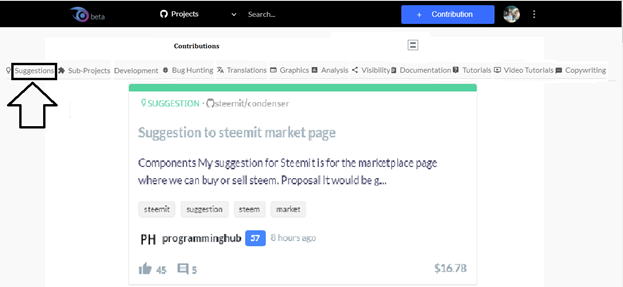
I find it more hassle when I want to look for the tutorials that the other users contributed to. As what I have noticed, the space where the contributions for different categories were as small as you can see in the picture below. Let us consider that not all users have good eye sight.

The picture above shows that the left and right arrow were so small that some user’s failed to noticed directly and its purpose.
Proposal
My proposal for the utopian.io is to add this button 
at the top menu button. The purpose of this button is to expand the windows where all the contributions of each category can be seen directly and the visual display will be expanded. By this button, the user can clearly see all the contributions in each category.
Then the user can also compress it by the time he/she already done looking all the contributions that he/she wants to.
Mockups / Examples
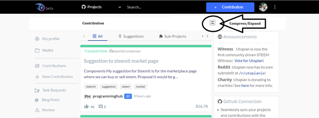
Upon adding this feature, the utopian.io will now look like this.

The user will just click on the compress/expand button in order to expand the display of all the contribution’s category. Once click it will display like this below.
All the categories will be displayed and the contribution display for that category will be expanded and it will look better that the user can clearly see all the details of the contribution.
In order to compress it again, the user will just click again on the compress/expand button and it look like this below.
Benefits
♦ The user will be able to look clearly the contribution’s details because of its expanded display window
♦ Less hassle in looking for the contributions under each categories because it is already been displayed the user will just click the suggested button
Posted on Utopian.io - Rewarding Open Source Contributors
Your contribution can not be approved as it seems to be really trivial + you don't have to use the arrows on utopian ,because you can move to other categories using the arrows on your keyboard.
You are advised to always suggest things that will most probably have great impact on the project.
Example of good contributions can be found here here and here
please do well to look into the sample gieven to avoid submiting low quality contribution in the future. Thank you.
You can contact us on Discord.
[utopian-moderator]
My suggestion that you reviewed sir is about compress/expand button it has nothing to do with the arrows that you mentioned. But rather the suggested button has its own purpose to widen or compress the display of all the contributions, the arrows were part of it if this button is implemented.
Congratulations @rfece143! You have completed some achievement on Steemit and have been rewarded with new badge(s) :
Click on any badge to view your own Board of Honor on SteemitBoard.
For more information about SteemitBoard, click here
If you no longer want to receive notifications, reply to this comment with the word
STOP