Learning React-native : Part VI
Official Github repo for this tutorial: https://github.com/facebook/react-native
What will I learn?
- Creating custom button component without using ‘Button’ and Signup screen
- Using dimension API for application responsiveness
- Using the platform API
Requirements
- A laptop/PC with Mac OS/ Linux/ Windows
- Preinstalled node.js
- Preinstalled Code editor
Note: This tutorial is performed in Visual Studio Code on a laptop with Windows 10 Home, 64 bit OS
Difficulty
Intermediate, you must have good knowledge of JavaScript to catch up this tutorial.
Tutorial Content
In our previous tutorial, we learned about integrating third-party libraries, flexbox and making our own custom ‘TextInput’ component. Now today we will be focusing on some of the API provided by react-native like Dimension API, platform API and we will also handle the user input in our application. Our login screen looks like this.
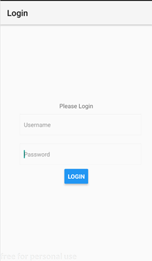
Now, let us style our Login screen a bit more attractive by adding some background images and then we will work on its responsiveness. Let us add some background to our login screen.
Download a good image and store it in the assets folder. We can use the component provided by react-native that is “ImageBackground” to use the image as background.
We should import the image first like this
import BackgroundImage from '../../assets/login_screen_background.jpg';
Now we should wrap our whole view inside the <ImageBackground> so that our background will cover the entire screen
  <ImageBackground
            style={styles.backgroundImage}
            source={BackgroundImage}>
            <View>
                //screen’s view
            </View>
            </ImageBackground>
We need to make our background image appear on the whole screen available so in order to do that we should let it occupy the entire screen so we should assign it with ‘flex:1’
backgroundImage:{
        flex:1,
        width:"100%"

      }
Now let us add some background in our ‘TextInput’ component. We can do it in the ‘DefaultInput’ component we made in the previous tutorial.
<ImageBackground
    style={styles.imageBackgrounf}
    source={TextInputBackground}>


    <TextInput
     style={styles.input}
     autoCapitalize='none'
     autoCorrect={false}
     autoFocus={true}
     underlineColorAndroid="transparent"

 {...props}
    />
    </ImageBackground>
Now if we run the application the output looks like this:
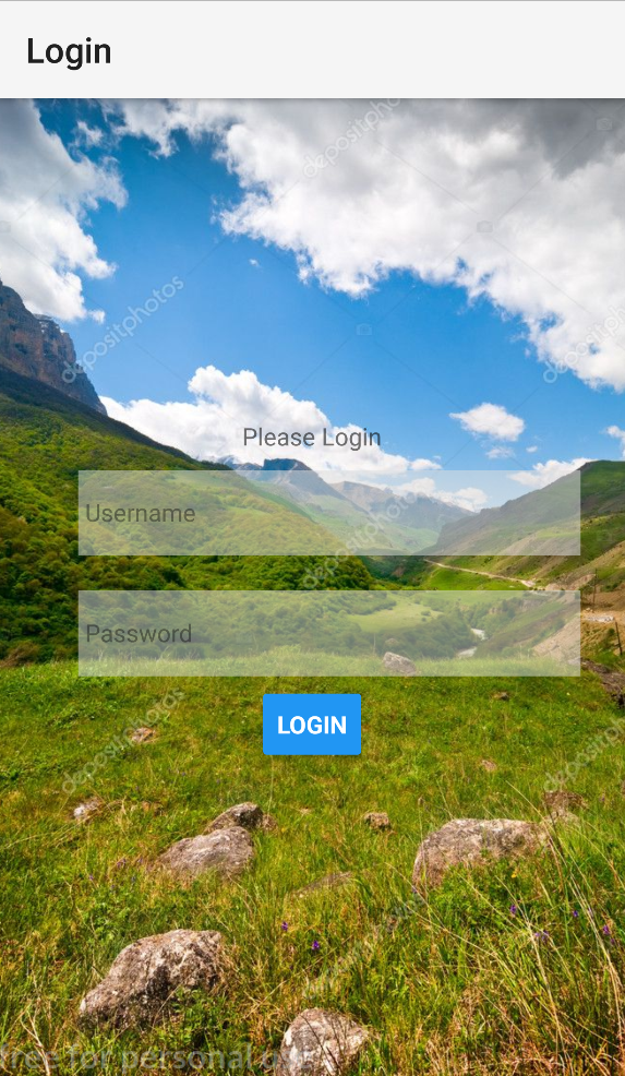
It seems very nice. Now let us add signup button in our login screen so that user can also navigate to signup screen.
Creating custom button component
As the button will be used in many places in our application let us make a custom button so that we do not have to declare and style it again and again. It is difficult for us to style a ‘Button’ as it doesn’t take style as its prop. There are many options for us to handle press events like TouchableOpacity, TouchableNativeFeedBack, TouchableHighlight etc and so on.
TouchableOpacity: It is a wrapper which decreases the opacity of the wrapped view. It works on both IOS and Android devices.
TouchableNativeFeedback: It is a wrapper which provides native button effect like the ripple effect in android devices.
TouchableHighlight: It is a wrapper which highlights the wrapped view when touched.
For now, we will be using ‘TouchableOpacity’
import React from 'react';
import {
     TouchableOpacity , Text, View, StyleSheet ,Platform} from 'react-native';
const buttonWithBackground = props => {
    return(
        <TouchableOpacity
         onPress={props.onPress}>
        <View style={styles.button}>
        <Text style={styles.textStyle}>{props.children}</Text>
        </View>
        </TouchableOpacity>
    );

};

const styles = StyleSheet.create({
    button: {
        padding: 10,
        margin: 5,
        width:"100%",
        backgroundColor:"#00ACC1"
    },
    textStyle:{
        textAlign: 'center',
        color:"white",
        justifyContent:"center"

    }
});

export default buttonWithBackground;
Here we have created a variable buttonWithBackground which returns the JSX object.
Here ‘TouchableOpacity’ wraps a ‘View’ and ‘Text’.
Even if we created the custom button separately but we will have to handle the press listeners in the place where it has been declared and the name of the button also varies so we have used ‘props’ so that it can distribute the properties accordingly.
Now, in order to use this custom button component, we have to call it in our Login.js
<ButtonWithBackground
                 onPress={(val)=>this.userLogin(val)}
                 >
                 Login
                 </ButtonWithBackground>


                <ButtonWithBackground
                 onPress={(val)=>this.userSignup(val)}>
                 Signup
                 </ButtonWithBackground>
                 </View>
Now the output seems like this:
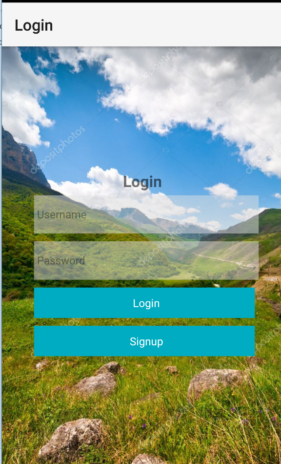
Well, it looks quite good. Now let us create a signup screen. It will be similar to that of the login screen.
In order to open signup screen, we first have to register signup screen in our App.js as in our previous tutorial and then to open Signup we have to use Navigation provided by ‘react-native-navigation’ as discussed previously. And then in the signup press handler, we have to start Signup.js screen
userSignup(val){

       Navigation.startSingleScreenApp({
        screen:{
          screen:"steemittutorial.SignupScreen",
          title:"Signup",

        }
      });
    }
So, our signup looks like this:
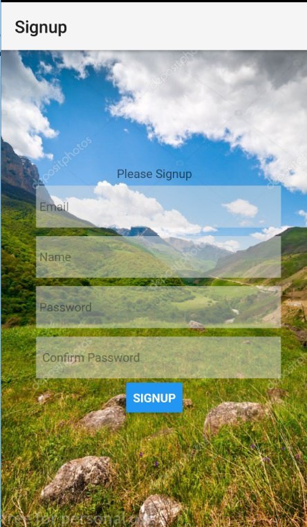
In our Signup screen, we have added 4 input fields and one button. The code used is same as that of login.js I have provided the full code of Signup screen below.
Our signup screen looks good in the portrait mode but what if we rotate it
The view doesn’t look nice. In the mobile with a small screen, the view gets more damaged. In order to solve this problem, we should create two different views one for landscape mode and one for the portrait mode.
For now, let us keep the password and confirm password field in the same line when the orientation changes to the landscape. We can achieve this with the help of dimension API provide by ‘react-native’.
Dimension API
Dimension API gives the width and height of the device we are running our application on.
Dimensions.get('window').height - This gives us the height of the device
Dimensions.get('window').width - This gives us the width of the device
So, when we rotate our screen from portrait to landscape the height of the window also changes. For eg: if the height of the window was 800 in the portrait mode then when we rotate our screen it may reduce to 300.
Orientation can be changed any time by the user. To, handle the orientation change appropriately we should declare a state which determines the view mode of our application.
Initially, it is set to portrait if the height of the window is greater than 500 else it is set to landscape.
  state ={
         viewMode:Dimensions.get('window').height>500?"portrait":"landscape"
     }
Now we should listen to the orientation change in our application so that we know it exactly at the time of the change. For that, we fire up the event ‘addEventListener’ in the constructor.
constructor(props){
         super(props);
         Dimensions.addEventListener("change",this.updateStyles);
     }
So, when the orientation is changed ‘updateStyles’ function is called which receives the window’s width and height.
     updateStyles=(dims)=>{
        this.setState({
          viewMode:
          dims.window.height>500?"portrait":"landscape"
        });
      }
Now when this function is fired we simply change the state of our ‘viewMode’ according to the height we get. As now we have updated our state as per the update in the orientation. We can simply apply different styles in our view.
Here I have created different styles of portrait and landscape. This makes us easy to use it our render method.
  passwordContainerPortrait:{
        flexDirection:'column',
        justifyContent:"flex-start"
    },
    passwordContainerLandscape:{
        flexDirection:'row',
        justifyContent:'space-between'
    },
    passwordWrapperPortrait:{
        width:"100%"
    },
    passwordWrapperLandscape:{
        width:"45%"
    },
As we have created different style we can simply check the state of ‘viewMode’ and apply the style accordingly
<View style={this.state.viewMode==='portrait'
               ?styles.passwordContainerPortrait
               :styles.passwordContainerLandscape}>
Here if the viewMode equals ‘portrait’ then the style of ‘passwordContainerPortrait’ is applied and if it equals ‘landscape’ then the style of ‘passwordContainerLandscape’ is applied.
Now when we rotate the screen the view is like:
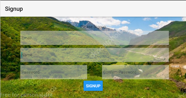
The view now seems nice even if the device is rotated.
The final code of Signup.js looks like this:
import {  Text,
    TextInput,
    View,
    Button,
    StyleSheet,
    Dimensions,
    ImageBackground} from 'react-native';
import React,{Component} from 'react';
import BackgroundImage from '../../assets/login_screen_background.jpg';
import DefaultInput from '../../ui/DefaultInput'

class Signup extends Component{
    userSignUp(val){

     }

     state={
         viewMode:Dimensions.get('window').height>500?"potrait":"landscape"
     }

     constructor(props){
         super(props);
         Dimensions.addEventListener("change",this.updateStyles);
     }
     updateStyles=(dims)=>{
        this.setState({
          viewMode:
          dims.window.height>500?"potrait":"landscape"
        });
      }

   render(){
       return(
        <ImageBackground
        style={styles.backgroundImage}
        source={BackgroundImage}>
        <View style={styles.signupContainer}>
            <Text>Please Signup</Text>
            <View style={styles.inputContainer}>
             <DefaultInput
               placeholder='Email'
               keyboardType='email-address'

               />
             <DefaultInput
               placeholder='Name'
               />
               <View style={this.state.viewMode==='potrait'
               ?styles.passwordContainerPotrait
               :styles.passwordContainerLandscape}>
               <View
                style={this.state.viewMode==='potrait'
                ?styles.passwordWrapperPotrait
                :styles.passwordWrapperLandscape}>
            <DefaultInput
                placeholder='Password'
                secureTextEntry={true}
              />
              </View>
              <View
               style={this.state.viewMode==='potrait'
               ?styles.passwordWrapperPotrait
               :styles.passwordWrapperLandscape}
               >
              <DefaultInput
                placeholder='Confirm Password'
                secureTextEntry={true}

              />
              </View>
              </View>

              </View>
             <Button
             onPress={(val)=>this.userSignUp(val)}
             title="Signup"/>

        </View>
        </ImageBackground>
       );
   }
}
const styles=StyleSheet.create({
    passwordContainerPotrait:{
        flexDirection:'column',
        justifyContent:"flex-start"
    },
    passwordContainerLandscape:{
        flexDirection:'row',
        justifyContent:'space-between'
    },
    passwordWrapperPotrait:{
        width:"100%"
    },
    passwordWrapperLandscape:{
        width:"45%"
    },
   signupContainer: {
        flex:1,
        flexDirection:'column',
        justifyContent:"center",
        alignItems:"center"

      },
      imageBackgroundButton:{

      },
      backgroundImage:{
        flex:1,


      },
      inputContainer:{

          width:"80%"

      },

})

export default Signup;
This is how we handle the orientation change in our application using Dimension API.
Platform API
What if we want to use different icons or colors as per our device. We can achieve this by using Platform API provided by react-native. This API let us know the device in which the application is running.
For eg: Android uses ripple effect when the button is pressed but IOS doesn’t have this property. We can simply use platform API to add ripple effect in android only.
We will be editing ButtonWithBackground.js to implement the Platform API
Here ‘buttonWithBackground’ is a variable which returns some JSX object. Here if the platform is ‘android’ then we used <TouchableNativeFeedback> to give ripple like effect in the wrapped view and if the platform is IOS then we simply use ‘TouchableOpacity’ to make the wrapped view transparent when clicked.
const buttonWithBackground = props => {

    const content=(
        <View style={[styles.button, {backgroundColor: props.color}]}>
        <Text style={styles.textStyle}>{props.children}</Text>
    </View>
    );
    if(Platform.OS==='android'){
        return(
            <TouchableNativeFeedback onPress={props.onPress}>
                {content}
            </TouchableNativeFeedback>
        );
    }
    return(
        <TouchableOpacity onPress={props.onPress}>
        {content}
        </TouchableOpacity>
    );
};
If you run this then you can see some ripple effect in your android device and in the IOS device you can see the wrapped view losing its opacity.
The final code of ButtonWithBackground.js looks like this:
import React from 'react';
import {
     TouchableOpacity,TouchableNativeFeedback, Text, View, StyleSheet ,Platform} from 'react-native';
const buttonWithBackground = props => {


    const content=(

        <View style={[styles.button, {backgroundColor: props.color}]}>
        <Text style={styles.textStyle}>{props.children}</Text>
    </View>
    );
    if(Platform.OS==='android'){
        return(
            <TouchableNativeFeedback onPress={props.onPress}>
                {content}
            </TouchableNativeFeedback>
        );
    }
    return(
        <TouchableOpacity onPress={props.onPress}>
        {content}
        </TouchableOpacity>
    );
};

const styles = StyleSheet.create({
    button: {
        padding: 10,
        margin: 5,
        width:"100%",
        backgroundColor:"#00ACC1"
    },
    textStyle:{
        textAlign: 'center',
        color:"white",
        justifyContent:"center"

    }
});

export default buttonWithBackground;
We can also create a separate entry point for our application. To render a different entry point you can add the desired entry point for Android in ‘index.android.js’ and for ios in ‘index.ios.js’
We learned to use the platform API, dimension API and made custom button component. In our next series, we will be validating the user's input.
All above codes can be downloaded from my GitHub link. Click here to download.
CURRICULUM
Hey @programminghub
Thanks for contributing on Utopian.
We’re already looking forward to your next contribution!
Contributing on Utopian
Learn how to contribute on our website or by watching this tutorial on Youtube.
Want to chat? Join us on Discord https://discord.gg/h52nFrV.
Vote for Utopian Witness!
Thanks for the contribution!
Your contribution has been evaluated according to Utopian policies and guidelines, as well as a predefined set of questions pertaining to the category.
To view those questions and the relevant answers related to your post, click here.
Need help? Write a ticket on https://support.utopian.io/.
Chat with us on Discord.
[utopian-moderator]
I will say that technologies that can replace JavaScript in browsers have only recently appeared. Still, it will take a long time before they reach a sufficient level of development and learn all that JavaScript can do. And in the server and embedded systems, JavaScript has a lot of alternatives, but it's a niche there too. Many companies have invested, and continue to support, a lot of money in developing engines that run JavaScript and that make the language more and more effective and relevant. The demand on the job market for JavaScript developers dramatically exceeds the supply, hence the good salaries. Companies are now looking for developers of any level, including beginners. https://ithire.com/category/react-developers