Interesting, I like the second logo more. It has those HMI letters like the current logo in a better way. And first logo directly reminded me that is a spaceship from a shooter game and a little bit of batman logo because of that shadow.
As a suggestion if I'm not seeing wrong. When I use two different font weights I just only skip one weight. Like if there is regular - medium - semibold and bold. I choose to combine regular with semibold or medium with bold. Otherwise I believe it cause some trouble when you need to resize the logo.
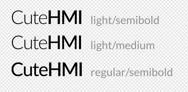
I agree with your comments about the logo designs. Actually, I avoid from using similar thicknesses without big differentiate on logo designs thats why I skipped two weight but yes, I realized that it made too much difference for this font. Thank you for suggestion, I should not forget to look to logo design from long distance again.
Thank you for your review, @oups!
So far this week you've reviewed 2 contributions. Keep up the good work!