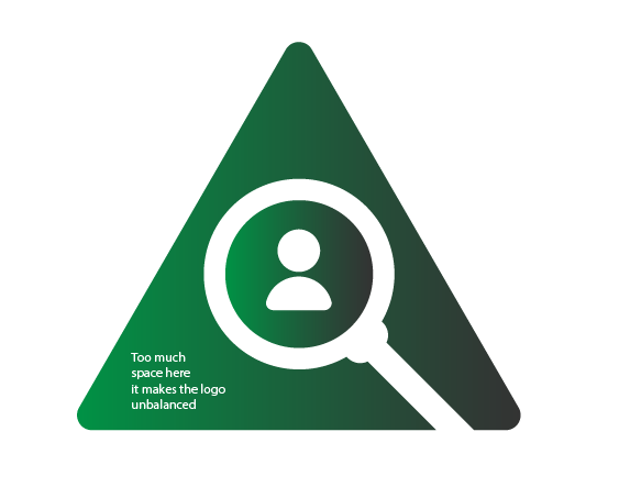
RE: Logo design for Friend Finder
Hi @tebriz, thank you for your contribution.
I noticed that the project does not have a proper license in the github repository. next time make sure you contribute to projects that has one.
You should explain more about the logo, for example what is the reasone you choose the triangle shape, or why the green color. if you want to improve your presentation, take a look at utopian weekly top contributions.
The logo itself feels unbalanced as you give too much space in the bottom left corner.

also, can you tell me why you decided to make utopian contribution now, 4 months after the pull request?
Your contribution has been evaluated according to Utopian policies and guidelines, as well as a predefined set of questions pertaining to the category.
To view those questions and the relevant answers related to your post, click here.
Need help? Write a ticket on https://support.utopian.io/.
Chat with us on Discord.
[utopian-moderator]
Hi, next time I'll explain more about the logo and green color was the owners's choice. I made this contribution after 4 months because I was busy and last month I banned for 1 month. How can I check for license can you help me?
Thank you for your suggestions.
Thank you for your review, @nilfanif! Keep up the good work!