You are viewing a single comment's thread from:
RE: My Proposed Icon Design for Odyssey Music Player
Your contribution cannot be approved because it does not follow the Utopian Rules.
- no benefits over their existing logo.
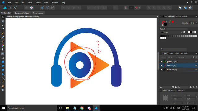
- See te red circle, is it supposed to be a disk/vinyl? why is it not perfectly circle? why is it oval?

You can contact us on Discord.
[utopian-moderator]
@nilfanif Hello it is not a disc it is O stands for Odyssey as you see in my concept please check it again that is why it is not perfect circle
Even though it was letter O, you should make it pefrect circle so it would look nice and balance, also it can represent two things, letter O and disc/vinyl.
Overall, we can't accept your logo, because there is no benefits over their existing logo.