Web Template - Responsive Timeline Using VueJS
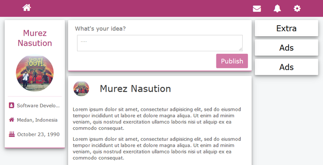
At this moment, I will share my recent timeline page as Single Page Application (SPA) Template. You will get many advantages when using this template, because of its capability that can be adapted to the screen size. And can be more flexible, because it's built using VueJS. Thus, there is a clear separation between template, style and data.
OK. Let us go to explore it!
Murez Nasution
Attention!
To be able using this template, you need several studies of the components related to perspective of VueJS. You can visit the official website directly here.
Prototype
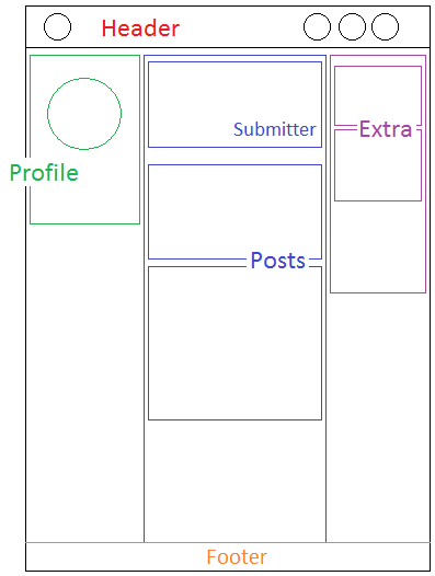
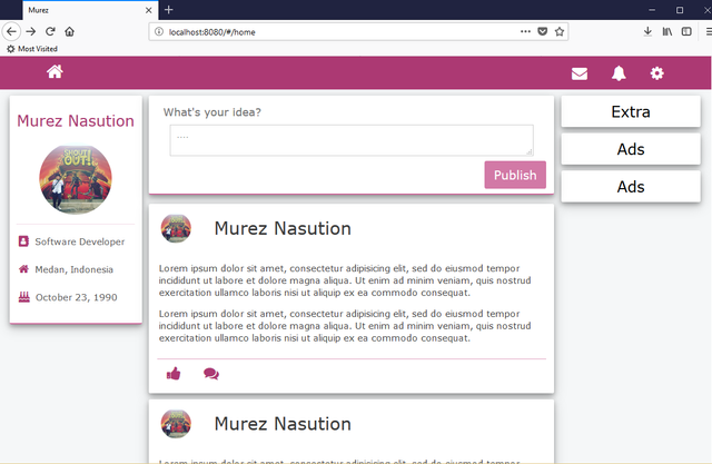
As in general, this template consists of three main divisions, i.e.:
- Header, located at the most top of the document. It consists of navigation as icons link to some features or menu.
- Main, located on the main part of the document. It contains of three main sub-divisions, i.e.
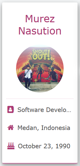
- Profile, located on the left side of the Main division. It shows attributes of the current user. Such as picture, name and others.
- Publisher, the scrolled-vertical viewport. Just consists of two main divisions,
- Submitter, located of the most top of the current division. It contains of a text input and a submit button to publish new post.
- Posts, flows down as much as posts of current user. Each of post contains three main divisions, i.e.: header, article and responses (like and comments).
- Extra, located on the right side of the Main division. It contains all of post of the users have created, which each note just consists of title and content.
- Footer, located at the most bottom of the document. It appears as additional information. For next time, the implementation varies according to your wishes.
As seen below,
Requirements
Before rock 'n roll, please, make sure to do the following steps:
- Install NodeJS
- Install
vue-cli-npm install -g vue-cli - Install Text Editor (Sublime, or any others)
- Download template in my GitHub.
Rock 'n Roll
Here is a general description of the implementation and the results
Header
All of icon resources is here http://fontawesome.io/icons/.
Code
<link rel='stylesheet' href='https://cdnjs.cloudflare.com/ajax/libs/font-awesome/4.7.0/css/font-awesome.min.css'>
<div class='header fs-25'>
    <i class='fa fa-home' title='Home'></i>
    <i class='fa fa-gear' title='Settings'></i>
    <i class='fa fa-bell' title='Notification'></i>
    <i class='fa fa-envelope' title='Messages'></i>
</div>

Result

Profile
Code
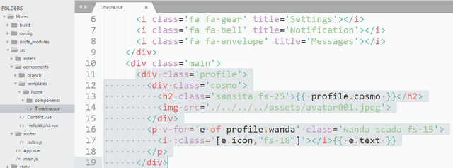
<div class='profile'>
    <div class='cosmo'>
    <h2 class='sansita fs-25'>{{ profile.cosmo }}</h2>
    <img src='./../../../assets/avatar001.jpeg'>
</div>
    <p v-for='e of profile.wanda' class='wanda scada fs-15'>
        <i :class='[e.icon,"fs-18"]'></i>{{ e.text }}
    </p>
</div>
Result
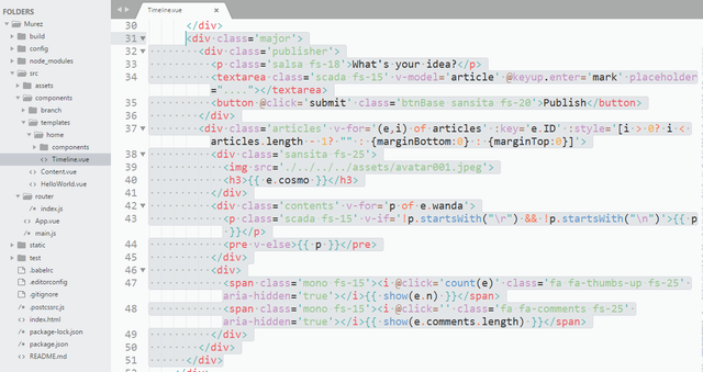
Publisher
Code
<div class='major'>
  <div class='publisher'>
    <p class='salsa fs-18'>What's your idea?</p>
    <textarea class='scada fs-15' v-model='article' @keyup.enter='mark' placeholder="...."></textarea>
    <button @click='submit' class='btnBase sansita fs-20'>Publish</button>
  </div>
  <div class='articles' v-for='(e,i) of articles' :key='e.ID' :style='[i > 0? i < articles.length - 1? "" : {marginBottom:0} : {marginTop:0}]'>
    <div class='sansita fs-25'>
      <img src='./../../../assets/avatar001.jpeg'>
      <h3>{{ e.cosmo }}</h3>
    </div>
    <div class='contents' v-for='p of e.wanda'>
      <p class='scada fs-15' v-if='!p.startsWith("\r") && !p.startsWith("\n")'>{{ p }}</p>
      <pre v-else>{{ p }}</pre>
    </div>
    <div>
      <span class='mono fs-15'><i @click='count(e)' class='fa fa-thumbs-up fs-25' aria-hidden='true'></i>{{ show(e.n) }}</span>
      <span class='mono fs-15'><i @click='' class='fa fa-comments fs-25' aria-hidden='true'></i>{{ show(e.comments.length) }}</span>
    </div>
  </div>
</div>
Result
Footer
Since the footer is still abstract and depends on the implementation of everyone who will use it, then in this section is skipped.
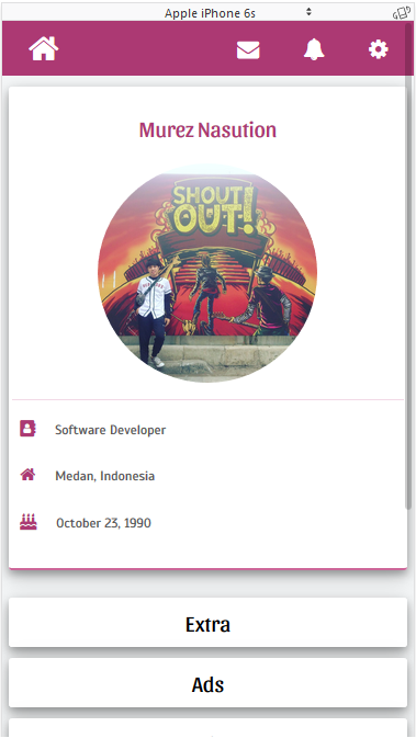
And finally, the result of full implementation, as seen below:
Web
Mobile
Thank you.
Posted on Utopian.io - Rewarding Open Source Contributors
Thank you for the contribution. It has been approved.
You can contact us on Discord.
[utopian-moderator]
Thank you very much.
I like the design and the shape of your post! Will inspire me for my next contributions :)
Thanks!
You're welcome. :-D
Hey @murez-nst I am @utopian-io. I have just upvoted you!
Achievements
Community-Driven Witness!
I am the first and only Steem Community-Driven Witness. Participate on Discord. Lets GROW TOGETHER!
Up-vote this comment to grow my power and help Open Source contributions like this one. Want to chat? Join me on Discord https://discord.gg/Pc8HG9x
Ngeriiii wak 140 haha
Karena kontribusinya di-vote Utopian. :-D