You are viewing a single comment's thread from:
RE: Task Request: A logo for MeraSteem
Please right click the image and "Open Image in New Tab" to view larger.
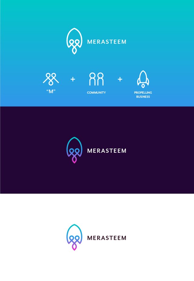
MeraSteem is a project that helps businesses with resources to get them off of the ground. In otherwords, MeraSteem acts as a launchpad for new ideas. This is why I've chosen to model this design concept after a rocket.
This design delivers three different meanings. The first is a "M", for Mera, hidden inside the image; the second, two heads inside of the ship to represent community; and lastly, as mentioned before, a rocket to symbolize propelling new ideas and businesses.
I've used the colors that you called out in the brief, however I brightened them to give a more modern look.

Hello @mrgodby, we like your design very much, the way you have described everything you have incorporated into your design is phenomenal. You have properly understood what message we want to give to the community and businesses. Also, the community and business prospects are also depicted very well in the logo.
After going through all the designs, we think your design is still the best, and it really suits our project. So we have decided to finalize this design and you may now officially post this design on your steem blog. You can give references to this comment if needed.