WİFİAnalyzer #New Logo
New Logo:
Logo Colors:
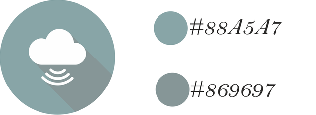

One Color:
Color Variation:
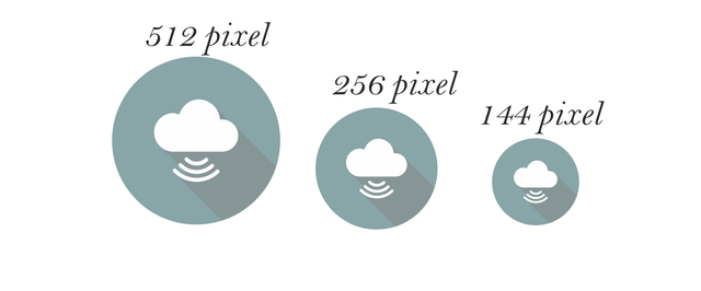
Different Sizes:
Logo Comparison:

Mockup:
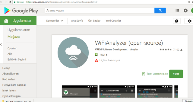
Benefits / Improvements:
Old logo is very simple and ordinary. Lots of application have same logo like old, so people can not prefer. Now clearer,informative and more striking. User who sees can prefer the WifiAnalyzer
application.
Tools:
Corel Draw
Idea:
In thıs logo, I thought clouds will be source and rains will be signals,clouds bring rain and wİfi brings internet
Proof of Work:
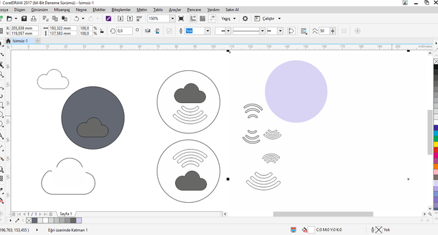
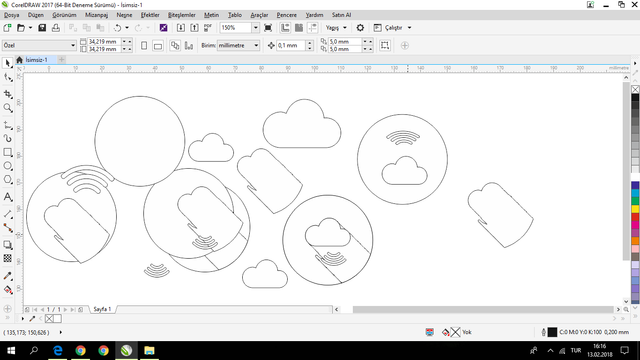
I explained :-)
Your contribution cannot be approved because it does not follow the Utopian Rules.
You can contact us on Discord.
[utopian-moderator]