New Logo for FilePreloaderLibrary
Repository
https://github.com/TeamAmaze/FilePreloaderLibrary
Details
This is an Android based open source project. The aim of this library is to preload entire folders the user might access, so that they load instantly should the user open them.
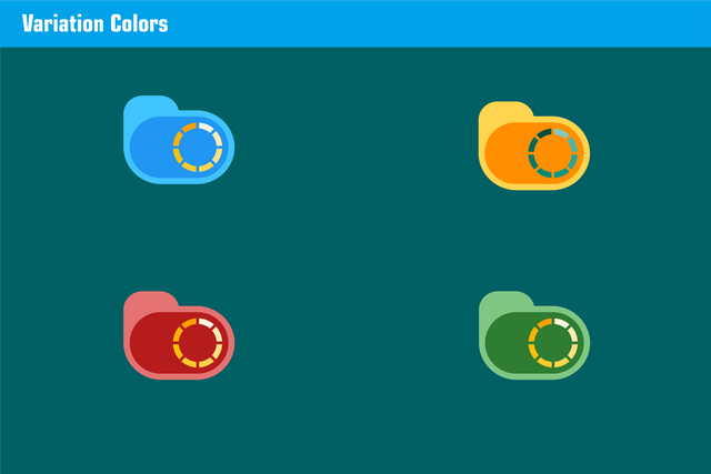
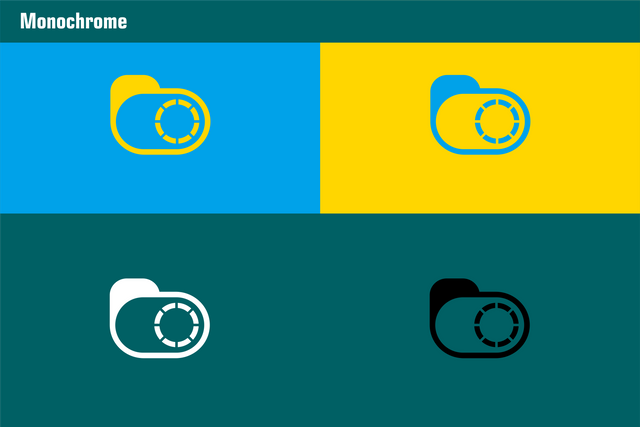
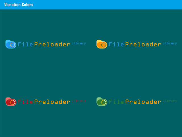
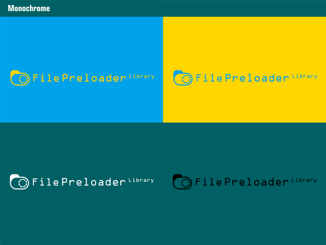
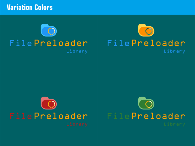
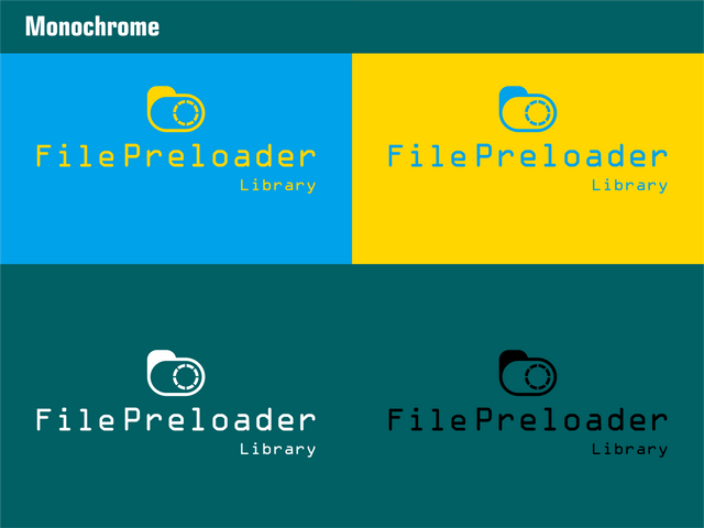
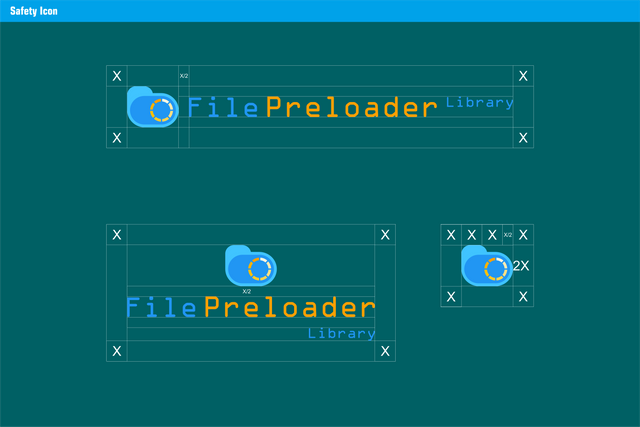
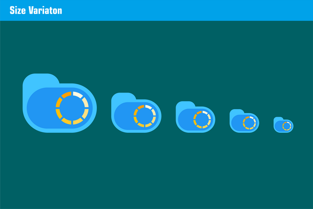
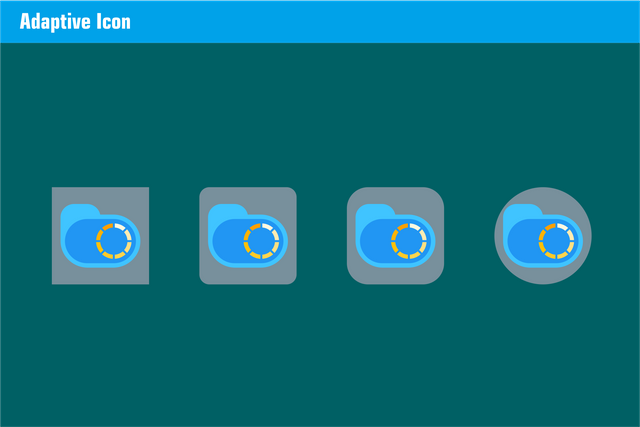
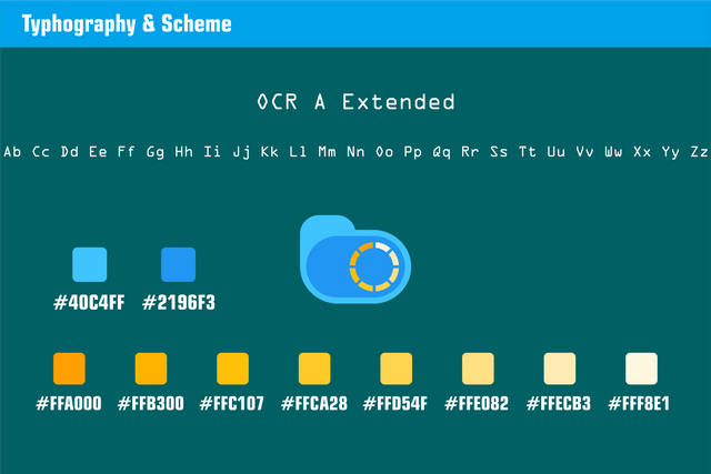
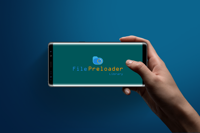
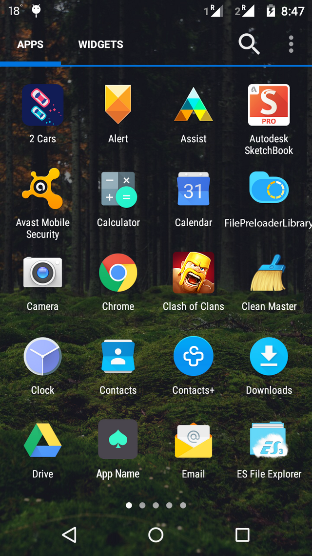
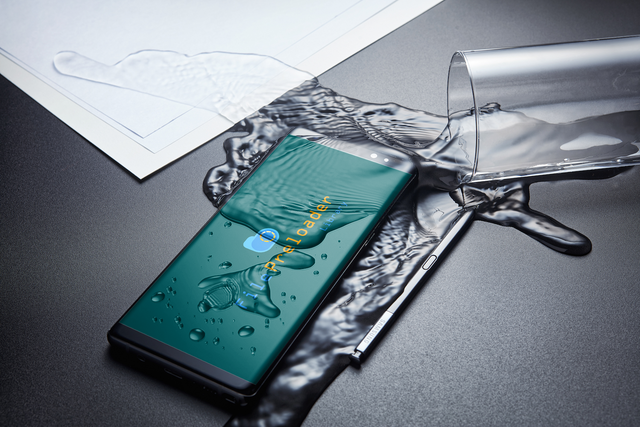
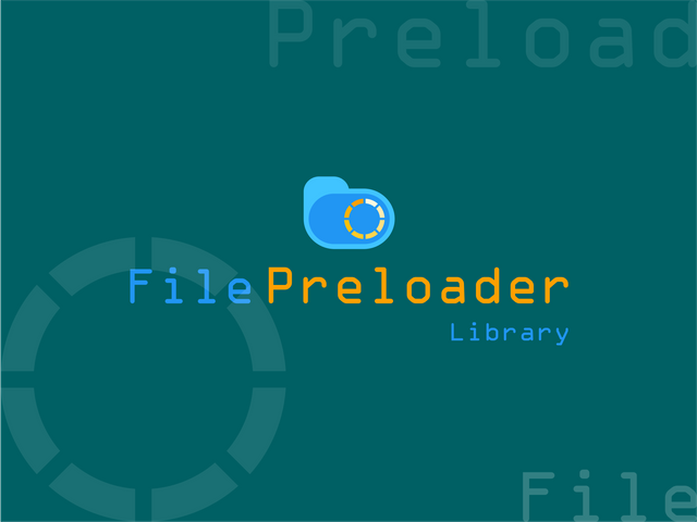
this project does not yet have a logo. and I offered to make an attractive logo for this project and the project owner agreed. After that I sent a pull request. And the project owner has agreed to that. See our conversation about the link below.
Pull Requests First and Second
Logomark and Logo Result


Logomark and Logotype Primary (Horizontal)


Logomark and Logotype Secondary (Vertical)


Benefits / Improvements
Hello, all. I hope you are all healthy. at this time I have reviewed this Project. and this project does not yet have a logo. so I offered to make an attractive new logo in my opinion. I hope it's interesting for you. This new logo looks interesting and unique because in this design I use the file manager icon with a combination of loader icons in the middle. the reason I'm using this loader icon is because it follows the name of the project. so that the name and icon are appropriate. so I use the icon. for the color I use material colors. and OCR A Extended fonts
Proof of authorship
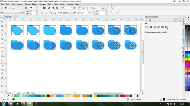
Tools
This design I use CorelDRAW Graphics suite X7
Original files
Drive Download
Mockup Download, Download, Download
Font Download
Proof of Work Done
https://github.com/mansya/FilePreloaderLibrary

This work is licensed under a Creative Commons Attribution 4.0 International License.
Hi @mansyaprime, thank you for your contribution.
The logomark is very nice, however I did't really see the shape of "file manager/folder" maybe it was because you gave to much roundness in the corners of the logomark.
Here i reduced the roundness of the corners and you can see the shape of "folder" much clearer.

Another thing you might want to take note is the color, orange on top of blue, I know that the complementary color of blue is orange, but the orange on top of blue is kinda hard to see.
see the comparison bellow:
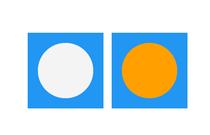
next time, to help you choose better colors you can use adobe kuler as reference.
Your contribution has been evaluated according to Utopian policies and guidelines, as well as a predefined set of questions pertaining to the category.
To view those questions and the relevant answers related to your post, click here.
Need help? Chat with us on Discord.
[utopian-moderator]
very amazing advice. thank you @nilfanif
Thank you for your review, @nilfanif! Keep up the good work!
Hi @mansyaprime!
Your post was upvoted by @steem-ua, new Steem dApp, using UserAuthority for algorithmic post curation!
Your post is eligible for our upvote, thanks to our collaboration with @utopian-io!
Feel free to join our @steem-ua Discord server
Hey, @mansyaprime!
Thanks for contributing on Utopian.
We’re already looking forward to your next contribution!
Get higher incentives and support Utopian.io!
Simply set @utopian.pay as a 5% (or higher) payout beneficiary on your contribution post (via SteemPlus or Steeditor).
Want to chat? Join us on Discord https://discord.gg/h52nFrV.
Vote for Utopian Witness!
Hi, we are holding a close logo design contest with grand prize of 50 STEEM and each participant will get instant 1 STEEM as gift.
If you are interested please come and join us in our private Discord channel: https://discord.gg/N5JVChk