My proposed logo design for Vlc media player
Details
I have been using vlc media player for a very long time now. just today, i thought about designing something new for the project in such a way that at a glance, on can easily identify that this is a media player
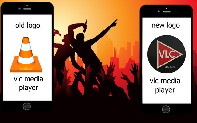
The current logo looks more like a cone and no exact sign for one to easily identify the project as a media player. Below i present to you my proposed design for this project.
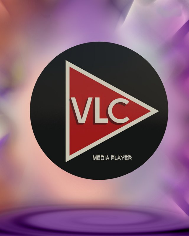
Benefits / Improvements
The new concept will enable both the current users and potential users to be able to recognize that the project is a media player. Looking at the current logo, you will be convinced that it does not actually describe what the project is all about. I strongly believe that if my proposed logo is implemented, at a glance users or potential users can easily recognize it.
Tools
I used three (3) different software to produce or create my proposed logo namely:
- AutoCad 207
- Revit 209 and
- Play with picture.
Listed above are the software used to realize my proposed logo
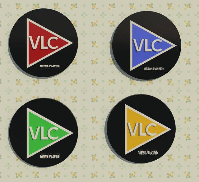
Logo color variation
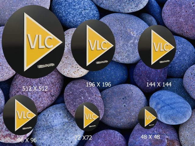
Logo size variation
My concept
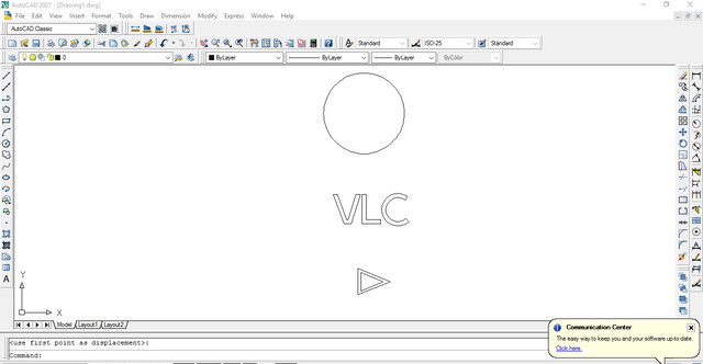
Work process
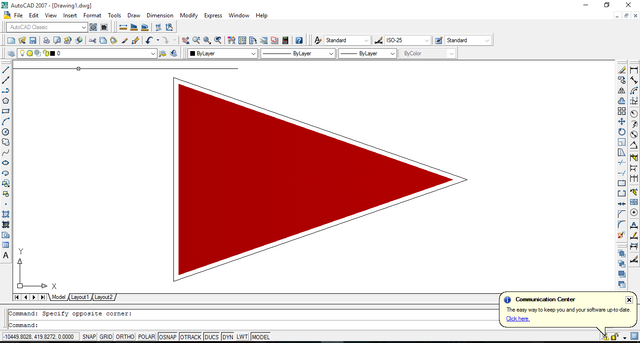
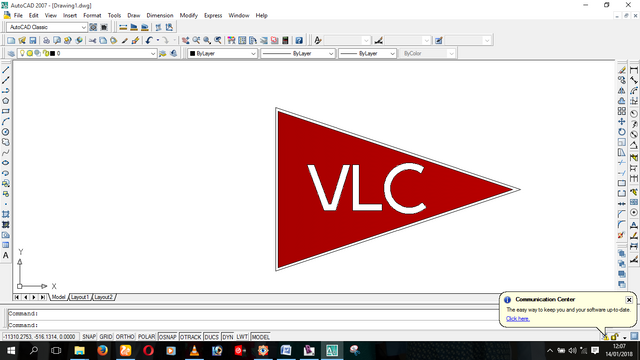
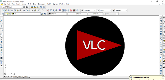
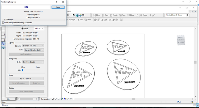
Old and New Logo
Original files
Please kindly click here to download the original files
Thank you.
Posted on Utopian.io - Rewarding Open Source Contributors
This contribution has been hidden in Utopian because it does not follow the rules and standards for vector logo.
You can contact us on Discord.
[utopian-moderator]
Hey @espoem, I just gave you a tip for your hard work on moderation. Upvote this comment to support the utopian moderators and increase your future rewards!
Dont deform the logo.
Hello @andrejcibik, its just a new concept which i ofcus explained in my contribution. I strongly believe that this will make a whole lot of sense. The old logo to be honest at a glance, no one can easily recognize it as a logo for a media player.
Thank you for the contribution. It has been approved.
You can contact us on Discord.
[utopian-moderator]
Red colored logo with black bacground looks great. A welcome change.