Exchange History and Exchange Info Pages Need Redesign
Repository
https://github.com/artolabs/steemax

Details
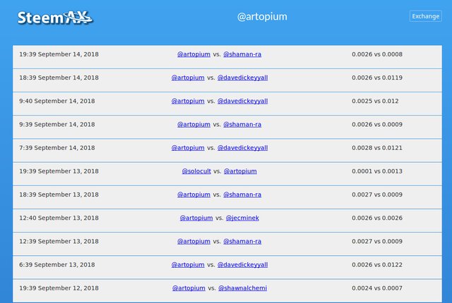
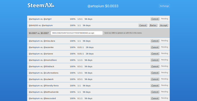
SteemAX is a web app that allows Steemians to automate an exchange of upvotes with other Steemians for a set duration. In this task request I'm seeking someone to redesign the look and feel of the exchange history page and the account exchange info page. This needs to be accomplished via CSS only. These two pages share the same CSS files for the formatting of their tables, so to change one page is to change them both. If the designer finds it necessary this can be separated into a new CSS files.
There are actually 3 CSS files for three different screen sizes. All CSS files for all screen sizes must be changed.
Exchange History page
https://steemax.info/history
The web page layout for the exchange history page needs to meet the following requirements:
The background must remain the same.
All HTML must remain the same. Only change the CSS to achieve a more nicely formatted table by doing the following:
Make all elements on the page more symmetrically aligned with each other.
Only use the font LatoWeb and LatoWebLight or sans-serif.
Use borders, rounded corners and other design elements to achieve a more professional looking page.
Only use shades of grey, white, black and the same color blue used in the background.

Account Exchange Info Page
Use https://steemax.info/@artopium
as an example page (or any other account)
The web page layout for the account exchange info page needs to meet the following requirements:
The background must remain the same.
All HTML must remain the same. Only change the CSS to achieve a more nicely formatted table by doing the following:
Make all elements on the page more symmetrically aligned with each other.
Only use the font LatoWeb and LatoWebLight or sans-serif.
The "pop-under" that appears when an "accept", or "cancel" button is clicked must retain the same functionality, but should also be redesigned to have more symmetry and a more professional look.
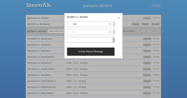
The "pop-up" box that appears when the "barter" button is clicked should retain the same functionality but can also be redisgned to have more symmetry and a more professional look.
Use borders, rounded corners and other design elements to achieve a more professional looking page.
Only use shades of grey, white, black and the same color blue used in the background.


Deadline
I'm giving a one week deadline for a mock-up proposal or a portfolio of prior work done.
September 27th, 2018
Communication
For the quickest response please submit proposals to my discord server in the SteemAX channel. Thank you.
https://discord.gg/97GKVFC
Thank you learnelectronics! You've just received an upvote of 54% by @ArtTurtle!
@ArtTurtle Wants To Upvote Your Art & Music!
The quickest and easiest way to start receiving an upvote for each and every single one of your art and music posts is by delegating 20 SP or more to @ArtTurtle using this delegate button. It's fully automatic and once your delegation has hit the blockchain @ArtTurtle will begin upvoting your art and music content within 45 minutes.
Don't want to give up your SP? You can also get @ArtTurtle's upvotes by signing up for free to Artopium.com! For more detailed information about @ArtTurtle and how it works be sure to check out this recent article by @Artopium titled @ArtTurtle Will Upvote Each & Every One of Your Art/Music Posts