Revamp of utopian.io website
Here is my work for the UI revamp for the utopian website.

I will be listing out the features of my works:
- The website is one page design as I did not want the current style of website to be changed.
- Bright color gradients have been used to make sure it looks clean and minimal.
- Based on the menu links, the website is divided into divs which will be easier to navigate.
- The length of the website is shortened as the existing one is too lengthy to scroll.
- Detailed stroke icons have been used to make it look easier for users.
- Most of the information is bundled inside a button with a outer link. The main aim to make the website look short and descriptive.
- The mobile app screenshot is designed to make users bring more visibility for the website.
- All images and icons used are open source which are attached in the attachment below.
- All the icons are SVG file to decrease the size of icons and as well as to retain the clarity of icons.
- Each divs is designed with a mindset where users are able to view the current div information in their screens.
- The website is designed with the mind of bootstrap which is easier for developers.
- All the necessary links are designed with a mindset that information can be accumulated in modal box.
- Only one font is used to not differentiate between heading and paragraphs because I wanted to make sure everything in the website is readable.
Features
1. Necessary Logins Links in One Place
Single div for all the necessary login links so that user does not have to scroll down.
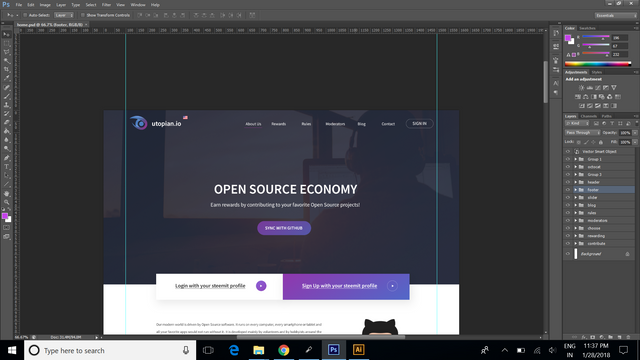
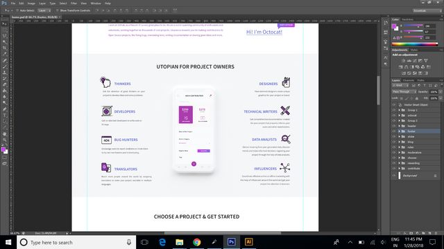
2. Mobile UI Screenshot
The mobile app UI is designed to bring more trust and visibility for the users. Will be working on mobile app based on this design comments.
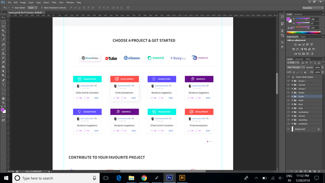
3. Project tasks in a slider
All the open source projects tasks are listed in row of 2 to make sure users are able to see the most of the information in a single slider. Accessibility to find tasks will be easier.
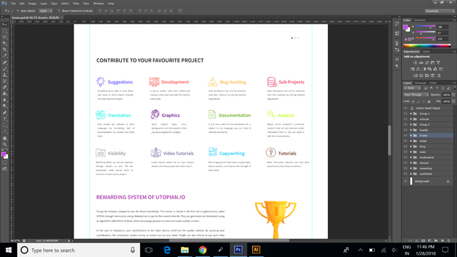
4. Flat Colors for Each Task Categories
This is designed with all the flat colors and the most suitable icons according to the categories.
5. More visibility to the moderators
The moderators are the core behind utopian. So in order to give importance to them, this section is designed with bright colors and as well as information is shown in minimal.
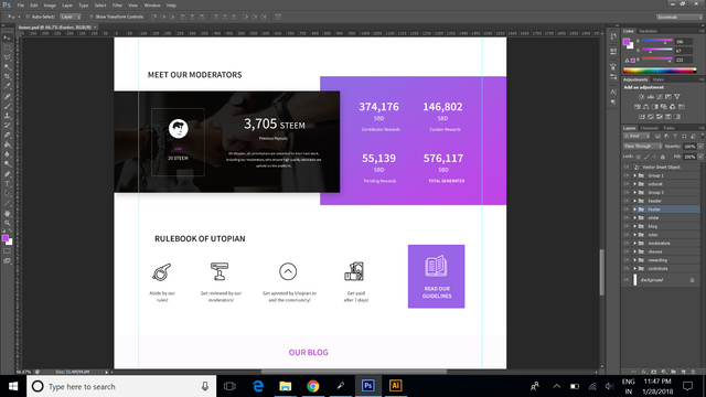
**Working Files ** https://drive.google.com/drive/folders/167A9HG2ftzTikmH0_o4tjCSdmSn1Re9o?usp=sharing
Posted on Utopian.io - Rewarding Open Source Contributors
This post has received a 0.59 % upvote from @booster thanks to: @karthikix.
Thank you for the contribution. It has been approved.
You can contact us on Discord.
[utopian-moderator]
thank you @radudangratian.
Hey @karthikix I am @utopian-io. I have just upvoted you!
Achievements
Community-Driven Witness!
I am the first and only Steem Community-Driven Witness. Participate on Discord. Lets GROW TOGETHER!
Up-vote this comment to grow my power and help Open Source contributions like this one. Want to chat? Join me on Discord https://discord.gg/Pc8HG9x
thank you @utopian.
Woah..! This looks really nice. Keep it going