Ethtags update #3: New design, menu, about and faq pages, etc...
Hello everybody, it has been two weeks again, so I thought I would write a summary of what I did, I will start doing these every week, once I have more time.
For those who do not know ethtags, it is a ethereum smart contract which lets you tie a signature and a text to your address. You can then use the dogtag as a signature on forums or anywhere where you can insert an iframe. The signature will always load as long as the browser can run web3, most browsers can, however you need an injected web3 from for example metamask to edit your dogtag.
You can check out ethtags here. Then you can browse the repository on github or check out the commit.
Dogtags are currently running in the Ropsten test network, so if you want to create your own dogtag you will have to use metamask. There is a short tutorial in my second post linked below.
Previous posts:
New look

I have been playing around with css, gradients and html and I ended up redesigning a lot of the elements.
The buttons are now all round and white with green outline and they change color on hover. The new menu is fixed on top and it also shows the icon, however the menu does not show up when you preview your dogtag or visit a dogtag of someone else.
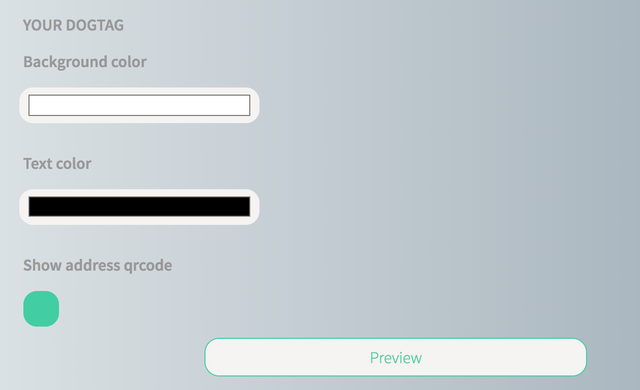
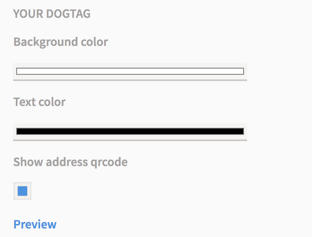
I have experimented with many ways how to design the color picker, but I stuck with this rounded design that clearly shows the color, the default one from the ethereum styles leaves you with a tiny strip which is hardly legible.
Changes were also made to the way a checkmark looks and behaves because by default it had a ::before and ::after which both had fixed position and would not center properly, that was undesirable. These are now hidden. When unchecked the background is white and it has an outline and when checked its background has the same color as the outline.
Both the textarea that contains the content of your dogtag and the input field for the signature have been redesigned. They are now rounded and I added padding and margins to them.
The code blocks were also rounded in order to maintain consistency throughout the whole DAPP. I have also added a new background to the body of the whole webpage it is a carefully chosen and adapted gradient from uigradients web page, I can recommend their collection. Addition of the gradient as a background introduced a bug which caused every dogtag to have this gradient as a background, however this was easily fixed.
Overall I am happy with the outcome of this redesign, although it took over 10 hours of coding and redoing and it will most likely take another 10 or 20 hours to bring it to perfection. That is also the reason why there was not much progress on the code side, however I have fixed a couple of bugs.
You can compare the design with the design from the previous posts, you will see that pretty much everything changed.
Just for the quick comparison there is the new design of the panel which lets you change how the dogtag looks:

And there is the old one:

New logo
![]()
It is nothing special, however I finally got at least a bit of an idea what it should look like so I will improve the logo over time and I think that this logo is good enough to use during the development stage. I made it using a great vector graphics program GravitDesigner, I can really recommend it. It is a great tool.
Menu

I originally wanted ethtags to be a one page experience, however it would be relatively hard to implement some sort of a FAQ and About elements, so I droped my original vision and implemented a menu.
FAQ and About

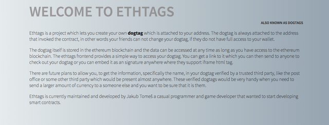
I have added new FAQ and About sections which I mentioned previously. I have written a short text about ethtags which you can see in the About section that you can access via the new menu and I plan to expand it in the future. The FAQ section will be written over time as I get more feedback about the DAPP.
Copy buttons

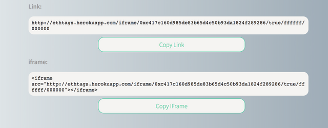
Copy buttons are a small, however very noticeably addition. It is a great improvement to the clunky selecting and copying of the link or iframe code. I have looked around for various solution, but in the end I went with a meteor library from atmosphere, which did not require many changes to the existng code and had the cleanest implementation.
Added favicons
There is not really much to say about this. I have added all kinds of favicons to support majority of browsers.
Bugfixes
I have fixed a bug which was introduced by the new background that I mentioned earlier. It was caused by the prefference of the background tag instead of the background-color tag. The fix was rather simple, I just changed the tag in the call.
The other issue which was very noticeable was the fact that the width changed at least twice when you loaded the main page. I have managed to track down the culprit, it was caused by reactive variables which were loaded in after the whole page was loaded and rendered. This bug was solved by entering a dummy address and other values into each of the reactive variables.
The bug or rather coding inefficiency which I will be tackling next week and I already designed a solution for it will be the delay before the address is loaded, currently the is a hardcoded delay which lets the web3 injectors sort everything out before anything starts happening, instead I will check if the addresses already loaded and I will execute everything dependent on the addresses right after they load.
Posted on Utopian.io - Rewarding Open Source Contributors
Your contribution cannot be approved because it does not follow the Utopian Rules.
This is a minimal contribution according to me to be
accepted as a
Developmentcontribution.Thanks!
You can contact us on Discord.
[utopian-moderator]
@jtomes123 also it's not a good habit to commit all these small changes in a single commit. You should split up your changes and commit them separately. This way it's easier for us to review your work and it's easier for you and others to comprehend how the software evolved.
I know and I definitely agree, because it is very difficult even for me to correctly set up changelogs for the files so most files usually end up with messy changelogs on github. I is caused by the issues of deployment to heroku, but I have written scripts which will streamline the process, so I will make commits daily instead of weekly or bi-weekly. I have elaborated a bit more about the changes which I made in the last two weeks so it should be easier to comprehend. I am sorry for the trouble.
@jtomes123, I like your contribution to open source project, so I upvote to support you.