how to Add zoom effect to image with css and jquery
What Will I Learn?
- you will learn jquery hover event
- you will learn css transform function
Requirements
- You have basic about java script
- You have basic about css
Difficulty
- Basic
Tutorial Contents
There are many plugins available to add special effects to the image when the cursor moves over the image (hovering the image). All of these plugins include a lot of code on the web page that might affect the page speed when it is loaded (lemot). If you want to use less code and avoid those slow issues, this zoom image effect script is the right choice for you.
In this tutorial we will add zoom effect on when in hover by using jqury and css.
- In making it I use
notepad + +, and browserchrome - The first stage is to create an html file with the name
zoom.html. - Then create an html element, like this:
<html>
       <head>
    <title> efek zoom</title>
       </head>
       <body>
       </body>
</html>
- Put an image into the same folder as your html file, then Make a command
<src>to call<img>, like this:
<img src="cat.jpg" class="zoom"/>
<img src>: call the existing image in the same folder,<class>: specify the class used by<img>- Then create a command to call
file.css, like this:
<link rel = "stylesheet" href = "style.css">
<rel>: declare a page relationship with a link,< href>: create a link.- Next we have to download and host the jquery file, if you do not have it you can download here, we will add the jquery code into
<head>, this is the jquery code I use :
<script src="https://ajax.googleapis.com/ajax/libs/jquery/3.2.1/jquery.min.js"></script>
- The next step, we will create a command to activate the zoom effect, the code created must be between
<script> .. </ script.>, As usual to start the script, we will first enter the ready function, like this:
$(document).ready(function(){
...
    });
$ (document) .ready: start the document,(function(){: open a function- Add event hover to enable zoom effect, like this:
$('.zoom').hover(function() {
...
    });
$ ('. zoom').: is a class of<img>,hoveris hover event,(function () {: open a function,});close function.- Then create a command to add a class
$ (this) .addClass ('transition');
$ (this) .addClass: adds a new class,('transitions'): the name of the class.- Then add a new function, like this:
$ (this) .removeClass ('transition');
$ (this) .removeClass: delete class,('transition'): the name of the class that will be deleted.Here full code of zoom.html
<!DOCTYPE html>
<html>
<head>
<link rel="stylesheet" href="style.css">
<script src="https://ajax.googleapis.com/ajax/libs/jquery/2.2.4/jquery.min.js"></script>
<script>
$(document).ready(function(){
    $('.zoom').hover(function() {
        $(this).addClass('transisi');
    }, function() {
        $(this).removeClass('transisi');
    });
});
</script>
</head>
<body>
<center>
<h1> menambah efek zoom pada image </h1>
<img src="cat.jpg" class="zoom"/>
</center>
</body>
</html>
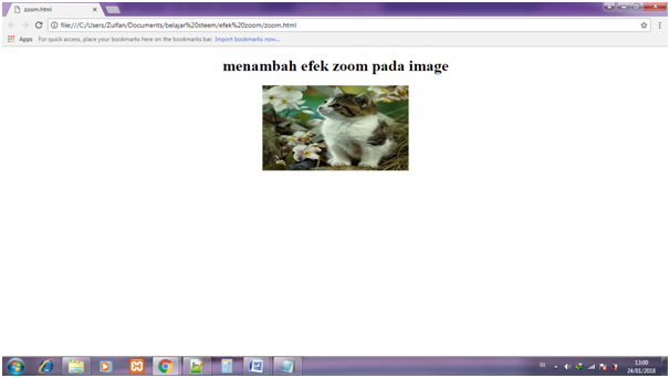
Here is output before add css :

- Once the html file is created successfully. Then create a css file named
style.css - Create a style for class
<zoom>, this class serves to show the initial appearance of the image. Like this:
img.zoom {
    width: 300px;
    height: 175px;
    -webkit-transition: all .2s ease-in-out;
    -moz-transition: all .2s ease-in-out;
img.zoom: name of class,widthandheight: set the initial size of the image,webkit- transitionandmoz-transition: set transition speed,east in: slow at the beginning,east-out: fast at the beganning.- then create a class for transition, like this:
.transisi {
    -webkit-transform: scale(1.8);
    -moz-transform: scale(1.8);
    -o-transform: scale(1.8);
    transform: scale(1.8);
transform: scale (1.8): enlarge the image scale as 1.8 x.- here full code of style.css :
img.zoom {
    width: 300px;
    height: 175px;
    -webkit-transition: all .2s ease-in-out;
    -moz-transition: all .2s ease-in-out;
}
.transisi {
    -webkit-transform: scale(1.8);
    -moz-transform: scale(1.8);
    -o-transform: scale(1.8);
    transform: scale(1.8);
}
- run the program and close the cursor on the image
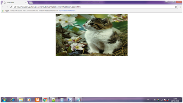
Live Demo - Here is output after add css :

Posted on Utopian.io - Rewarding Open Source Contributors
Hello @ipanridha, it was discovered that this content has already been submitted somewhere else over the internet before [Link].
For this reason, this contribution will be unvoted. Thank you
You can contact us on Discord.
[utopian-moderator]
Hey @knowledges, I just gave you a tip for your hard work on moderation. Upvote this comment to support the utopian moderators and increase your future rewards!
Thank you for the contribution. It has been approved.
You can contact us on Discord.
[utopian-moderator]
haha.. good wak :v
Thank you
Unvoted for breaking the Utopian Rules https://utopian.io/rules