Latest Icon Design from Wanna
Details
Wanna is an implementation of a 21st-century to-do list app. It introduces a new workflow and has its own philosophy which makes it different from other to-do list apps.
The first thing you need to do is open a browser and write electron to find an open source based application
the next stage you have to manually check the github of the application, whether the github is still active or not, to be accepted by one of utopian rules
DIFFERENT FOUR COLOR VARIATION
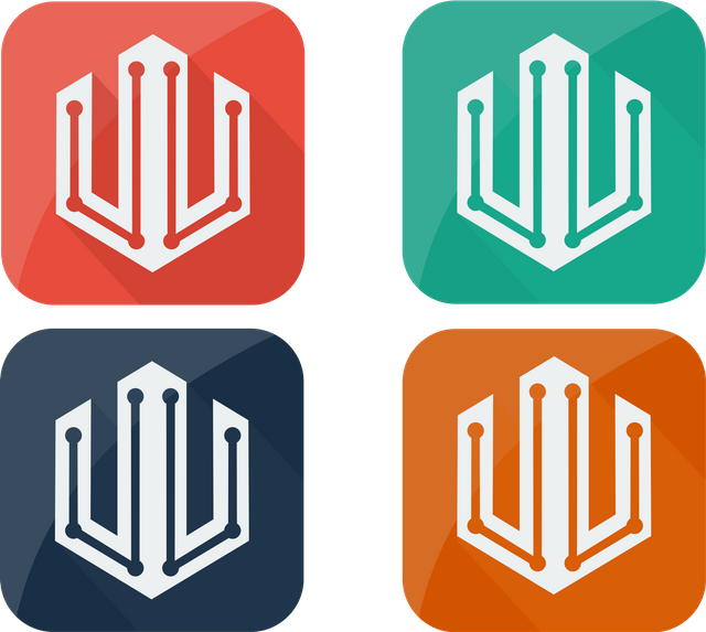
DIFFERENT COLOR VARIATION

DIFFERENT ICON
FONT USED ARIAL TEXT
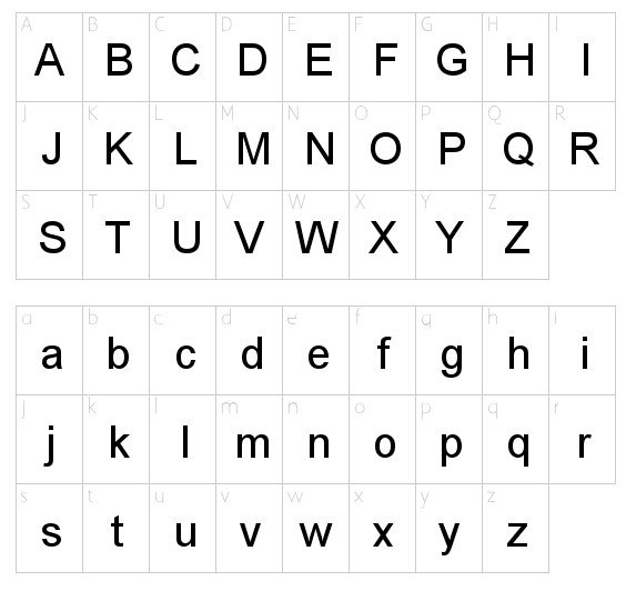
DIFFERENT ICON SIZE


Benefits / Improvements
I want to break the modern style in the new logo. This new logo looks good from the old, with the development of graphic design, more stylish and latest design techniques. So I designed this latest wanna logo to make it more popular and easily recognizable to users.
Tools
I use coreldraw to design a logo, coreldraw is designed for both graphic and vector design.
CONCEPT
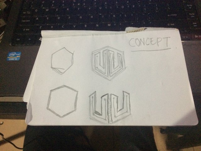
PROOF OF WORK
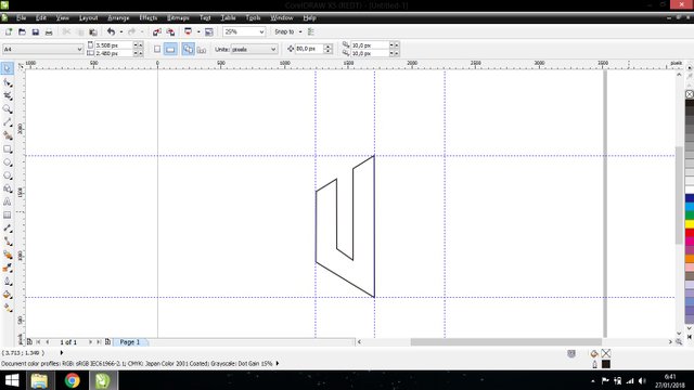
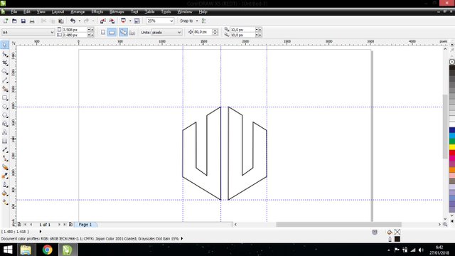
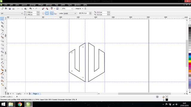
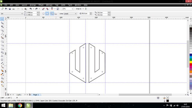
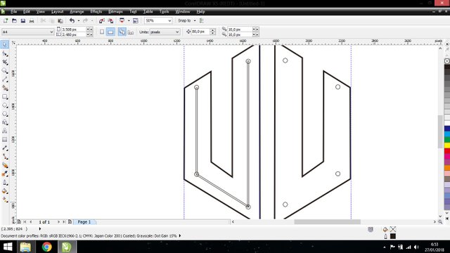
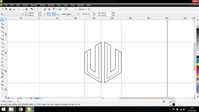
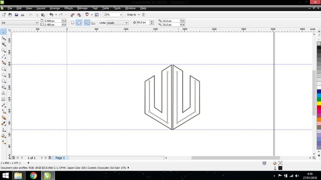
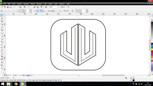
Original files
You can download all the editable files in this link Download File Project
Posted on Utopian.io - Rewarding Open Source Contributors
Details inside the symbol are too thin. They disappear in small size. Please change the with of lines so i is visible. Also try to center these lines inside the lines of symbol.
@andrejcibik Done, i have fixed my contribution
Thank you for the contribution. It has been approved.
You can contact us on Discord.
[utopian-moderator]
@andrejcibik thank you mod
Hey @fakhriart I am @utopian-io. I have just upvoted you!
Achievements
Community-Driven Witness!
I am the first and only Steem Community-Driven Witness. Participate on Discord. Lets GROW TOGETHER!
Up-vote this comment to grow my power and help Open Source contributions like this one. Want to chat? Join me on Discord https://discord.gg/Pc8HG9x