A SUGGESTION FOR STEEMIT TO READJUST THE DOWNVOTE BUTTON

INTRODUCTION
Sometime last night while reading random posts on the platform, I noticed this red something beside the upvote button. That colour was alien around there. The only red coloured thing I come across once in a while on the steemit blog is the red flag. I had to take a second and closer look and there i decerned what it really was: A DOWNVOTE BUTTON!
Oh, finally! I whispered within as I recalled this has been a long yearning of some steemians.
For quite a long while, numerous steemians have asked for and demonstrated the need for a downvote button on the platform, one of which is to serve as a tool to easily combat plagiarism and other 'shit posts'. Now their long request has been met. An applause to the steemit development team.
THE PROBLEM
While the new development is commendable and speaks volumes of steemit as a platform sensitive to its users' needs, the position of the downvote button is... lemme say dangerous - given its proximity to the upvote button.
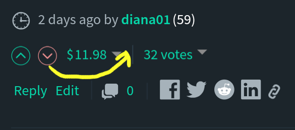
Here's the point: while trying to cast a vote some hours back, I had to take time out to zoom the button in reasonably before daring to press anything. Most of us use mobile devices for social media surfing as this and the tendency here is that rampant errors are bound to occur as steemians attempt to cast their votes on posts. With the red arrow right there beside the green, we are about to witness voting crisis in the history of steemit as steemians unwittingly downvote posts while trying to upvote them. Not everyone would have the patience to zoom the buttons in before casting their votes. Using a PC is no guarantee of escape from this imminent chaos either as both buttons are just so uncomfortably close.
RECOMMENDATION
I firmly suggest an immediate action be taken to prevent this crisis. Ultimately, this would entail readjusting the position of the new button. How about steemit relocate the downvote button to the right side of the post-payout - as demonstrated below - instead of leaving both upvote and downvote buttons adjacent to each other?

This I believe would effectively check the impending mayhem while still keeping both buttons at reasonable closeness.
Hello @diana01!
Thank you for contributing.
Suggestions are technical enhancements/features having significant impact on the project. Your suggestion is about the relocation/readjustment of the downvote option which might be useful but cannot be considered for utopian reward.
I would suggest you to open an issue on GitHub to see what Steemit Inc. thinks about your proposal.
Your contribution has been evaluated according to Utopian policies and guidelines, as well as a predefined set of questions pertaining to the category.
To view those questions and the relevant answers related to your post, click here.
Need help? Chat with us on Discord.
[utopian-moderator]
Button readjustment is no technical enhancement to steemit. It's ok. Please keep on with your POLICIES AND GUIDELINES. I post this with hopes some dev like @blockchainstudio might find and be able to fix it.
Thank you for your review, @syedumair! Keep up the good work!
As a follower of @followforupvotes this post has been randomly selected and upvoted! Enjoy your upvote and have a great day!
Sure this is a must. I actually tried to fix this on my own, but the stylesheet is quite complicated, since it's used in three different cases, so it wasn't easy at all to me. Hope someone will fix this.
I take it you are part of the dev team then? Surely some dev would fix it. Thanks for seeing my point.
Hi @dinan01, no I'm a community contributor. doing it for fun and as a fan.
You may see some of works that I've done here: https://steemit.com/freedomex/@steemitblog/downvotes-added-community-contributions-bug-fixes, https://steemit.com/dtube/@steemitblog/steemit-community-contributions-d-tube-embeds If you're using Busy, I've contributed much more :)
Wow! I just visited those links now. You are doing quite a lot at the background. Thanks for all your contributions on the platform. It must be really cool being a dev; and I believe if you just bid your time and give it more thinking, you'd find a way around this button stuff.
haha thanks. I used to be a dev, but now I'm an economist (but because of that, sometimes dev work is more fun :) I'm also posting analysis articles. Here are some:
Yeah, I can decern the dev + economist in those analyses. Nice blend if you ask me. Though i could only skim through (for their length), I'll find time to read through them properly.