Graphics for Sub-Project | OhSteem: Logo
 Graphics by @deveerei
This is the logo for Oh Steem, it is an Open Source project - a logic game originally from 0hh1.com forked to make it Steemit-themed. We're using the Material Design Principle again to make this logo.
Github Link: Deveerei's 0hh1 version: Oh Steem
Recent Posts: Sub-Project | OhSteem: A Logic Game (Design/Github/Roadmap)
Original Developer: Martin Kool | Q42
Guide: What is Material Design | Icons.
A Look at the Workspace:
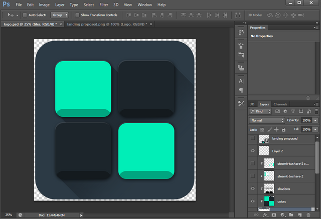
Screenshot of the Workspace.
Resources:
You can check out the .PSD file of this logo by downlading a copy of it from my Google Drive.
Steps in Creating the Logo:
This is the background shape of the logo - made in a 2000 pixels by 2000 pixels work area. Made with the Rounded Rectangle Tool with corners set at 250 pixels roundness.

Screenshot for Reference.
I added 4 tiles here, all made with the Rounded Rectangle Tool, corner roundness has been set to 100 pixels here.

Screenshot of Step 1 for Reference.
I added Clipping Mask and painted a layer of color on top of the 4 tiles I made earlier - they are arranged in an alternating position of colors. The brighter color has a hex of #00eeb7 (R = 0, G = 238, B = 183). The darker color has a hex of #1c252b (R = 28, G = 37, B = 43).
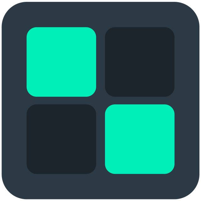
Screenshot of Adding Tiles for Reference.
I duplicated the tiles and added it as an overlay through Clipping Mask and rearranging its position - made the colors all black and added Opacity of 30%. Erased a few parts of it to prevent overlay unto unnecessary spaces.
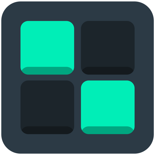
Screenshot for Adding Shadows for Reference.
Added Drop-Shadow to the tiles layer, the settings are as follows:
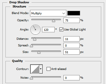
Screenshot of Menu for Reference.
- Blend Mode = Multiply
- Angle = 120 degrees
- Use Global Light = Ticked
- Distance = 11 pixels
- Spread = 0 pixel
- Size = 51 pixels
- Quality = Default
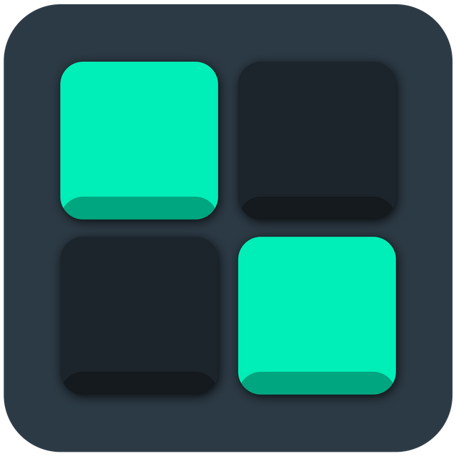
Screenshot for Reference.
Added Highlights by Duplicating the tiles under the main tiles, moving it a few pixels upwards, making its color white.
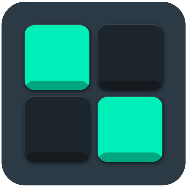
Screenshot for Reference.
Final editing phase, added long shadow in -45 degrees rotation, with Clipping Mask applies so it does not exceed the main box.
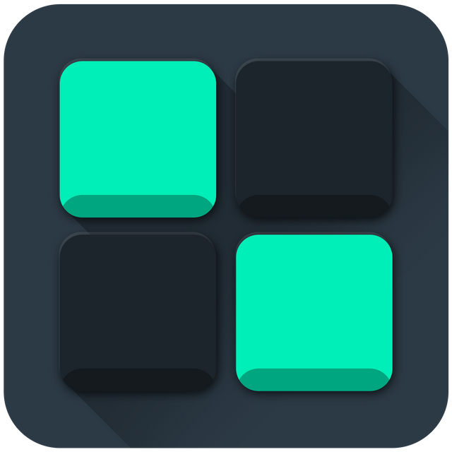
Screenshot for Reference.
There you have it. The logo for Oh Steem. Did you like it's simplicity? Thanks for viewing my post!
Open Source Contribution posted via Utopian.io
Thank you for the contribution. It has been approved.
You can contact us on Discord.
[utopian-moderator]
Thank you so much @arie.steem! :D
I really like its simple but rock design!
This design is my kind of vibe. Minimalist, simple. I'm into designing this past few weeks for vlogging kaya nakarelate ako. At nagustuhan ko tong ginawa mo dev. Goodluck! 😉 -@monkeypattycake
Thank you so much Ate Pat - where's your account? Haha!
(claps) Good job @deveerei!
Hey @deveerei I am @utopian-io. I have just super-voted you at 10% Power!
Suggestions https://utopian.io/rules
Achievements
Up-vote this comment to grow my power and help Open Source contributions like this one. Want to chat? Join me on Discord https://discord.gg/Pc8HG9x
visit my steem, l will follow you, follow me back please
Wow !!!!
Help each other.So Upvote/Follow me Also.
yeah. i like it...
please follow me /vote back