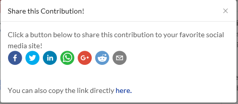
Share buttons display abnormally
Expected behavior
All the share icon buttons should be displayed normally inside the box.
Actual behavior
By clicking on Share link of each article, the media buttons are out of the box, this breaks the layout.
How to reproduce
Open an article/post, and click on Share, the icon buttons displaying out of range.
- Browser: Chrome 63 (Edge is working well)
- Operating system: Windows 10 64bit
Recording Of The Bug
Following is a screenshot under Chrome 63.

Following is a screenshot under Edge, which displaying well.

Suggestions
I noticed there are some <br> after the buttons, and the margin value is different between Chrome and Edge. However I can't provide more on how to correct this, I think this is a systematic change since utopian.io is a complex project.

Margin value is 24 under Chrome 63.

Margin value is 3.2 under Edge, which displaying normally.
Posted on Utopian.io - Rewarding Open Source Contributors
Could you attach a screenshot of share button working in Edge? for those who don't have edge?.
Sure. I've added a screenshot under Edge in the post, the pictures definitely tell the difference and the problem.
Thank you for the contribution. It has been approved.
You can contact us on Discord.
[utopian-moderator]
Thank you for your time! :)
Hey @daijia I am @utopian-io. I have just upvoted you!
Achievements
Suggestions
Get Noticed!
Community-Driven Witness!
I am the first and only Steem Community-Driven Witness. Participate on Discord. Lets GROW TOGETHER!
Up-vote this comment to grow my power and help Open Source contributions like this one. Want to chat? Join me on Discord https://discord.gg/Pc8HG9x