Logotype Design Proposal por Musify

Details
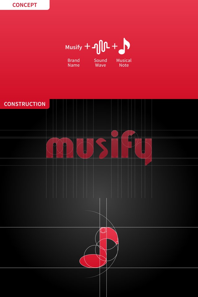
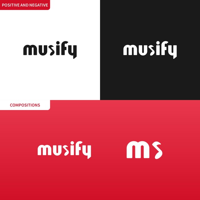
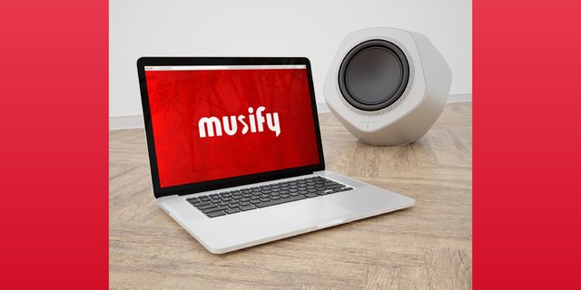
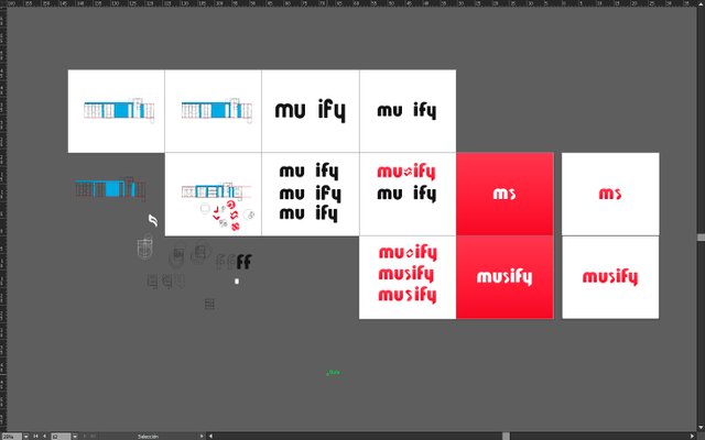
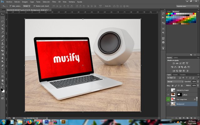
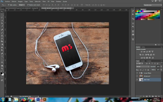
This time I decided to affort an absolute change to the logo of the brand, by designing the letters which simulate the shape of sound waves and takeing advantage of the letter "S" and its similarity with the quaver note, so I could add more singularity to this logo -always looking for fresh, scalable, and professional results-

Benefits / Improvements
The logo design I propose reflects the value of music through its own esence as a well-studied sign, looking attractive and functional at the same time, working with efficiency on digital platforms which is the main target where it aims to.
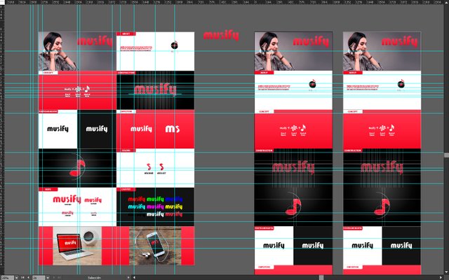
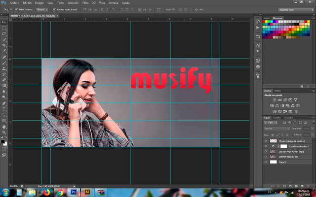
Proof of Work
Tools
- Brain.
- Creativity.
- Pc with Windows 7 OS.
- Adobe Illustrator CS6.
- Adobe Photoshop CS6.
Original files
Posted on Utopian.io - Rewarding Open Source Contributors
Your contribution cannot be approved because it does not follow the Utopian Rules.
Musify recently updated their logo (10 days ago) It's a short period of time to make any changes again.
Other than that you didn’t provided font information.
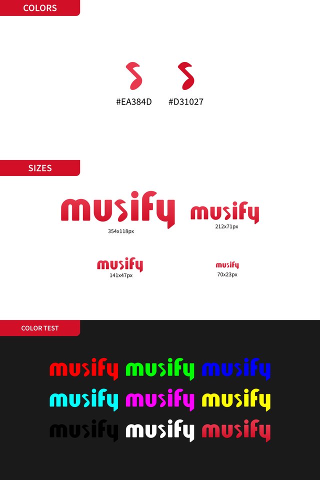
I actually like your thinking but your choice of font makes that s shaped note looks like it’s bugged, it’s not easy to see in small sizes. It could be some other color or even bigger to show it more clear.
You can contact us on Discord.
[utopian-moderator]
Hey @oups, I just gave you a tip for your hard work on moderation. Upvote this comment to support the utopian moderators and increase your future rewards!
Wow that is so bad! I had no idea the logo I saw on their page was already selected. I understand when you say that I didn't provide font information but I see you didn't notice that I decided to design the letters and the musical note (letter s) that compose the logotype, and that's why I didn't provide any kind of information about type selection because a didn't choose a previous designed typeface; however I thank you for giving that advice about the wrong way the letter s could look regarding the other letters around it -looking "bugged", as you said, and not working good in small sizes-. Thanks a lot once again, every mistake is a chance to learn more and go on.
You have two baselines and two x-lines for your font, there are two missing circles in your f, there are no lines for angle cuts.. I thought you just overlayed a font to just make it look like geometric.
Also it's hard to see it as a sound wave since they have many alternative visualizations.
I got it! I got it! I didn't realize about those errors! Thanks again bro
Very clever!
Thanks a lot! :)