Tutorial Chart.js: Javascript Library to display Chart
When we have many data in our site it's better to us to visualize it in to Graph or Chart. Because, we know as Humans, we are visualize creatures, it will hard to understanding long list of raw number. Chart will help us to display data (statistics) easier to read than the table. By using charts or graphs makes the data easier to understand and also more attractive. Charts are usually used to display daily visitor statistics, different data from one month to another, etc.
In this Tutorial, I'll introduce Javascript charting library called Chart.js.
Why using Chart.js??
I using Chart.js because it is easy-to-use, and I can be learned it quickly, Interactive and Attractive. The learning curves is a major factor for me. Chart.js is one of the quickest and easiest Javascript libraries to learn with good flexibility data visualizations I needs.
Installing Chart.js
Chart.js is easy to learn and easy to Install. To install Chart.js we just need put this script to header of our site.
<script src="https://cdnjs.cloudflare.com/ajax/libs/Chart.js/2.1.4/Chart.min.js"></script>
After that we need the place to our Chart. We use <canvas> tag for the place our Chart. Our Chart will display in that tag. <canvas>tag is recommended tag from Chart.js to shown the Chart. We must put our <canvas> Tag in our <body> Tag. Let's look what we can do with Chart.js.
Line Chart
Firstly, we need some configuration to display our data in Chart mode with Chart.js in our canvas,
Our configuration script will be in Tag<script> </script> in our <body> Tag. Suppose we have data like this:
| Month | Value |
| Jan | 50 |
| Feb | 10 |
| Mar | 30 |
| Apr | 15 |
| Mei | 25 |
| Jun | 24 |
Let's we configure our Chart to display data in the Table with Line Chart. We put this script in our body Tag.
<canvas id="Chart-Line" width="600" height="400"></canvas>
<script>
var ourLineChart = document.getElementById('Chart-Line').getContext('2d');
var myChart = new Chart(ourLineChart, {
    type: 'line',  //
    data: {
        labels: ['Jan', 'Feb', 'Mar', 'Apr', 'Mei', 'Jun'],
        datasets: [{
            data: [50, 10, 30, 15, 25, 24],
            label: 'our datasheet',
            fill:true,
            backgroundColor: "rgba(54, 162, 235, 0.2)",
            borderWidth:1,
            borderColor:"blue"
        }]
    },
    options: {
            responsive:false,
            scales: {
                yAxes: [{
                    ticks: {
                        beginAtZero:true
                    }
                }]
            }
    }
});
</script>
The result will look's like this. Or you can open this link to get real result.
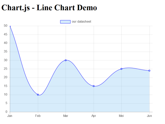
Let's we see line by line about this script to make us understand what's happening.
First, we have <canvas> tag.
<canvas id="Chart-Line" width="600" height="400"></canvas>
Our chart will display in this canvas with width 600px and height 400px.
After that script, we have this :
var ourLineChart = document.getElementById('Chart-Line').getContext('2d');
This script gets reference to our <canvas> element above. The script calls the getContext method too to returns an object that provides methods and properties for drawing on the canvas. We put it all in variable named ourLineChart.
var myChart = new Chart(ourLineChart , {
  type: 'line',  // type of line
  data: // array of line data goes here
});
In here, we create the chart object. Chart.js’ new Chart() constructor takes two parameters, the first parameter is to rendered <canvas> which we initialize in ourLineChart and the second parameter is an configuration object that Chart.js will use to build our chart. The configuration object contains the datasheet and the configuration options. For example, type is line because we want our datasheet become a Line Chart. The data is our datasheet to populate the chart.
labels: ['Jan', 'Feb', 'Mar', 'Apr', 'Mei', 'Jun'],
 datasets: [{
            data: [50, 10, 30, 15, 25, 24],
        }]
In data we have label and datasheet. And in datasheet we have data again. Let's focus to label and data in datasheet. We can see there are contain same value with our table before. This is the main configuration in Chart.js to make a Chart. If we want to add new lines, we just adding new array in our labels and our data. This is so easy right??
Hmmm, this just Line Chart, how about another Chart??
Don't worry, all chart have same configuration so we just learn it once to understand all Chart. Before we go to another Chart let's we see another configuration of our script.
        datasets: [{
            data: [50, 10, 30, 15, 25, 24],
            label: 'our data',
            backgroundColor: "rgba(54, 162, 235, 0.2)",
            fill:true,
            borderWidth:1,
            borderColor:"blue"
        }]
I hope this image can explain the function of each configuration.
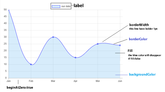
As we can see in the image, we can configure many thing in Chart.js. I'm very-very sorry I can't explain it All, but you can see the docs
Try another Chart
For display Bar Chart, Radar Chart, Polar Chart, etc. You still can use same configuration but with changing the type from line to bar. For example:
type: 'line'
change to :
type:'bar' // available chart type: 'line', 'bar', 'radar', 'polarArea', 'pie', 'doughnut', 'radar', and 'bubble'
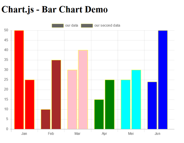
But before that, it's better to us to learn something important. We can add more datasheet to compare to our first datasheet. Our new datasheet is like this : [25, 35, 40, 25,30, 50]. Beside that, we can change background color for each data. The first data will have background "red" and the next is "brown", "pink", "green", "cyan", "blue", "black" to make it more interactive. Let's we implement it in script.
var ourLineChart = document.getElementById('Chart-Bar').getContext('2d');
var myChart = new Chart(ourLineChart, {
    type:'bar' // available chart type: 'line', 'bar', 'radar', 'polarArea', 'pie', 'doughnut', 'radar', and  'bubble'
    data: {
        labels: ['Jan', 'Feb', 'Mar', 'Apr', 'Mei', 'Jun'],
        datasets: [{
            data: [50, 10, 30, 15, 25, 24],
            label: 'our datasheet',
            fill:true,
            backgroundColor: [
                "red", "brown", "pink", "green", "cyan", "blue","black"
              ],
            borderWidth:1,
            borderColor:"yellow"
        }, {
            data: [25, 35, 40, 25,30, 50],
            label: 'our second datasheet ',
            fill:true,
            backgroundColor: [
                "red", "brown", "pink", "green", "cyan", "blue","black"
              ],
            borderWidth:1,
            borderColor:"yellow"
        }
    ]
    },
    options: {
            responsive:false,
            scales: {
                yAxes: [{
                    ticks: {
                        beginAtZero:true
                    }
                }]
            }
    }
});
Result of Bar Chart
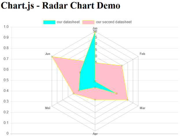
Result of Radar Chart
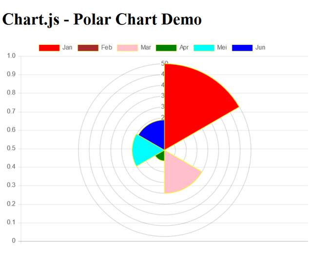
Result of Polar Chart
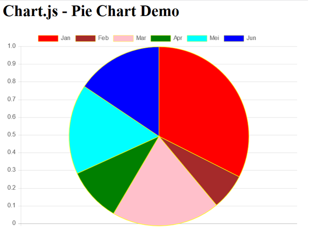
Result of Pie Chart
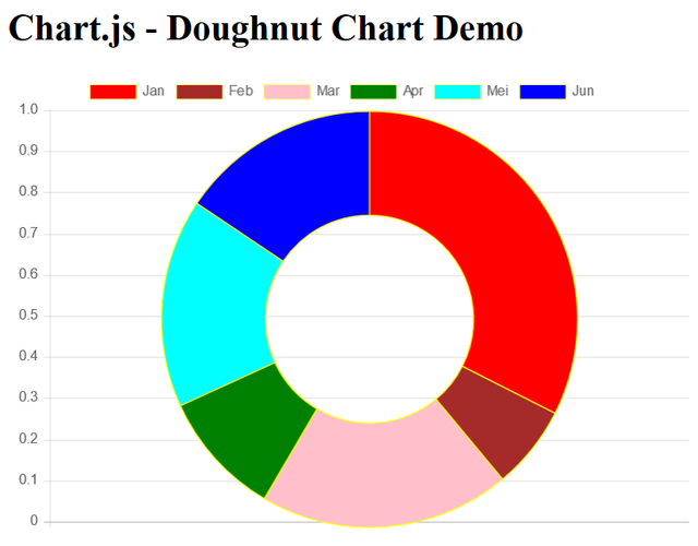
Result of Doughnut Chart
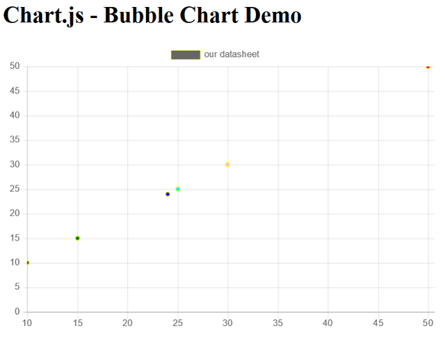
Result of Bubble Chart
*notes:
- For type chart polarArea, it is better to us to just using 1 background color.
- For type chart polarArea, pie and doughnut, it is better to us to just using 1 datasheet. The Chart will be bad if we are using two or more datasheet to polarArea, pie or doughnut.
Conclusion
We can see how easy to make a Chart with Chart.js. Learn once, to learn understand all chart. We can conclusion the step of using Chart.js. First step is include Chart.js CDN file. Second step is setup <canvas> Tag. The last is configuration. In configuration, Chart.js has three properties, there are type, data and option. I think that's all what can I share about Chart.js. Sorry for all of my limitless. I hope it will be use full for us. If you want to know more about Chart.js, you can go to official website of Chart.js in http://www.chartjs.org/. One more, I put all of script in my Github in here.
respectfully,
cakra
Posted on Utopian.io - Rewarding Open Source Contributors
Congratulations @cakra! You have completed some achievement on Steemit and have been rewarded with new badge(s) :
Click on any badge to view your own Board of Honor on SteemitBoard.
For more information about SteemitBoard, click here
If you no longer want to receive notifications, reply to this comment with the word
STOPThank you for the contribution. It has been approved.
You can contact us on Discord.
[utopian-moderator]
Hey @cakra I am @utopian-io. I have just upvoted you!
Achievements
Suggestions
Get Noticed!
Community-Driven Witness!
I am the first and only Steem Community-Driven Witness. Participate on Discord. Lets GROW TOGETHER!
Up-vote this comment to grow my power and help Open Source contributions like this one. Want to chat? Join me on Discord https://discord.gg/Pc8HG9x