Hey @zularizal ,
Thank you for the contribution.
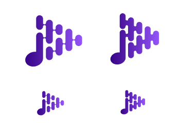
In my opinion if you make vertical elements thinner and shapes of wave thicker, the logo design could be more balanced anad visible in small sizes.
It's only suggestion. Here I made it below:
Your contribution has been evaluated according to Utopian policies and guidelines, as well as a predefined set of questions pertaining to the category.
To view those questions and the relevant answers related to your post, click here.
Need help? Chat with us on Discord.
Thank you @baranpirincal , I agree with your advice.
Thank you for your review, @baranpirincal! Keep up the good work!