Hey @tebriz ,
Thank you for the contribution. Your presentation looks more clear, understandable and well made. One more thing I can say about the presentation is , you can clarify the reason about the using specific typeface. Also, What does the project mean to you and what are the effects of your design to repository. Shortly, I expected your thoughts more about the project. However, I am curious about Nilfanif's opinion. I liked the improvement and I appreciated your effort.
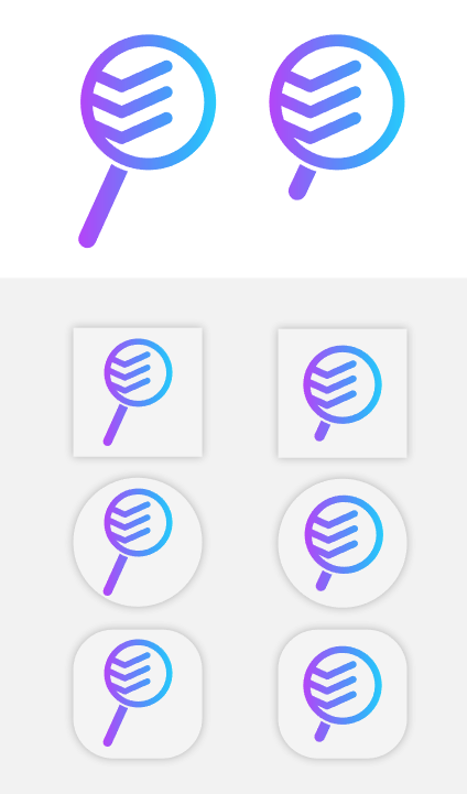
Combining check icon and shape of magnifying glass idea is good. However, when we are design a logo, we should think about the other mediums which project owner can use the logo design. So, I think if we make rod of magnifying glass more smaller, logo design can be more useful on other mediums such as website, mobile app. , as an icon)
Your contribution has been evaluated according to Utopian policies and guidelines, as well as a predefined set of questions pertaining to the category.
To view those questions and the relevant answers related to your post, click here.
Need help? Chat with us on Discord.
Hi @baranpirincal, welcome back. I'll clarify details on my next presentation. I'm glad that you liked the presentation, I'm trying to improve it to excellent level, so I'll keep making improvements on it. Thanks for the suggestions about the logo, it's good to know. Thanks for the moderation.
Thank you for your review, @baranpirincal! Keep up the good work!